## Line Chart: F1(C) vs. Number of Hidden Classes
### Overview
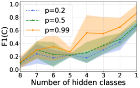
The image is a line chart showing the relationship between F1(C) score and the number of hidden classes for three different values of 'p': 0.2, 0.5, and 0.99. The chart includes shaded regions around each line, representing the uncertainty or variance in the data.
### Components/Axes
* **X-axis:** Number of hidden classes, ranging from 1 to 8 (decreasing from left to right).
* **Y-axis:** F1(C), ranging from 0.0 to 1.0.
* **Legend (top-left):**
* Blue dotted line: p=0.2
* Green dashed line: p=0.5
* Orange solid line: p=0.99
### Detailed Analysis
* **p=0.2 (Blue dotted line):**
* Trend: Generally increasing with decreasing number of hidden classes, but with fluctuations.
* Data Points:
* 8 hidden classes: ~0.08
* 7 hidden classes: ~0.25
* 6 hidden classes: ~0.18
* 5 hidden classes: ~0.22
* 4 hidden classes: ~0.12
* 3 hidden classes: ~0.28
* 2 hidden classes: ~0.42
* 1 hidden class: ~0.65
* **p=0.5 (Green dashed line):**
* Trend: Similar to p=0.2, generally increasing with decreasing number of hidden classes, but with fluctuations.
* Data Points:
* 8 hidden classes: ~0.08
* 7 hidden classes: ~0.20
* 6 hidden classes: ~0.25
* 5 hidden classes: ~0.22
* 4 hidden classes: ~0.25
* 3 hidden classes: ~0.40
* 2 hidden classes: ~0.55
* 1 hidden class: ~0.70
* **p=0.99 (Orange solid line):**
* Trend: Generally increasing with decreasing number of hidden classes, but with more pronounced fluctuations.
* Data Points:
* 8 hidden classes: ~0.08
* 7 hidden classes: ~0.35
* 6 hidden classes: ~0.35
* 5 hidden classes: ~0.22
* 4 hidden classes: ~0.30
* 3 hidden classes: ~0.55
* 2 hidden classes: ~0.65
* 1 hidden class: ~0.90
### Key Observations
* All three lines show a general upward trend as the number of hidden classes decreases.
* The F1(C) score is generally higher for p=0.99 compared to p=0.5 and p=0.2, especially for lower numbers of hidden classes.
* The shaded regions indicate the uncertainty in the data, which appears to be larger for p=0.99.
* There is a dip in F1(C) around 4-5 hidden classes for all three values of 'p'.
### Interpretation
The data suggests that the F1(C) score, a measure of classification performance, tends to improve as the number of hidden classes decreases. This improvement is more pronounced when 'p' is higher (closer to 1). The fluctuations in the lines indicate that the relationship is not strictly linear and may be influenced by other factors. The shaded regions highlight the variability in the results, suggesting that the performance can vary depending on the specific data or experimental conditions. The higher F1(C) scores for p=0.99 suggest that this value may be more effective for the given classification task, especially when the number of hidden classes is low. The dip around 4-5 hidden classes could indicate a critical point where the model's performance is negatively impacted.