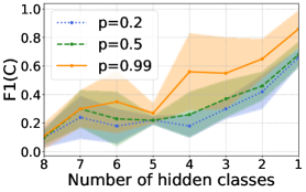
## Line Chart: F1 Score vs. Number of Hidden Classes
### Overview
The image presents a line chart illustrating the relationship between the number of hidden classes and the F1 score (F1(C)) for three different values of 'p' (0.2, 0.5, and 0.99). Each line represents a different 'p' value, and the shaded area around each line indicates a confidence interval or standard deviation. The x-axis represents the number of hidden classes, ranging from 1 to 8, while the y-axis represents the F1 score, ranging from 0.0 to 1.0.
### Components/Axes
* **X-axis Title:** "Number of hidden classes"
* **Y-axis Title:** "F1(C)"
* **Legend:** Located at the top-right corner of the chart.
* `p = 0.2` (represented by a blue dotted line)
* `p = 0.5` (represented by a green dashed line)
* `p = 0.99` (represented by an orange solid line)
* **X-axis Markers:** 1, 2, 3, 4, 5, 6, 7, 8. The axis appears to be reversed, with 8 on the left and 1 on the right.
* **Y-axis Markers:** 0.0, 0.2, 0.4, 0.6, 0.8, 1.0
### Detailed Analysis
* **p = 0.2 (Blue Dotted Line):** The line generally slopes upward from x=8 to x=1, but with significant fluctuations.
* At x=8, F1(C) ≈ 0.18
* At x=7, F1(C) ≈ 0.25
* At x=6, F1(C) ≈ 0.22
* At x=5, F1(C) ≈ 0.20
* At x=4, F1(C) ≈ 0.25
* At x=3, F1(C) ≈ 0.35
* At x=2, F1(C) ≈ 0.55
* At x=1, F1(C) ≈ 0.65
* **p = 0.5 (Green Dashed Line):** The line shows a similar upward trend, but starts at a lower value and has a smaller range of fluctuation.
* At x=8, F1(C) ≈ 0.10
* At x=7, F1(C) ≈ 0.18
* At x=6, F1(C) ≈ 0.22
* At x=5, F1(C) ≈ 0.18
* At x=4, F1(C) ≈ 0.25
* At x=3, F1(C) ≈ 0.35
* At x=2, F1(C) ≈ 0.50
* At x=1, F1(C) ≈ 0.60
* **p = 0.99 (Orange Solid Line):** This line exhibits the most pronounced upward trend, starting at a moderate value and increasing significantly towards x=1.
* At x=8, F1(C) ≈ 0.20
* At x=7, F1(C) ≈ 0.30
* At x=6, F1(C) ≈ 0.40
* At x=5, F1(C) ≈ 0.30
* At x=4, F1(C) ≈ 0.50
* At x=3, F1(C) ≈ 0.60
* At x=2, F1(C) ≈ 0.70
* At x=1, F1(C) ≈ 0.85
### Key Observations
* As the number of hidden classes decreases (from 8 to 1), the F1 score generally increases for all values of 'p'.
* The 'p = 0.99' line consistently shows the highest F1 scores across all numbers of hidden classes.
* The shaded areas around the lines indicate variability in the F1 scores, suggesting that the results may not be consistent across different datasets or runs.
* The line for p=0.2 shows the most variance.
### Interpretation
The chart demonstrates that increasing the number of hidden classes generally *decreases* the performance (as measured by F1 score) of the model. This suggests that a smaller number of hidden classes may be more effective for this particular task. The parameter 'p' appears to have a significant impact on performance, with higher values of 'p' (closer to 1) resulting in higher F1 scores. This could indicate that 'p' represents a confidence threshold or a weighting factor that influences the model's decision-making process. The widening confidence intervals as the number of hidden classes decreases suggest that the model becomes more sensitive to variations in the data when fewer classes are used. The chart suggests a trade-off between model complexity (number of hidden classes) and performance, and that the optimal number of hidden classes depends on the value of 'p'. The data suggests that the model performs best when 'p' is high and the number of hidden classes is low.