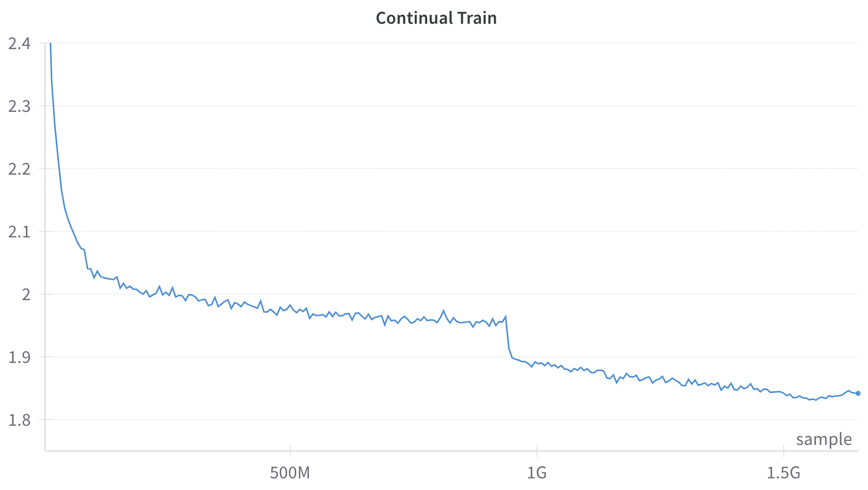
## Line Chart: Continual Train
### Overview
This image is a line chart depicting a single data series over a continuous x-axis. The chart illustrates a metric that generally decreases over time, characterized by a sharp initial decline, a long period of gradual decrease with minor fluctuations, a sudden distinct drop, and a final leveling off with a slight uptick at the very end.
### Components/Axes
**Header Region:**
* **Title:** "Continual Train" (Centered at the top).
**Y-Axis (Left, Vertical):**
* **Label/Title:** None explicitly provided.
* **Scale:** Linear.
* **Markers/Ticks:** 1.8, 1.9, 2, 2.1, 2.2, 2.3, 2.4.
* **Gridlines:** Faint, light gray horizontal lines extend across the chart area from each Y-axis tick mark.
**X-Axis (Bottom, Horizontal):**
* **Label/Title:** "sample" (Positioned at the bottom right corner, just above the axis line).
* **Scale:** Linear, representing large quantities (Millions/Billions).
* **Markers/Ticks:**
* 500M (Center-left)
* 1G (Center-right)
* 1.5G (Far right)
* *Note: The origin (0) is implied at the far left intersection.*
**Data Series:**
* A single, solid blue line. There is no legend as there is only one series. A distinct small blue dot marks the final data point on the far right.
### Detailed Analysis
**Trend Verification & Data Extraction:**
The blue line represents a continuous process. We can break the visual trend into four distinct phases:
1. **Phase 1: Initial Sharp Decline (0 to ~100M samples)**
* *Trend:* The line slopes downward almost vertically at the start, indicating a rapid decrease in the measured metric.
* *Data Points:* The line begins at the top-left corner at exactly **2.4** (at 0 samples). It drops precipitously to approximately **2.1** by roughly 50M samples, and slows its descent to reach approximately **2.05** by 100M samples.
2. **Phase 2: Gradual Decline and Plateau (~100M to ~950M samples)**
* *Trend:* The line slopes downward very gently. It exhibits high-frequency, low-amplitude noise (jaggedness) throughout this section.
* *Data Points:* At the **500M** sample mark, the value is approximately **1.97**. The line continues to drift lower, reaching approximately **1.95** just before the 1G mark (estimated at 950M samples).
3. **Phase 3: Sudden Step-Drop (~950M samples)**
* *Trend:* The line drops vertically in a near-instantaneous step.
* *Data Points:* Just prior to the 1G mark, the value falls sharply from approximately **1.95** down to approximately **1.90**.
4. **Phase 4: Continued Gradual Decline and Final Uptick (~950M to ~1.6G samples)**
* *Trend:* Following the step-drop, the line resumes its gentle downward slope with continued minor noise. It flattens out completely near the end and shows a slight upward curve.
* *Data Points:* At the **1G** mark, the value is approximately **1.89**. At the **1.5G** mark, the value is approximately **1.84**. The line hits a visual minimum of roughly **1.83** around 1.55G samples. The final recorded point (marked with a dot) is at approximately 1.6G samples, showing a slight increase to approximately **1.84**.
### Key Observations
* **The Step-Drop:** The most prominent anomaly in the chart is the sudden, vertical drop in the metric just before the 1G sample mark. This breaks the established pattern of gradual decline.
* **High-Frequency Noise:** The line is not smooth; it features constant, minor jagged fluctuations throughout the entire training process, which is typical of stochastic processes.
* **Final Reversal:** After 1.5G samples, the metric stops improving (decreasing) and begins to slightly worsen (increase), marked explicitly by the final dot.
### Interpretation
*Contextual Deduction:* Given the title "Continual Train" and the X-axis labeled "sample" (measured in Millions and Gigas/Billions), this chart almost certainly represents the **training loss curve of a machine learning model** (likely a Large Language Model, given the scale of 1.5 Billion+ samples). The Y-axis, though unlabeled, represents the Loss metric (e.g., Cross-Entropy Loss), where lower is better.
* **Initial Learning (Phase 1):** The rapid drop from 2.4 to 2.05 represents the model's initial phase of learning, where it quickly picks up the most obvious patterns in the data.
* **Convergence/Plateau (Phase 2):** The slow decline from 100M to 950M indicates the model is slowly refining its understanding, but is approaching a limit based on its current configuration. The jaggedness is standard batch-to-batch variance (stochastic gradient descent noise).
* **Intervention/Phase Shift (Phase 3):** The sudden drop at ~950M samples is highly indicative of a deliberate intervention by the engineers training the model. In ML training, a step-drop like this is classically caused by a **Learning Rate Decay** (dropping the learning rate by a factor, allowing the model to settle into a sharper local minimum). Alternatively, in the context of "Continual Train," it could represent the introduction of a new, perhaps easier or highly structured, dataset phase.
* **Overfitting or Data Shift (Phase 4):** The model continues to learn at the new, lower loss level. However, the slight uptick at the very end (after 1.5G) suggests the model might be beginning to overfit to the training data, or it encountered a batch of data that was out-of-distribution, causing the loss to slightly regress.