\n
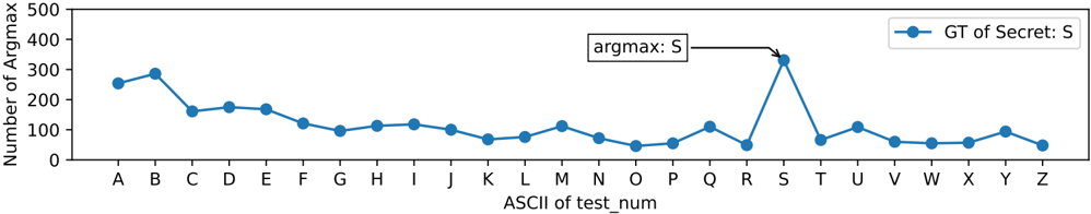
## Line Chart: Number of Argmax vs. ASCII of test_num
### Overview
The image presents a line chart illustrating the relationship between the ASCII value of `test_num` and the "Number of Argmax". The chart displays a single data series labeled "GT of Secret: S". A text annotation points to a specific data point, indicating "argmax: S".
### Components/Axes
* **X-axis:** Labeled "ASCII of test\_num". The axis markers represent letters from A to Z.
* **Y-axis:** Labeled "Number of Argmax". The scale ranges from 0 to approximately 500, with increments of 100.
* **Data Series:** A single blue line labeled "GT of Secret: S".
* **Legend:** Located in the top-right corner, displaying the label "GT of Secret: S" and a corresponding blue circle.
* **Annotation:** A text box labeled "argmax: S" with an arrow pointing to the data point corresponding to the letter 'S' on the x-axis.
### Detailed Analysis
The blue line representing "GT of Secret: S" exhibits a generally decreasing trend from 'A' to 'L', followed by fluctuations and a sharp increase at 'S'.
Here's a breakdown of approximate values extracted from the chart:
* **A:** Approximately 270
* **B:** Approximately 300
* **C:** Approximately 270
* **D:** Approximately 200
* **E:** Approximately 180
* **F:** Approximately 150
* **G:** Approximately 120
* **H:** Approximately 100
* **I:** Approximately 90
* **J:** Approximately 80
* **K:** Approximately 80
* **L:** Approximately 90
* **M:** Approximately 70
* **N:** Approximately 60
* **O:** Approximately 50
* **P:** Approximately 60
* **Q:** Approximately 100
* **R:** Approximately 120
* **S:** Approximately 380
* **T:** Approximately 100
* **U:** Approximately 80
* **V:** Approximately 70
* **W:** Approximately 70
* **X:** Approximately 60
* **Y:** Approximately 60
* **Z:** Approximately 70
The line slopes downward from A to approximately J, then plateaus and fluctuates until reaching S, where it experiences a significant peak. After S, the line declines and remains relatively stable between 60 and 100.
### Key Observations
* The highest value occurs at 'S', with a "Number of Argmax" of approximately 380.
* The lowest values are observed around 'M' and 'N', with values around 60-70.
* There is a clear outlier at 'S', significantly deviating from the surrounding data points.
* The data suggests a non-linear relationship between the ASCII value of `test_num` and the "Number of Argmax".
### Interpretation
The chart likely represents the frequency or count of a specific event ("Argmax") associated with different input values (`test_num`). The ASCII value of `test_num` is used as the independent variable. The sharp peak at 'S' suggests that the event is significantly more likely to occur when `test_num` corresponds to the letter 'S'. The annotation "argmax: S" reinforces this interpretation, indicating that 'S' is the value that maximizes the "Number of Argmax".
The overall shape of the curve suggests that the event is more frequent for letters earlier in the alphabet (A-C) and then decreases until 'S', where it spikes. The subsequent decline and stabilization could indicate a saturation effect or a different underlying mechanism for letters after 'S'. The data could be related to a cryptographic key or a pattern-matching algorithm where 'S' holds a special significance. The "GT of Secret: S" label hints at a ground truth or expected value related to a secret, and the chart visualizes how often the argmax aligns with this secret.