## Line Graph: Number of Argtmax vs ASCII of test_num
### Overview
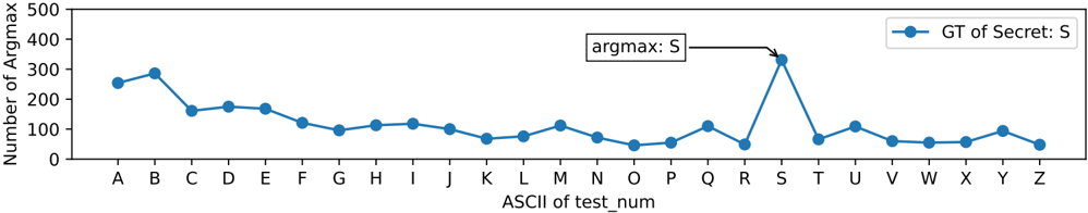
The image depicts a line graph illustrating the relationship between the ASCII values of test numbers (A-Z) and the corresponding "Number of Argtmax." The graph includes a single data series labeled "GT of Secret: S" (blue line) and highlights a peak labeled "argmax: S" at ASCII value S (~350). The y-axis ranges from 0 to 500, while the x-axis spans ASCII values A-Z.
### Components/Axes
- **X-axis**: Labeled "ASCII of test_num," with discrete markers A-Z (representing ASCII values 65-90).
- **Y-axis**: Labeled "Number of Argtmax," scaled from 0 to 500 in increments of 100.
- **Legend**: Located in the top-right corner, with two entries:
- "GT of Secret: S" (blue line with circular markers).
- "argmax: S" (annotated peak at S).
- **Line**: A single blue line with circular markers, representing the "GT of Secret: S" data series.
### Detailed Analysis
- **Data Points**:
- **A**: ~250 (blue marker).
- **B**: ~300 (blue marker, local peak).
- **C**: ~150 (blue marker).
- **D**: ~180 (blue marker).
- **E**: ~170 (blue marker).
- **F**: ~120 (blue marker).
- **G**: ~90 (blue marker).
- **H**: ~100 (blue marker).
- **I**: ~110 (blue marker).
- **J**: ~80 (blue marker).
- **K**: ~60 (blue marker).
- **L**: ~70 (blue marker).
- **M**: ~100 (blue marker).
- **N**: ~80 (blue marker).
- **O**: ~60 (blue marker).
- **P**: ~50 (blue marker).
- **Q**: ~100 (blue marker).
- **R**: ~50 (blue marker).
- **S**: ~350 (blue marker, annotated as "argmax: S").
- **T**: ~70 (blue marker).
- **U**: ~100 (blue marker).
- **V**: ~60 (blue marker).
- **W**: ~50 (blue marker).
- **X**: ~50 (blue marker).
- **Y**: ~90 (blue marker).
- **Z**: ~40 (blue marker).
### Key Observations
1. **Peak at S**: The highest value (~350) occurs at ASCII S, explicitly annotated as "argmax: S."
2. **General Trend**: The line exhibits a downward trend after B (~300), with fluctuations (e.g., minor peaks at Q and U).
3. **Lowest Values**: The minimum (~40) occurs at Z, with several points (P, R, V, W, X) below 100.
4. **Anomaly**: The sharp spike at S (~350) stands out as an outlier compared to other values (mostly 50–200).
### Interpretation
- **Data Meaning**: The graph suggests that the "GT of Secret: S" metric peaks at ASCII S, potentially indicating a critical test case or anomaly. The fluctuations may reflect variability in performance or data collection across test numbers.
- **Relationships**: The "argmax: S" annotation directly correlates with the highest y-axis value, confirming S as the maximum. The blue line consistently represents the "GT of Secret: S" series.
- **Significance**: The outlier at S warrants further investigation, as it deviates significantly from the general trend. This could indicate a unique condition or error in the dataset.