\n
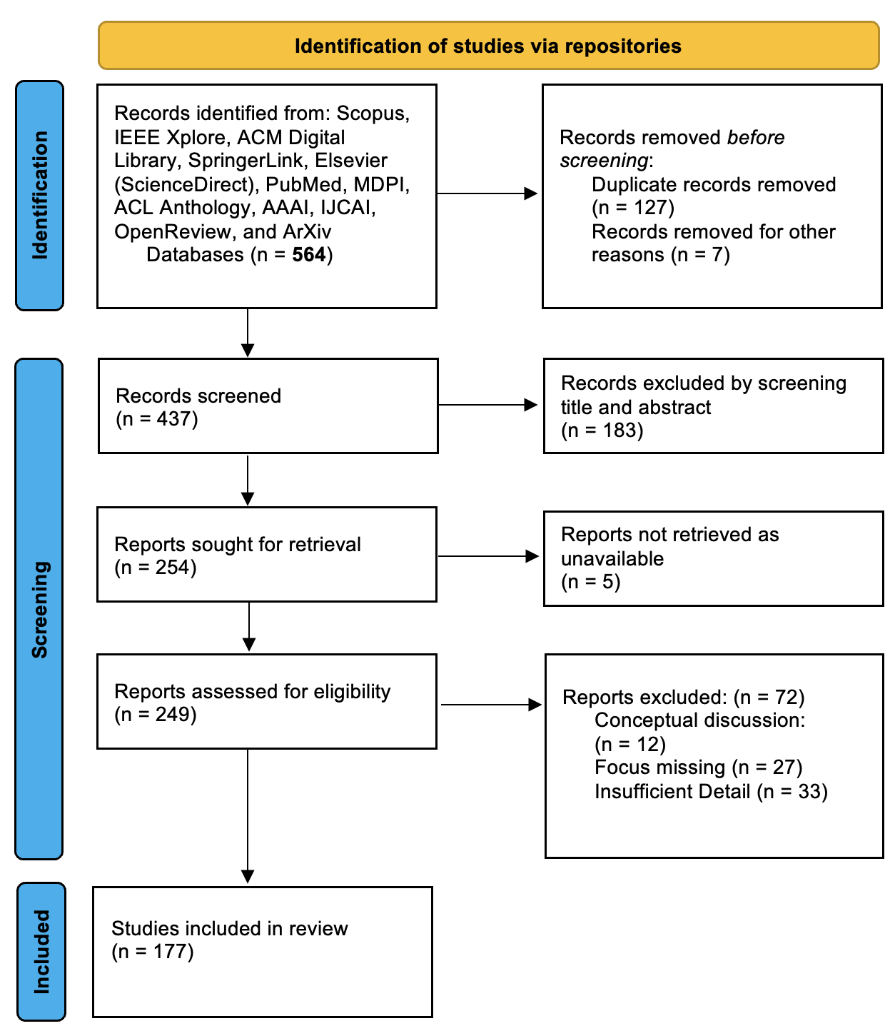
## PRISMA Flow Diagram: Systematic Review Study Selection Process
### Overview
This image is a flow diagram illustrating the multi-stage selection process for studies included in a systematic review. It follows the PRISMA (Preferred Reporting Items for Systematic Reviews and Meta-Analyses) format, detailing the flow of information through four phases: Identification, Screening, and Included. The diagram uses a vertical flow with boxes representing stages and arrows indicating the progression and exclusion of records.
### Components/Axes
The diagram is structured into three main vertical sections, labeled on the left with blue sidebars:
1. **Identification** (Top section)
2. **Screening** (Middle section)
3. **Included** (Bottom section)
A yellow header at the top reads: **"Identification of studies via repositories"**.
The flowchart consists of rectangular boxes connected by downward and rightward arrows. Boxes on the left represent the main flow of studies progressing through the review. Boxes on the right, connected by rightward arrows, represent records or reports excluded at various stages, along with the reasons for exclusion.
### Detailed Analysis
The process begins at the top and flows downward. The exact text and numerical data from each box are transcribed below.
**Phase 1: Identification**
* **Main Flow Box (Top-Left):**
* Text: "Records identified from: Scopus, IEEE Xplore, ACM Digital Library, SpringerLink, Elsevier (ScienceDirect), PubMed, MDPI, ACL Anthology, AAAI, IJCAI, OpenReview, and ArXiv Databases (n = **564**)"
* *This box lists the sources and the initial total number of records identified.*
* **Exclusion Box (Top-Right):**
* Text: "Records removed *before* screening: Duplicate records removed (n = 127) Records removed for other reasons (n = 7)"
* *This box accounts for records removed prior to the screening phase.*
**Phase 2: Screening**
* **Main Flow Box 1:**
* Text: "Records screened (n = 437)"
* *This is the number of unique records remaining after initial removal (564 - 127 - 7 = 430, though the diagram states 437).*
* **Exclusion Box 1 (Right of "Records screened"):**
* Text: "Records excluded by screening title and abstract (n = 183)"
* **Main Flow Box 2:**
* Text: "Reports sought for retrieval (n = 254)"
* *This is the number of records that passed title/abstract screening (437 - 183 = 254).*
* **Exclusion Box 2 (Right of "Reports sought for retrieval"):**
* Text: "Reports not retrieved as unavailable (n = 5)"
* **Main Flow Box 3:**
* Text: "Reports assessed for eligibility (n = 249)"
* *This is the number of full-text reports assessed (254 - 5 = 249).*
* **Exclusion Box 3 (Right of "Reports assessed for eligibility"):**
* Text: "Reports excluded: (n = 72) Conceptual discussion: (n = 12) Focus missing (n = 27) Insufficient Detail (n = 33)"
* *This box provides a breakdown of reasons for excluding full-text reports. The sum of the reasons (12 + 27 + 33) equals 72.*
**Phase 3: Included**
* **Main Flow Box (Bottom-Left):**
* Text: "Studies included in review (n = 177)"
* *This is the final number of studies included in the systematic review (249 - 72 = 177).*
### Key Observations
1. **Significant Initial Attrition:** The process begins with 564 identified records, but 134 (24%) are removed before screening even begins, primarily due to duplicates (127).
2. **Major Screening Filter:** The largest single reduction occurs during title and abstract screening, where 183 out of 437 records (42%) are excluded.
3. **Full-Text Exclusion Reasons:** When assessing full-text reports, the most common reason for exclusion is "Insufficient Detail" (33 reports), followed by "Focus missing" (27 reports), and "Conceptual discussion" (12 reports).
4. **Final Inclusion Rate:** Only 177 out of the initial 564 identified records (31%) are ultimately included in the review, demonstrating a rigorous selection process.
5. **Numerical Consistency Check:** The flow of numbers is mostly consistent: 564 - 134 = 430 (diagram shows 437); 437 - 183 = 254; 254 - 5 = 249; 249 - 72 = 177. The discrepancy between the calculated 430 and the stated 437 in the "Records screened" box is a minor inconsistency in the diagram's data.
### Interpretation
This diagram visually documents the methodology and rigor of a systematic review's study selection process. It serves as an audit trail, showing how the final set of 177 studies was derived from an initial pool of 564 records.
* **What it demonstrates:** The process is designed to minimize bias by transparently showing every step where studies were excluded and the specific reasons for exclusion. The high exclusion rates, particularly at the title/abstract screening and full-text assessment stages, suggest the review had well-defined, specific inclusion criteria.
* **Relationship between elements:** The left column represents the "surviving" cohort of studies moving toward inclusion, while the right column acts as a "waste stream," documenting attrition. The arrows create a clear, logical funnel.
* **Notable patterns:** The breakdown of full-text exclusion reasons is particularly valuable. It indicates that a common pitfall for studies in this field (likely computer science/AI, given the databases like ArXiv, ACL, AAAI) is a lack of methodological detail or a mismatch with the review's specific focus, rather than purely being conceptual papers.
* **Underlying message:** The diagram communicates thoroughness and reproducibility. A reader can see exactly how the authors arrived at their final dataset, which is a cornerstone of credible systematic review research. The minor numerical discrepancy (430 vs. 437) is a point a careful reader might note, but it does not undermine the overall transparent structure of the process.