## Flowchart: Challenges and Limitations
### Overview
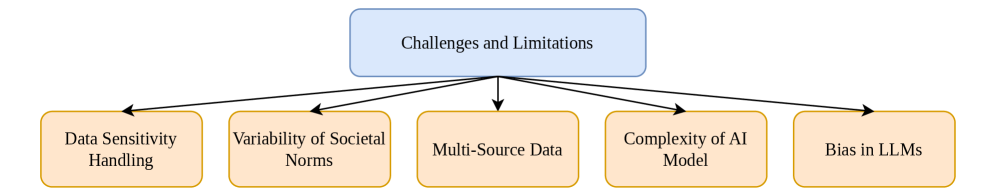
The image is a hierarchical flowchart titled **"Challenges and Limitations"** (blue rectangle at the top center). Five subcategories branch downward from the main title via black arrows, each represented by peach-colored rectangles with orange borders. The diagram emphasizes categorical relationships rather than numerical data.
### Components/Axes
- **Main Title**: "Challenges and Limitations" (blue, top-center).
- **Subcategories** (five peach rectangles with orange borders):
1. **Data Sensitivity Handling** (leftmost).
2. **Variability of Societal Norms** (second from left).
3. **Multi-Source Data** (center).
4. **Complexity of AI Model** (second from right).
5. **Bias in LLMs** (rightmost).
- **Arrows**: Black, connecting the main title to each subcategory.
### Detailed Analysis
- **Structure**: The flowchart uses a top-down hierarchy. The main title is centrally positioned, with subcategories arranged horizontally below it. Arrows originate from the main title and point directly to each subcategory, indicating direct subordination.
- **Textual Content**: All labels are in English. No numerical values, scales, or legends are present. The diagram focuses on categorical organization.
- **Visual Design**:
- Main title: Blue rectangle (centered).
- Subcategories: Peach rectangles with orange borders (aligned horizontally).
- Arrows: Black, uniform thickness, originating from the main title.
### Key Observations
- All subcategories are equally prioritized, with no visual hierarchy among them.
- No data points, trends, or quantitative metrics are included.
- The diagram’s simplicity suggests it is intended for conceptual categorization rather than data analysis.
### Interpretation
The flowchart categorizes **five distinct challenges/limitations** under the umbrella term "Challenges and Limitations." Each subcategory represents a standalone issue, likely relevant to AI, machine learning, or data science contexts (e.g., "Bias in LLMs" implies large language models). The absence of numerical data or interconnections between subcategories implies the diagram is designed to highlight discrete challenges rather than their relationships or magnitudes. The use of color (blue for the main title, peach/orange for subcategories) aids visual differentiation but does not encode additional meaning. This structure could serve as a framework for further analysis, where each subcategory might be expanded into detailed sub-diagrams or datasets.