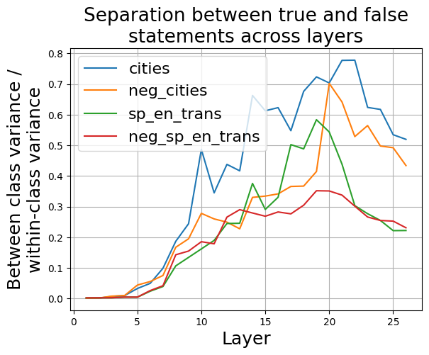
## Line Graph: Separation between true and false statements across layers
### Overview
The image is a line graph depicting the relationship between "Between class variance / within-class variance" and "Layer" for four distinct data categories. The graph shows how variance separation between true and false statements evolves across 25 layers, with four colored lines representing different categories.
### Components/Axes
- **X-axis (Layer)**: Ranges from 0 to 25 in increments of 5.
- **Y-axis (Between class variance / within-class variance)**: Scaled from 0.0 to 0.8 in increments of 0.1.
- **Legend**: Located in the top-left corner, with four categories:
- **cities** (blue line)
- **neg_cities** (orange line)
- **sp_en_trans** (green line)
- **neg_sp_en_trans** (red line)
### Detailed Analysis
1. **cities (blue line)**:
- Starts near 0.0 at layer 0.
- Rises sharply to ~0.75 at layer 10.
- Fluctuates between ~0.6 and 0.75 from layers 10–20.
- Declines to ~0.55 at layer 25.
2. **neg_cities (orange line)**:
- Begins near 0.0 at layer 0.
- Gradually increases to ~0.3 at layer 10.
- Peaks at ~0.65 at layer 20.
- Drops to ~0.45 at layer 25.
3. **sp_en_trans (green line)**:
- Starts near 0.0 at layer 0.
- Rises steeply to ~0.6 at layer 15.
- Peaks at ~0.7 at layer 20.
- Declines to ~0.3 at layer 25.
4. **neg_sp_en_trans (red line)**:
- Begins near 0.0 at layer 0.
- Increases to ~0.25 at layer 10.
- Peaks at ~0.35 at layer 15.
- Declines to ~0.2 at layer 25.
### Key Observations
- **Peak Variance Separation**:
- The **cities** (blue) and **sp_en_trans** (green) lines exhibit the highest variance separation, peaking at layers 10 and 20, respectively.
- The **neg_cities** (orange) and **neg_sp_en_trans** (red) lines show lower peaks, with **neg_sp_en_trans** peaking earlier (layer 15).
- **Trend Divergence**:
- The **cities** and **sp_en_trans** lines diverge significantly after layer 10, while **neg_cities** and **neg_sp_en_trans** remain relatively flat until later layers.
- **Anomalies**:
- The **sp_en_trans** line shows a sharp drop after layer 20, suggesting a potential instability or shift in data distribution.
### Interpretation
The graph demonstrates that **cities** and **sp_en_trans** categories achieve the strongest separation between true and false statements at specific layers (10 and 20), likely indicating optimal model performance or data clustering at these points. The **neg_cities** and **neg_sp_en_trans** categories lag in variance separation, suggesting weaker discrimination capabilities. The divergence between positive and negative categories (e.g., **cities** vs. **neg_cities**) highlights how data distribution characteristics influence model behavior. The sharp decline in **sp_en_trans** after layer 20 may indicate overfitting or a structural shift in the data, warranting further investigation.
*Note: All values are approximate, derived from visual estimation of the graph's scale and line trajectories.*