\n
## Heatmap: Correlation or Density Map
### Overview
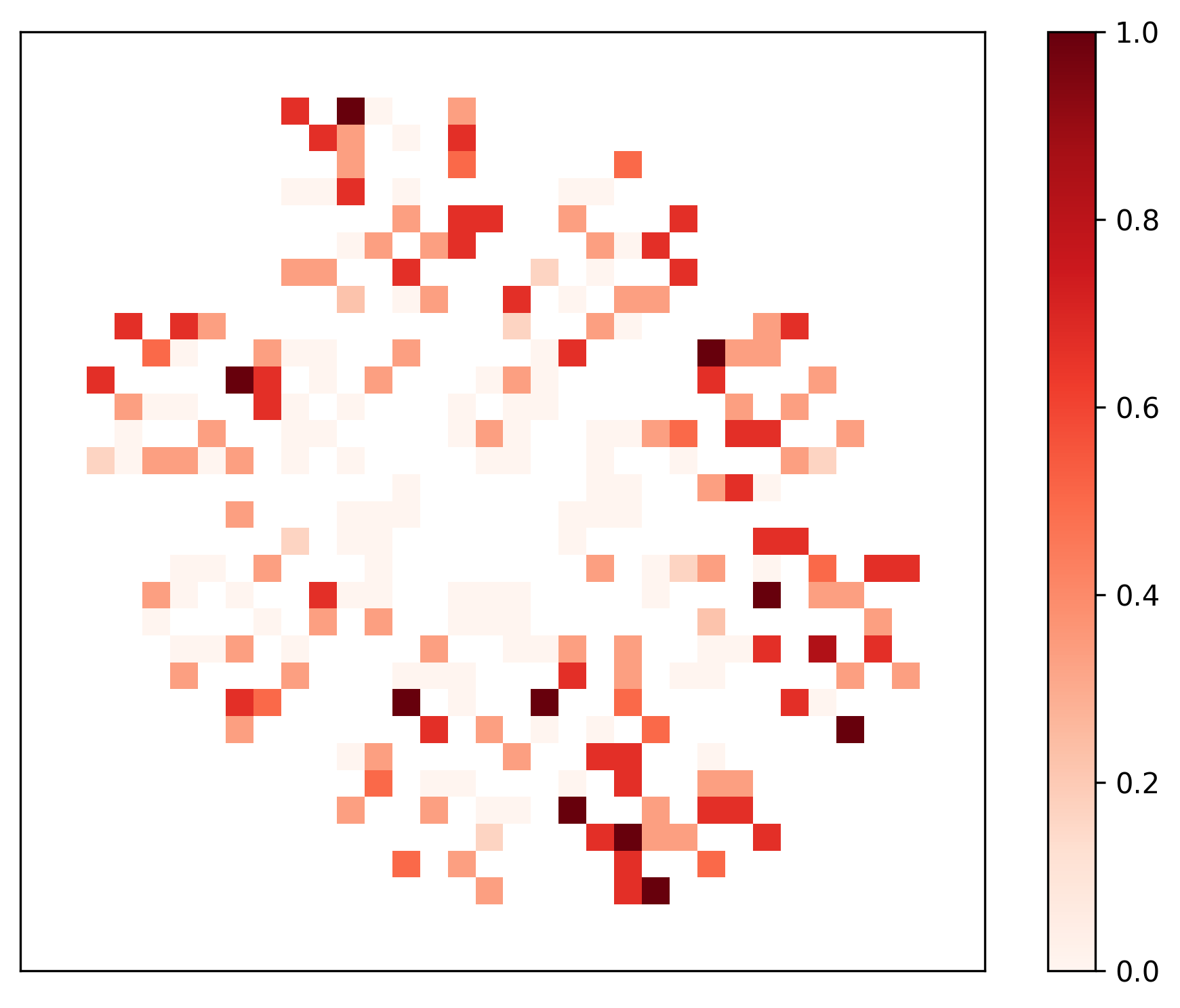
The image presents a heatmap, likely representing a correlation matrix or a density map. The data is visualized using a color gradient, with darker shades of red indicating higher values and lighter shades indicating lower values. The data appears to be arranged in a two-dimensional grid, with no explicit axis labels provided.
### Components/Axes
There are no explicit axis titles or labels. The heatmap itself is the primary component. A colorbar is present on the right side of the image, indicating the mapping between color and value. The colorbar ranges from 0.0 (lightest shade) to 1.0 (darkest shade). The grid appears to be approximately 20x20 cells, though precise counts are difficult without clear boundaries.
### Detailed Analysis
The heatmap displays a pattern of clustered high-value areas (dark red) interspersed with areas of low value (light red/white).
Here's a breakdown of approximate values based on color matching with the colorbar:
* **High Values (0.8 - 1.0):** These are concentrated in several distinct clusters.
* Top-left cluster: Approximately 5 cells.
* Center-left cluster: Approximately 6 cells.
* Center-right cluster: Approximately 4 cells.
* Bottom-center cluster: Approximately 5 cells.
* Bottom-right cluster: Approximately 3 cells.
* **Medium Values (0.4 - 0.8):** These surround the high-value clusters, forming a transition zone. There are many cells in this range, making precise counts difficult.
* **Low Values (0.0 - 0.4):** These fill the spaces between the clusters and form the background of the heatmap. Again, numerous cells fall into this category.
The distribution appears non-uniform, with a clear tendency for values to cluster together. There are no obvious linear trends or gradients across the entire heatmap.
### Key Observations
* The data is not randomly distributed; it exhibits strong clustering.
* The clusters are relatively isolated from each other, suggesting a degree of independence between the variables or features represented by each cluster.
* The absence of axis labels makes it impossible to determine the meaning of the clusters or the variables they represent.
* The heatmap is symmetrical, suggesting that the relationship being visualized is mutual (e.g., correlation).
### Interpretation
Without axis labels, the precise interpretation is limited. However, the heatmap strongly suggests a correlation or density pattern.
* **Correlation Matrix:** If this is a correlation matrix, the dark red clusters indicate strong positive correlations between the variables represented by those clusters. The lighter areas indicate weak or no correlation.
* **Density Map:** If this is a density map, the dark red clusters represent areas of high concentration of data points or events. The lighter areas represent areas of low concentration.
The clustering pattern suggests that the variables or features can be grouped into distinct sets that are strongly related to each other but less related to other sets. The lack of a clear overall trend suggests that the relationships are complex and not easily summarized by a single parameter.
Further investigation would require knowing the meaning of the axes and the data represented by each cell. The heatmap provides a visual summary of the relationships, but it does not explain the underlying causes or mechanisms.