## Heatmap: Unlabeled Distribution Pattern
### Overview
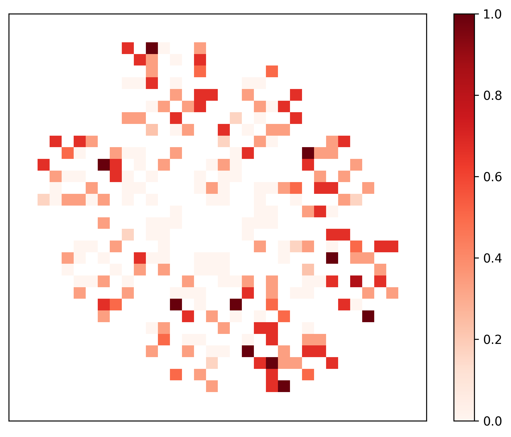
The image depicts a heatmap with a grid of colored squares arranged in a circular pattern. Colors range from white (low values) to dark red (high values), with a gradient scale on the right. The distribution shows clusters of high-intensity values (dark red) concentrated in specific regions, surrounded by lower-intensity areas (lighter red/white).
### Components/Axes
- **Grid**: A 2D matrix of squares with no labeled axes or categories.
- **Color Scale**: Vertical gradient on the right, ranging from **0.0 (white)** to **1.0 (dark red)**.
- **Pattern**: Circular arrangement of squares, with no textual labels, axis titles, or legends.
### Detailed Analysis
- **Color Distribution**:
- **Dark Red (0.8–1.0)**: Clusters of 5–7 squares in the central region, with isolated dark red squares scattered peripherally.
- **Medium Red (0.4–0.8)**: Surrounding the central clusters, forming a gradient transition.
- **Light Red/White (0.0–0.4)**: Dominates the outer edges, with sparse medium-red regions.
- **Spatial Grounding**:
- Color scale is positioned on the **right edge**, occupying ~20% of the image width.
- Grid occupies the remaining space, with no axis markers or legends.
### Key Observations
1. **Central Concentration**: The highest values (dark red) are tightly clustered near the center, suggesting a focal point of intensity.
2. **Peripheral Gradient**: Values decrease radially outward, with the outermost regions showing minimal intensity (white).
3. **Cluster Variability**: Some clusters have irregular shapes (e.g., L-shaped or fragmented), while others are compact.
4. **No Textual Labels**: No categories, axis titles, or legends are present to contextualize the data.
### Interpretation
The heatmap likely represents a spatial distribution of a metric (e.g., sensor readings, population density, or resource allocation). The central clusters indicate regions of maximum intensity, while the gradient suggests a decay or dispersion effect. The absence of labels limits direct interpretation, but the pattern implies:
- **Dominant Central Phenomenon**: A core area with the highest values, possibly a hub or focal point.
- **Secondary Peaks**: Smaller clusters may represent localized secondary phenomena or outliers.
- **Boundary Effects**: The periphery’s low values could indicate a natural boundary or diminishing influence.
**Note**: Without contextual labels, the exact nature of the data (e.g., time, location, or category) remains speculative. The pattern emphasizes spatial relationships rather than categorical or temporal trends.