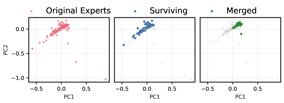
## Technical Description of Scatter Plots
This image presents a series of three scatter plots arranged horizontally, illustrating the transformation of data points across different stages. The plots share common axes and a legend.
### Legend and Axes
* **Legend:** Located at the top of the image, the legend defines three categories of data points:
* **Original Experts:** Represented by pink circles.
* **Surviving:** Represented by blue circles.
* **Merged:** Represented by green 'x' markers.
* **Vertical Axis (Y-axis):** Labeled "PC2", with tick marks at -1.0, -0.5, and 0.0.
* **Horizontal Axis (X-axis):** Labeled "PC1", with tick marks at -0.5, 0.0, and 0.5.
* **Grid:** A faint grid is present in all three plots, corresponding to the axis tick marks.
### Plot 1: Original Experts
* **Title:** "Original Experts" is positioned above the first plot.
* **Data Representation:** This plot shows the distribution of the "Original Experts" data points (pink circles).
* **Observations:**
* The majority of the points are clustered around the origin (PC1=0, PC2=0), extending along a positive diagonal trend from approximately (-0.2, -0.2) to (0.2, 0.2).
* There are several outliers, including a notable point near (0.3, -0.7) and another near (0.9, -1.0).
* The overall spread is relatively broad compared to the subsequent plots.
### Plot 2: Surviving
* **Title:** "Surviving" is positioned above the second plot.
* **Data Representation:** This plot shows the "Surviving" data points (blue circles). The "Original Experts" points are also visible but are rendered in faint grey, indicating they are background context.
* **Observations:**
* The "Surviving" points form a tighter cluster compared to the "Original Experts," concentrated around the origin and following the same positive diagonal trend.
* The outliers observed in the "Original Experts" plot (e.g., near (0.3, -0.7) and (0.9, -1.0)) are not part of the "Surviving" group, as indicated by their faint grey appearance.
* The "Surviving" group appears to be a subset of the "Original Experts," excluding the most extreme outliers.
### Plot 3: Merged
* **Title:** "Merged" is positioned above the third plot.
* **Data Representation:** This plot shows the "Merged" data points (green 'x' markers). The "Original Experts" points are again visible in faint grey as background.
* **Observations:**
* The "Merged" points form the tightest cluster among the three plots.
* This cluster is centered approximately around (PC1=0.1, PC2=0.1).
* The "Merged" group represents a highly concentrated subset of the original data, occupying a smaller region in the PC1-PC2 space compared to both the "Original Experts" and "Surviving" groups.