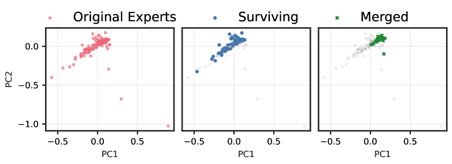
# Technical Document Extraction: Scatter Plot Analysis
## Image Description
The image contains three scatter plots arranged horizontally, each representing different data groupings. The plots are labeled with titles, axes, and a legend. The data points are color-coded to distinguish categories.
---
## Key Components
### 1. **Plot Titles**
- **Left Plot**: "Original Experts"
- **Middle Plot**: "Surviving"
- **Right Plot**: "Merged"
### 2. **Axis Labels**
- **X-axis**: "PC1" (Principal Component 1)
- **Y-axis**: "PC2" (Principal Component 2)
### 3. **Legend**
- **Colors and Labels**:
- **Red**: "Original Experts"
- **Blue**: "Surviving"
- **Green**: "Merged"
- **Gray**: Unlabeled (appears in "Surviving" and "Merged" plots)
### 4. **Axis Ranges**
- **PC1**: -0.5 to 0.5
- **PC2**: -1.0 to 0.0
---
## Data Trends and Observations
### **Original Experts (Red Points)**
- **Cluster**: Points are densely clustered around the origin (PC1 ≈ 0, PC2 ≈ 0).
- **Spread**: Some points extend slightly to the left (PC1 < 0) and downward (PC2 < 0).
- **Notable**: No gray points present in this plot.
### **Surviving (Blue and Gray Points)**
- **Blue Points**: Clustered in the upper-left quadrant (PC1 ≈ -0.2, PC2 ≈ 0.2).
- **Gray Points**: Scattered across the plot, with some near the origin and others in the lower-right quadrant.
- **Observation**: The blue cluster is distinct from the gray points, suggesting a separation in the "Surviving" category.
### **Merged (Green and Gray Points)**
- **Green Points**: Clustered in the upper-right quadrant (PC1 ≈ 0.2, PC2 ≈ 0.2).
- **Gray Points**: Scattered, with some overlapping the green cluster and others in the lower-left quadrant.
- **Observation**: The green cluster is distinct from the gray points, indicating a merged category with potential overlap or noise.
---
## Cross-Reference: Legend vs. Plot Data
- **Red (Original Experts)**: Matches the left plot's red points.
- **Blue (Surviving)**: Matches the middle plot's blue points.
- **Green (Merged)**: Matches the right plot's green points.
- **Gray**: Appears in both "Surviving" and "Merged" plots but is not explicitly labeled in the legend. Likely represents a subset or noise category.
---
## Summary
The three plots visualize principal component analysis (PCA) results for three categories: "Original Experts," "Surviving," and "Merged." The "Original Experts" cluster tightly around the origin, while "Surviving" and "Merged" show distinct clusters with additional gray points that may represent noise or subcategories. The gray points in "Surviving" and "Merged" plots are not explicitly labeled in the legend, suggesting they may be a separate or unclassified group.