\n
## Line Charts: Qwen3-8B and Qwen3-32B Layer-wise ΔP Analysis
### Overview
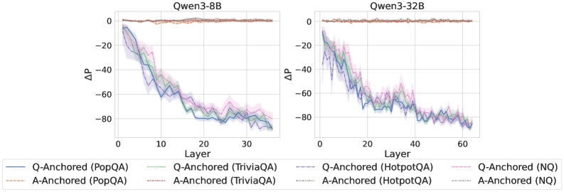
The image displays two side-by-side line charts comparing the layer-wise change in probability (ΔP) for two different language models: **Qwen3-8B** (left) and **Qwen3-32B** (right). Each chart plots the ΔP metric across the model's layers for four different question-answering datasets, using two distinct anchoring methods ("Q-Anchored" and "A-Anchored").
### Components/Axes
* **Chart Titles:**
* Left Chart: `Qwen3-8B`
* Right Chart: `Qwen3-32B`
* **Y-Axis (Both Charts):**
* Label: `ΔP`
* Scale: Ranges from approximately -80 to 0. Major gridlines are at intervals of 20 (-80, -60, -40, -20, 0).
* **X-Axis (Both Charts):**
* Label: `Layer`
* Scale (Qwen3-8B): Ranges from 0 to 35. Major ticks are at 0, 10, 20, 30.
* Scale (Qwen3-32B): Ranges from 0 to 60. Major ticks are at 0, 20, 40, 60.
* **Legend (Bottom of Image, spanning both charts):**
* Contains 8 entries, each with a unique color and line style.
* **Q-Anchored Series (Solid Lines):**
* `Q-Anchored (PopQA)` - Solid blue line
* `Q-Anchored (TriviaQA)` - Solid green line
* `Q-Anchored (HotpotQA)` - Solid purple line
* `Q-Anchored (NQ)` - Solid pink line
* **A-Anchored Series (Dashed Lines):**
* `A-Anchored (PopQA)` - Dashed orange line
* `A-Anchored (TriviaQA)` - Dashed red line
* `A-Anchored (HotpotQA)` - Dashed gray line
* `A-Anchored (NQ)` - Dashed cyan line
* **Visual Elements:** Each data series is represented by a colored line with a semi-transparent shaded band of the same color around it, likely indicating standard deviation or confidence intervals.
### Detailed Analysis
**Qwen3-8B Chart (Left):**
* **Trend Verification:** All four **Q-Anchored** lines (solid) show a strong, consistent downward trend from Layer 0 to Layer 35. They start near ΔP = 0 and descend to between -70 and -80 by the final layer. The lines are tightly clustered, with minor fluctuations.
* **Trend Verification:** All four **A-Anchored** lines (dashed) remain relatively flat and close to ΔP = 0 across all layers, showing minimal change. They exhibit very slight noise but no significant downward or upward slope.
* **Data Points (Approximate):**
* At Layer 0: All series start near ΔP = 0.
* At Layer 10: Q-Anchored lines are around ΔP = -40 to -50. A-Anchored lines are near 0.
* At Layer 20: Q-Anchored lines are around ΔP = -60 to -70.
* At Layer 35 (Final): Q-Anchored lines converge between -70 and -80. A-Anchored lines remain near 0.
**Qwen3-32B Chart (Right):**
* **Trend Verification:** The pattern is similar to the 8B model but extended over more layers. The **Q-Anchored** lines (solid) again show a pronounced downward trend, starting near 0 and falling to approximately -80 by Layer 60. The descent appears slightly more gradual initially compared to the 8B model.
* **Trend Verification:** The **A-Anchored** lines (dashed) are again stable near ΔP = 0 across the entire 60-layer span.
* **Data Points (Approximate):**
* At Layer 0: All series start near ΔP = 0.
* At Layer 20: Q-Anchored lines are around ΔP = -40 to -50.
* At Layer 40: Q-Anchored lines are around ΔP = -60 to -70.
* At Layer 60 (Final): Q-Anchored lines are clustered near -80. A-Anchored lines are near 0.
### Key Observations
1. **Method Dichotomy:** There is a stark and consistent difference between the two anchoring methods. **Q-Anchored** processing leads to a large, layer-dependent decrease in ΔP, while **A-Anchored** processing results in a ΔP that remains stable near zero.
2. **Dataset Consistency:** The trend described above holds true across all four datasets (PopQA, TriviaQA, HotpotQA, NQ). The lines for different datasets within the same anchoring method are very close to each other, suggesting the effect is robust across these benchmarks.
3. **Model Scaling:** The larger model (Qwen3-32B) exhibits the same qualitative behavior as the smaller model (Qwen3-8B) but over a greater number of layers. The final ΔP values for the Q-Anchored series are similar in magnitude (~ -80) for both models.
4. **Uncertainty Bands:** The shaded error bands are relatively narrow for the A-Anchored series (indicating low variance) and wider for the Q-Anchored series, especially in the middle layers, suggesting more variability in the ΔP measurement for that method.
### Interpretation
This visualization demonstrates a fundamental difference in how information or probability is processed within the transformer layers of these models, depending on the anchoring strategy.
* **Q-Anchored vs. A-Anchored:** The "Q" likely refers to the Question and "A" to the Answer. The data suggests that when the model's internal representations are anchored to the question (Q-Anchored), there is a progressive and significant reduction in the measured probability change (ΔP) as information flows deeper into the network. This could indicate a process of evidence accumulation, hypothesis testing, or probability redistribution that culminates in a final answer. In contrast, anchoring to the answer (A-Anchored) results in a stable internal state, possibly reflecting a verification or consistency-checking process where the probability of the pre-specified answer does not change substantially.
* **Layer-wise Progression:** The smooth, monotonic decrease for Q-Anchored series implies a coordinated, layer-by-layer computational process. The fact that this process spans the entire depth of the network (all 35 or 60 layers) highlights its centrality to the model's reasoning for these tasks.
* **Robustness:** The consistency across four diverse QA datasets indicates that this is a general property of the model's architecture and the anchoring methods, not an artifact of a specific type of question.
* **Implication:** The chart provides empirical evidence for distinct internal processing pathways. The Q-Anchored pathway appears to be the active "reasoning" chain, while the A-Anchored pathway may represent a more static "answer evaluation" mechanism. This could inform techniques for model interpretability or for designing more efficient inference methods.