## Dual Chart Analysis: Model Training Efficiency vs. Deviation from Optimal Size
### Overview
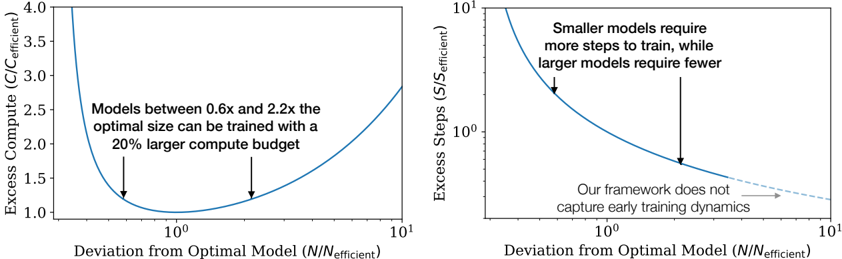
The image contains two side-by-side line charts that illustrate the relationship between a model's deviation from its "optimal" size (N/N_efficient) and two different cost metrics: Excess Compute and Excess Steps. Both charts use a logarithmic scale on the x-axis. The charts appear to be from a technical paper or presentation discussing the efficiency of training neural networks of varying sizes.
### Components/Axes
**Common Elements:**
* **X-Axis (Both Charts):** Labeled "Deviation from Optimal Model (N/N_efficient)". The scale is logarithmic, with major tick marks at 10⁰ (which equals 1) and 10¹ (which equals 10). The axis represents how much larger or smaller a model is compared to a theoretically optimal size.
* **Line Color:** Both data series are represented by a solid blue line.
**Left Chart:**
* **Title/Y-Axis:** "Excess Compute (C/C_efficient)". The scale is linear, ranging from 1.0 to 4.0.
* **Annotation:** Text positioned in the upper-middle area of the plot reads: "Models between 0.6x and 2.2x the optimal size can be trained with a 20% larger compute budget". Two black arrows point from this text to the blue curve at approximately x=0.6 and x=2.2 on the x-axis.
**Right Chart:**
* **Title/Y-Axis:** "Excess Steps (S/S_efficient)". The scale is logarithmic, with major tick marks at 10⁰ and 10¹.
* **Annotation 1:** Text in the upper-right quadrant reads: "Smaller models require more steps to train, while larger models require fewer". A black arrow points from this text to the steep, descending portion of the blue curve on the left side (where N/N_efficient < 1).
* **Annotation 2:** Text in the lower-right quadrant reads: "Our framework does not capture early training dynamics". A black arrow points from this text to the rightward end of the blue curve, which becomes a dashed line extending towards x=10¹.
### Detailed Analysis
**Left Chart (Excess Compute):**
* **Trend Verification:** The blue line forms a distinct U-shape (a convex curve). It starts very high on the left (for models much smaller than optimal), descends to a minimum, and then rises again on the right (for models much larger than optimal).
* **Key Data Points & Values:**
* The minimum point of the curve (lowest excess compute) occurs at `N/N_efficient = 10⁰ = 1`. At this point, `Excess Compute (C/C_efficient) = 1.0`, meaning no excess compute is required.
* The curve intersects the `Excess Compute = 1.2` line at two points, indicated by the arrows from the annotation. These correspond to `N/N_efficient ≈ 0.6` and `N/N_efficient ≈ 2.2`.
* At the far left of the visible plot (`N/N_efficient` slightly above 0.1), the excess compute value is above 4.0.
* At the far right of the visible plot (`N/N_efficient = 10`), the excess compute value is approximately 2.8.
**Right Chart (Excess Steps):**
* **Trend Verification:** The blue line shows a monotonically decreasing trend. It starts very high on the left and slopes downward to the right, flattening out as it approaches the minimum.
* **Key Data Points & Values:**
* At `N/N_efficient = 10⁰ = 1`, the `Excess Steps (S/S_efficient)` value is 1.0 (no excess steps).
* At `N/N_efficient ≈ 0.5` (left side), the excess steps value is approximately 2.0.
* At `N/N_efficient ≈ 2.0` (right side), the excess steps value is approximately 0.7.
* The dashed line extension suggests the trend continues to decrease slowly beyond `N/N_efficient = 10`, but the model's framework explicitly states it does not capture the dynamics in that early training region.
### Key Observations
1. **Optimal Point:** Both charts confirm that the most efficient training (where excess compute and excess steps both equal 1.0) occurs when the model size `N` equals the efficient optimal size `N_efficient` (`N/N_efficient = 1`).
2. **Asymmetric Cost:** The cost of deviating from the optimal size is asymmetric. Being too small (left of 1) is more costly in terms of both compute and steps than being equivalently too large (right of 1). The curves are steeper on the left.
3. **Compute vs. Steps Trade-off:** The left chart shows a clear minimum for compute, while the right chart shows steps only decrease as model size increases. This implies a trade-off: larger models require fewer training steps but more compute per step, leading to an optimal total compute point at a specific size.
4. **Annotated Insight:** The key practical insight is highlighted in the left chart's annotation: there is a relatively wide "sweet spot" (0.6x to 2.2x the optimal size) where the training compute overhead is limited to 20%.
### Interpretation
These charts present a quantitative argument for the existence of an optimal model size for a given training task and budget. The data suggests that:
* **Planning Efficiency:** When planning model training, targeting a size close to `N_efficient` minimizes total computational resources (compute). Significant under-sizing is particularly wasteful.
* **Practical Flexibility:** The finding that models within a 0.6x-2.2x range of the optimal size incur only a 20% compute penalty provides valuable flexibility for engineers. It means one does not need to pinpoint the exact optimal size to train efficiently; a reasonable estimate within that range is sufficient.
* **Framework Limitation:** The note about not capturing "early training dynamics" is a crucial caveat. It indicates the model's predictions (especially the dashed line for very large models) may not hold during the initial phases of training, where learning behavior can be different. This is a boundary condition for the theory's applicability.
* **Underlying Principle:** The U-shaped compute curve likely emerges from the balance between two factors: the increasing computational cost per training step as model size grows, and the decreasing number of steps required to reach convergence as model capacity increases. The minimum represents the point where this product is optimized.