## Line Chart: Warmup
### Overview
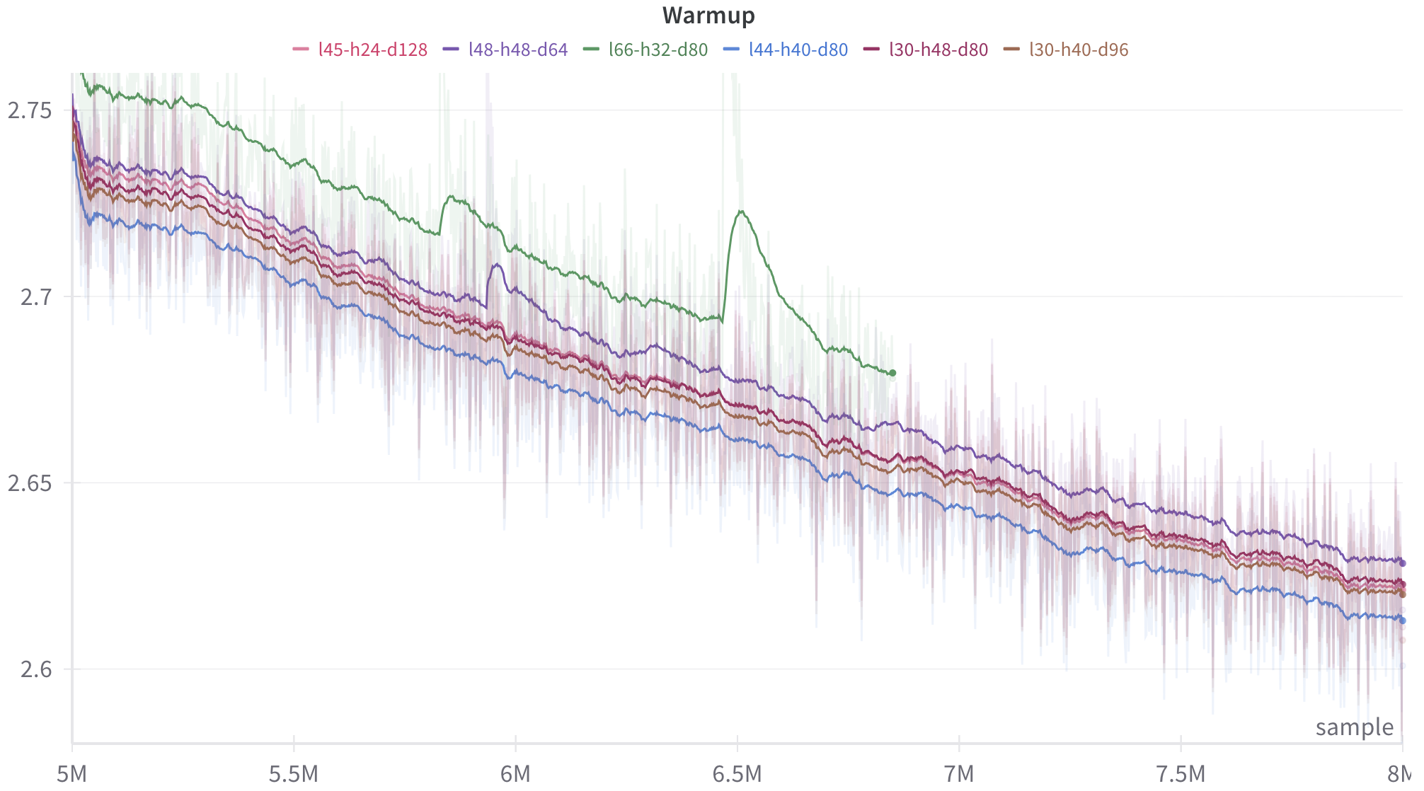
The image is a line chart titled "Warmup". It displays the performance of six different configurations, likely during a model training warmup phase. The x-axis represents the number of samples (in millions), ranging from 5M to 8M. The y-axis represents a performance metric, ranging from 2.6 to 2.75. Each configuration is represented by a colored line, with shaded regions around the lines indicating variability.
### Components/Axes
* **Title:** Warmup (located at the top-center of the chart)
* **X-axis:**
* Label: "sample" (located at the bottom-right of the chart)
* Scale: 5M, 5.5M, 6M, 6.5M, 7M, 7.5M, 8M
* **Y-axis:**
* Scale: 2.6, 2.65, 2.7, 2.75
* **Legend:** Located at the top of the chart, listing the configurations and their corresponding colors:
* Red: l45-h24-d128
* Purple: l48-h48-d64
* Green: l66-h32-d80
* Blue: l44-h40-d80
* Brown: l30-h48-d80
* Orange: l30-h40-d96
### Detailed Analysis
* **l45-h24-d128 (Red):** The red line starts at approximately 2.74 at 5M samples and gradually decreases to approximately 2.62 at 8M samples. The line shows a consistent downward trend.
* **l48-h48-d64 (Purple):** The purple line starts at approximately 2.74 at 5M samples and decreases to approximately 2.62 at 8M samples. The line shows a consistent downward trend, similar to the red line.
* **l66-h32-d80 (Green):** The green line starts at approximately 2.76 at 5M samples. It initially decreases, then exhibits a sharp increase around 6.3M samples, peaking above 2.72, before decreasing again to approximately 2.62 at 8M samples. This line shows the most variability.
* **l44-h40-d80 (Blue):** The blue line starts at approximately 2.72 at 5M samples and decreases to approximately 2.61 at 8M samples. The line shows a consistent downward trend.
* **l30-h48-d80 (Brown):** The brown line starts at approximately 2.73 at 5M samples and decreases to approximately 2.61 at 8M samples. The line shows a consistent downward trend.
* **l30-h40-d96 (Orange):** The orange line starts at approximately 2.73 at 5M samples and decreases to approximately 2.61 at 8M samples. The line shows a consistent downward trend.
### Key Observations
* All configurations show a general downward trend, indicating improvement in the performance metric as the number of samples increases.
* The green line (l66-h32-d80) exhibits a significant spike around 6.3M samples, suggesting a temporary degradation in performance for that configuration.
* The blue line (l44-h40-d80) consistently performs slightly better (lower value) than the other configurations, except for the green line after 7M samples.
* The red and purple lines are very close to each other.
* The brown and orange lines are very close to each other.
### Interpretation
The chart illustrates the "warmup" phase of a model training process, where different configurations are being evaluated. The downward trend in the performance metric suggests that the models are learning and improving over time. The spike in the green line indicates a potential issue or instability with that particular configuration. The blue line appears to be the most stable and performant configuration overall, at least during this warmup phase. The close proximity of the red/purple and brown/orange lines suggests that those configurations may have similar characteristics or performance profiles. The shaded regions around the lines indicate the variance in the performance metric, which could be due to factors such as data variability or stochasticity in the training process.