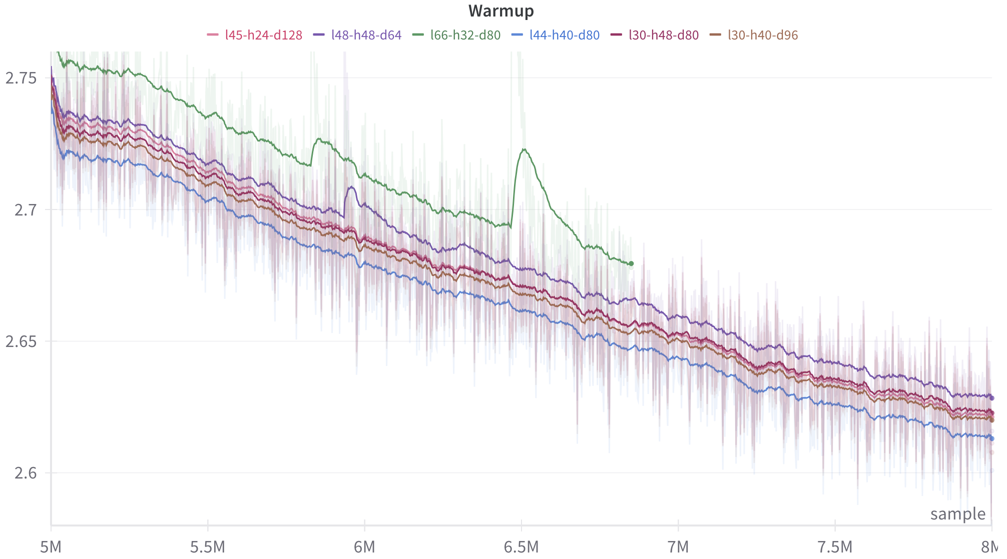
## Line Chart: Model Architecture Warmup Phase
### Overview
This image is a technical line chart titled "Warmup". It displays the performance trajectories of six different data series (likely machine learning model architectures) over a specific period measured in "samples". The chart features both highly volatile raw data (represented by faded, semi-transparent lines) and smoothed trend lines (represented by solid, opaque lines) for each series. The general trend for all series is downward, indicating a reduction in the measured metric (typically loss or error) over time.
### Components/Axes
**Header Region (Top)**
* **Title:** "Warmup" (Centered at the top).
* **Legend:** Located directly below the title, arranged horizontally. It maps colors to specific alphanumeric string labels, which appear to denote architectural hyperparameters (e.g., layers, heads, dimensions).
* **Pink line:** `l45-h24-d128`
* **Purple line:** `l48-h48-d64`
* **Green line:** `l66-h32-d80`
* **Blue line:** `l44-h40-d80`
* **Maroon line:** `l30-h48-d80`
* **Brown line:** `l30-h40-d96`
**Axes Region**
* **Y-Axis (Left):** Represents the numerical value of the metric being tracked. It has no explicit title but features numerical markers and light grey horizontal grid lines.
* Markers: 2.6, 2.65, 2.7, 2.75.
* The scale is linear.
* **X-Axis (Bottom):** Represents time or progression.
* **Label:** "sample" (Located at the bottom right corner).
* **Markers:** 5M, 5.5M, 6M, 6.5M, 7M, 7.5M, 8M. ("M" likely denotes Millions).
* The scale is linear.
### Detailed Analysis
*Trend Verification & Spatial Grounding:* All data series begin on the left side of the chart at the 5M mark and slope generally downward toward the right side. The lines are plotted over a background of their own faded, high-variance raw data.
**1. Green Series (`l66-h32-d80`)**
* **Trend:** Slopes downward but exhibits significant instability.
* **Data Points:** Starts at the highest position on the Y-axis at 5M (~2.76). It experiences a noticeable upward bump just before 6M (~5.9M, rising to ~2.73). It experiences a severe, sharp upward spike at exactly 6.5M (jumping from ~2.69 to ~2.72) before dropping sharply again.
* **Anomaly:** This line terminates prematurely. It ends with a distinct dot at approximately 6.85M on the X-axis, at a Y-value of ~2.68. It does not reach the 8M mark.
**2. Purple Series (`l48-h48-d64`)**
* **Trend:** Slopes downward steadily, remaining the second-highest line for the majority of the chart.
* **Data Points:** Starts at 5M at ~2.74. It exhibits a distinct, sharp upward bump just before 6M (around 5.95M, rising to ~2.71). It continues downward and ends at 8M with a distinct dot at a Y-value of ~2.63.
**3. Pink (`l45-h24-d128`), Maroon (`l30-h48-d80`), and Brown (`l30-h40-d96`) Series**
* **Trend:** These three lines slope downward and are tightly clustered together throughout the entire chart, making them difficult to distinguish individually without close inspection.
* **Data Points:** They start at 5M clustered between ~2.725 and ~2.735. They follow a very similar, smooth downward trajectory without major spikes. They end at 8M clustered tightly between ~2.615 and ~2.62, each terminating with a distinct dot.
**4. Blue Series (`l44-h40-d80`)**
* **Trend:** Slopes downward smoothly and consistently remains the lowest line on the chart from start to finish.
* **Data Points:** Starts at 5M at the lowest initial value of ~2.72. It maintains a steady decline without notable anomalies. It ends at 8M with a distinct dot at the lowest final Y-value of ~2.61.
### Key Observations
* **Best Performer:** The Blue line (`l44-h40-d80`) consistently maintains the lowest value throughout the measured period.
* **Worst/Most Unstable Performer:** The Green line (`l66-h32-d80`) starts with the highest values, exhibits severe instability (spikes at 5.9M and 6.5M), and fails to complete the run, terminating early at ~6.85M.
* **Correlated Anomalies:** The Green line and the Purple line both experience an upward bump just before the 6M mark, though the Green line's bump occurs slightly earlier than the Purple line's.
* **Clustering:** The Pink, Maroon, and Brown configurations yield nearly identical performance trajectories in this phase.
### Interpretation
* **Contextual Deduction (Peircean Reasoning):** The chart almost certainly represents the "warmup" phase of training for several Large Language Models (LLMs) or similar deep learning Transformer architectures.
* The Y-axis represents the "Loss" (error rate), which is why a downward trend is desired (lower is better).
* The X-axis represents training steps or tokens processed ("samples" in millions).
* The legend labels are standard shorthand for Transformer hyperparameters: `l` = number of layers, `h` = number of attention heads, `d` = hidden dimension size or head dimension.
* **Data Implications:**
* The Blue configuration (`l44-h40-d80`) is the most efficient architecture during this warmup phase, learning faster (achieving lower loss) than the others.
* The Green configuration (`l66-h32-d80`), which has the highest number of layers (66), is highly unstable. The massive spike at 6.5M indicates a loss divergence or gradient explosion. The premature termination at ~6.85M strongly suggests the training run crashed, failed, or was manually aborted due to this instability.
* The tight clustering of the 30-layer and 45-layer models (Maroon, Brown, Pink) suggests that within this specific parameter range, the trade-offs between layers, heads, and dimensions result in mathematically similar learning curves during early training.