## Line Chart: Warmup Performance Metrics
### Overview
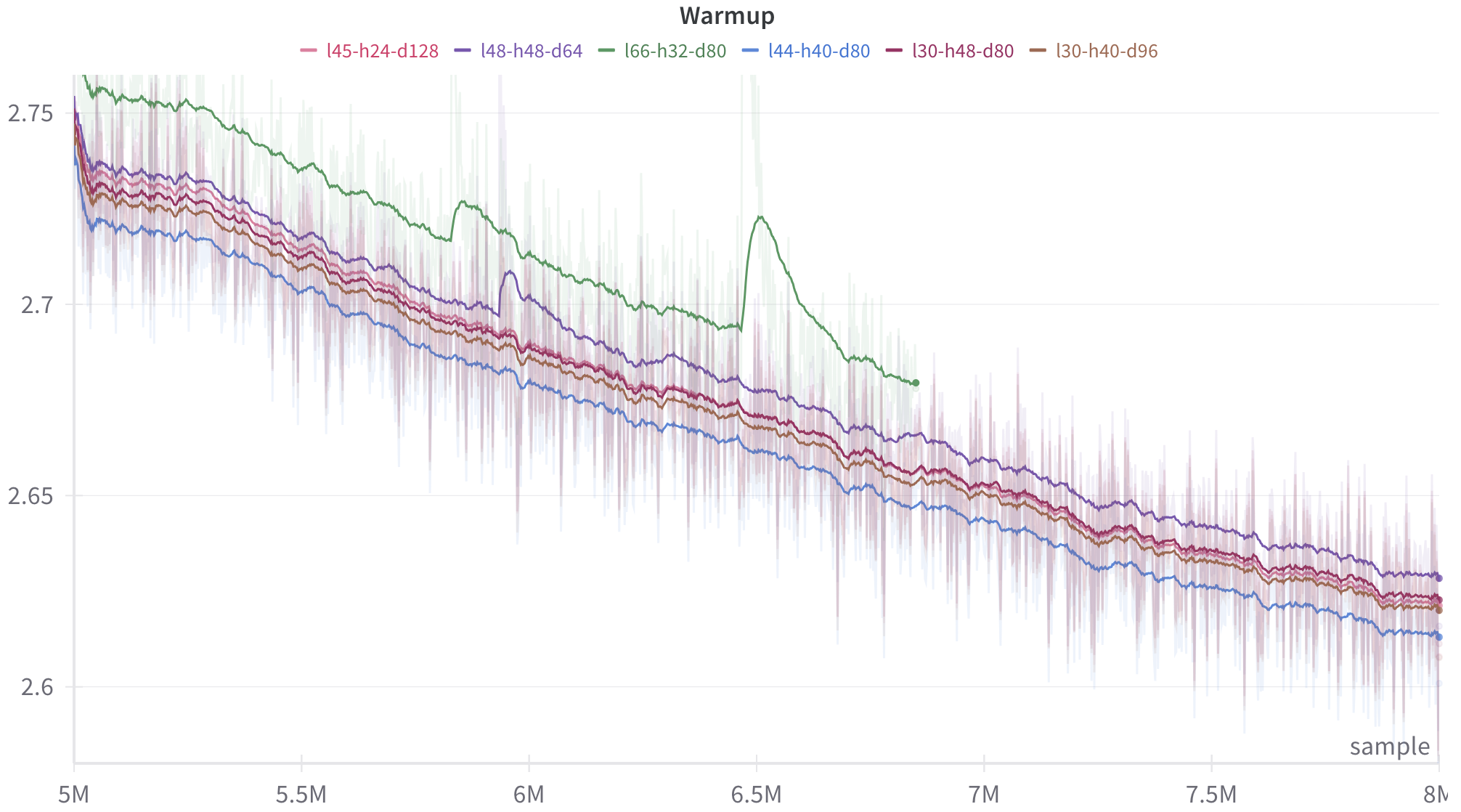
The chart displays six data series representing performance metrics across a sample range of 5M to 8M. Each line corresponds to a unique configuration (e.g., "l45-h24-d128") and shows trends in a metric normalized between 2.6 and 2.75. The green line ("l66-h32-d80") dominates the upper range, while the blue line ("l44-h40-d80") remains consistently lower.
### Components/Axes
- **X-axis**: Labeled "sample" with values from 5M to 8M (increasing left to right).
- **Y-axis**: Unlabeled, scaled from 2.6 to 2.75 in increments of 0.05.
- **Legend**: Positioned at the top, mapping colors to configurations:
- Red: l45-h24-d128
- Purple: l48-h48-d64
- Green: l66-h32-d80
- Blue: l44-h40-d80
- Maroon: l30-h48-d80
- Brown: l30-h40-d96
### Detailed Analysis
1. **Green Line (l66-h32-d80)**:
- Starts at ~2.75 (5M) and declines steadily to ~2.65 (8M).
- Sharpest drop occurs between 6M and 6.5M, where it dips to ~2.68 before resuming decline.
2. **Purple Line (l48-h48-d64)**:
- Begins at ~2.73 (5M), dips to ~2.68 (6M), then rises slightly to ~2.66 (7M) before declining again.
- Exhibits the most volatility, with frequent oscillations.
3. **Red Line (l45-h24-d128)**:
- Starts at ~2.74 (5M) and drops sharply to ~2.66 (6M), then stabilizes with minor fluctuations.
4. **Blue Line (l44-h40-d80)**:
- Declines gradually from ~2.72 (5M) to ~2.64 (8M), with a consistent downward slope.
5. **Maroon Line (l30-h48-d80)**:
- Starts at ~2.71 (5M), decreases to ~2.63 (8M), with a slower rate of decline compared to the blue line.
6. **Brown Line (l30-h40-d96)**:
- Begins at ~2.70 (5M) and drops to ~2.62 (8M), showing the steepest average slope among all lines.
### Key Observations
- **Outliers**: The green line's sharp dip at 6.5M and the purple line's mid-chart spike at 6M stand out as anomalies.
- **Trends**: All lines exhibit a general downward trend, but the rate and pattern vary significantly.
- **Overlap**: Lines converge toward the lower end of the y-axis (~2.62–2.65) by 8M, suggesting convergence in performance metrics.
### Interpretation
The data likely represents a performance metric (e.g., latency, efficiency) across different configurations. The green line's steady decline may indicate a stable, high-performing setup, while the purple line's volatility suggests sensitivity to sample size or configuration changes. The red line's abrupt drop could signal a critical threshold or failure mode. The convergence at lower values implies diminishing returns or stabilization across configurations as the sample size increases. The legend's placement at the top ensures clarity, but the unlabeled y-axis metric limits direct interpretation of absolute values.