\n
## Charts: Training Data Efficiency & Verifier-Guided Search
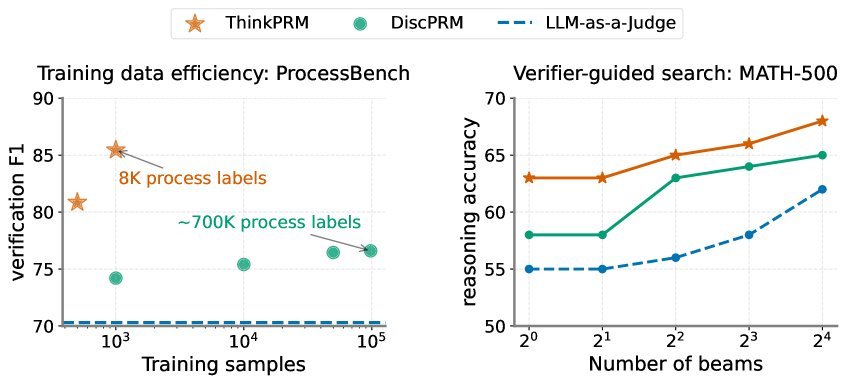
### Overview
The image presents two charts side-by-side. The left chart illustrates the training data efficiency on the ProcessBench dataset, showing verification F1 score against the number of training samples for different models. The right chart depicts verifier-guided search performance on the MATH-500 dataset, displaying reasoning accuracy against the number of beams used.
### Components/Axes
**Left Chart:**
* **Title:** Training data efficiency: ProcessBench
* **X-axis:** Training samples (logarithmic scale, from 10^3 to 10^5)
* **Y-axis:** Verification F1 score (from 70 to 90)
* **Legend:**
* ThinkPRM (Orange star)
* DiscPRM (Teal circle)
* LLM-as-a-judge (Blue dashed line)
* **Annotations:** "8K process labels" near the first ThinkPRM data point, "~700K process labels" near the last DiscPRM data point.
**Right Chart:**
* **Title:** Verifier-guided search: MATH-500
* **X-axis:** Number of beams (logarithmic scale, from 2^0 to 2^4, or 1 to 16)
* **Y-axis:** Reasoning accuracy (from 50 to 70)
* **Legend:**
* ThinkPRM (Orange solid line)
* DiscPRM (Teal solid line)
* LLM-as-a-judge (Blue dashed line)
### Detailed Analysis or Content Details
**Left Chart - Training Data Efficiency:**
* **ThinkPRM (Orange Star):** The line slopes downward initially, then plateaus. Approximate data points: (10^3, ~86), (10^4, ~65), (10^5, ~67).
* **DiscPRM (Teal Circle):** The line shows a slight upward trend. Approximate data points: (10^3, ~74), (10^4, ~75), (10^5, ~77).
* **LLM-as-a-judge (Blue Dashed Line):** The line is relatively flat. Approximate data points: (10^3, ~71), (10^4, ~71), (10^5, ~71).
**Right Chart - Verifier-Guided Search:**
* **ThinkPRM (Orange Solid Line):** The line slopes upward. Approximate data points: (2^0, ~64), (2^1, ~65), (2^2, ~67), (2^3, ~68), (2^4, ~69).
* **DiscPRM (Teal Solid Line):** The line slopes upward, but less steeply than ThinkPRM. Approximate data points: (2^0, ~58), (2^1, ~60), (2^2, ~62), (2^3, ~64), (2^4, ~65).
* **LLM-as-a-judge (Blue Dashed Line):** The line slopes upward, starting lower than the other two. Approximate data points: (2^0, ~54), (2^1, ~56), (2^2, ~59), (2^3, ~61), (2^4, ~63).
### Key Observations
* **Left Chart:** ThinkPRM shows a significant drop in verification F1 score as the number of training samples increases from 8K to 700K. DiscPRM shows a modest increase in F1 score with more training data. LLM-as-a-judge remains relatively constant.
* **Right Chart:** All three models show improved reasoning accuracy with an increasing number of beams. ThinkPRM consistently outperforms DiscPRM and LLM-as-a-judge. The performance gap between the models widens as the number of beams increases.
### Interpretation
The left chart suggests that ThinkPRM may not scale well with increasing training data on the ProcessBench dataset, potentially due to overfitting or diminishing returns. DiscPRM demonstrates more stable performance with more data. The right chart indicates that increasing the number of beams in the search process improves reasoning accuracy for all models on the MATH-500 dataset. ThinkPRM's superior performance suggests it benefits more from the verifier-guided search strategy. The consistent performance of LLM-as-a-judge across both charts suggests it may be less sensitive to the specific dataset or search strategy. The logarithmic scales on the x-axes emphasize the relative changes in training samples and beam numbers. The annotations on the left chart highlight the specific training data sizes used for ThinkPRM. The combination of these two charts provides insights into the trade-offs between training data efficiency and search strategy effectiveness for different models.