## Scatter Plot: Mean Pass Rate vs. Mean Number of Tokens Generated
### Overview
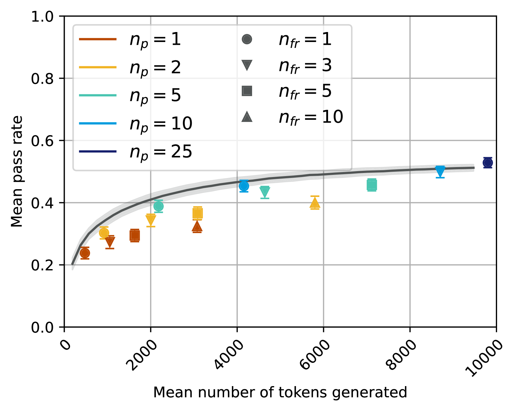
The image is a scatter plot showing the relationship between the mean pass rate and the mean number of tokens generated. The plot includes data points for different values of `np` (represented by lines) and `nfr` (represented by markers). A gray line with a shaded area represents a general trend.
### Components/Axes
* **X-axis:** Mean number of tokens generated, with ticks at 0, 2000, 4000, 6000, 8000, and 10000.
* **Y-axis:** Mean pass rate, with ticks at 0.0, 0.2, 0.4, 0.6, 0.8, and 1.0.
* **Legend (Top-Left):**
* Brown line: `np = 1`
* Yellow line: `np = 2`
* Teal line: `np = 5`
* Blue line: `np = 10`
* Dark Blue line: `np = 25`
* **Legend (Top-Right):**
* Gray circle: `nfr = 1`
* Gray downward-pointing triangle: `nfr = 3`
* Gray square: `nfr = 5`
* Gray upward-pointing triangle: `nfr = 10`
### Detailed Analysis
**Data Series:**
* **`np = 1` (Brown):** The data points are circles. The trend is generally increasing, starting around 0.25 at 0 tokens and reaching approximately 0.32 at 4000 tokens.
* (0, ~0.23)
* (2000, ~0.30)
* (4000, ~0.32)
* (6000, ~0.40)
* **`np = 2` (Yellow):** The data points are circles. The trend is generally increasing, starting around 0.25 at 0 tokens and reaching approximately 0.40 at 6000 tokens.
* (0, ~0.25)
* (2000, ~0.35)
* (4000, ~0.37)
* (6000, ~0.40)
* **`np = 5` (Teal):** The data points are circles. The trend is generally increasing, starting around 0.25 at 0 tokens and reaching approximately 0.47 at 8000 tokens.
* (0, ~0.22)
* (2000, ~0.40)
* (4000, ~0.47)
* (8000, ~0.47)
* **`np = 10` (Blue):** The data points are circles. The trend is generally increasing, starting around 0.25 at 0 tokens and reaching approximately 0.52 at 10000 tokens.
* (0, ~0.22)
* (4000, ~0.47)
* (8000, ~0.50)
* (10000, ~0.52)
* **`np = 25` (Dark Blue):** The data points are circles. The trend is generally increasing, starting around 0.25 at 0 tokens and reaching approximately 0.52 at 10000 tokens.
* (0, ~0.22)
* (10000, ~0.52)
* **`nfr = 1` (Gray Circle):**
* (0, ~0.22)
* (10000, ~0.52)
* **`nfr = 3` (Gray Downward-Pointing Triangle):**
* (2000, ~0.30)
* (4000, ~0.44)
* (8000, ~0.50)
* **`nfr = 5` (Gray Square):**
* (2000, ~0.32)
* (4000, ~0.32)
* **`nfr = 10` (Gray Upward-Pointing Triangle):**
* (2000, ~0.28)
* (6000, ~0.32)
**General Trend (Gray Line with Shaded Area):** The gray line represents a general trend, starting around 0.2 at 0 tokens and increasing to approximately 0.5 at 10000 tokens. The shaded area around the line indicates a confidence interval or variability.
### Key Observations
* The mean pass rate generally increases with the mean number of tokens generated.
* The rate of increase appears to diminish as the number of tokens generated increases, suggesting a saturation effect.
* The data points for different values of `np` and `nfr` are scattered around the general trend line.
### Interpretation
The plot suggests that increasing the number of tokens generated generally improves the mean pass rate, but there are diminishing returns. The different values of `np` and `nfr` introduce variability in the relationship, indicating that these parameters also influence the pass rate. The gray line and shaded area provide a general expectation for the pass rate given the number of tokens generated, while the individual data points show the specific outcomes for different parameter settings. The saturation effect implies that there is a limit to how much the pass rate can be improved by simply increasing the number of tokens generated.