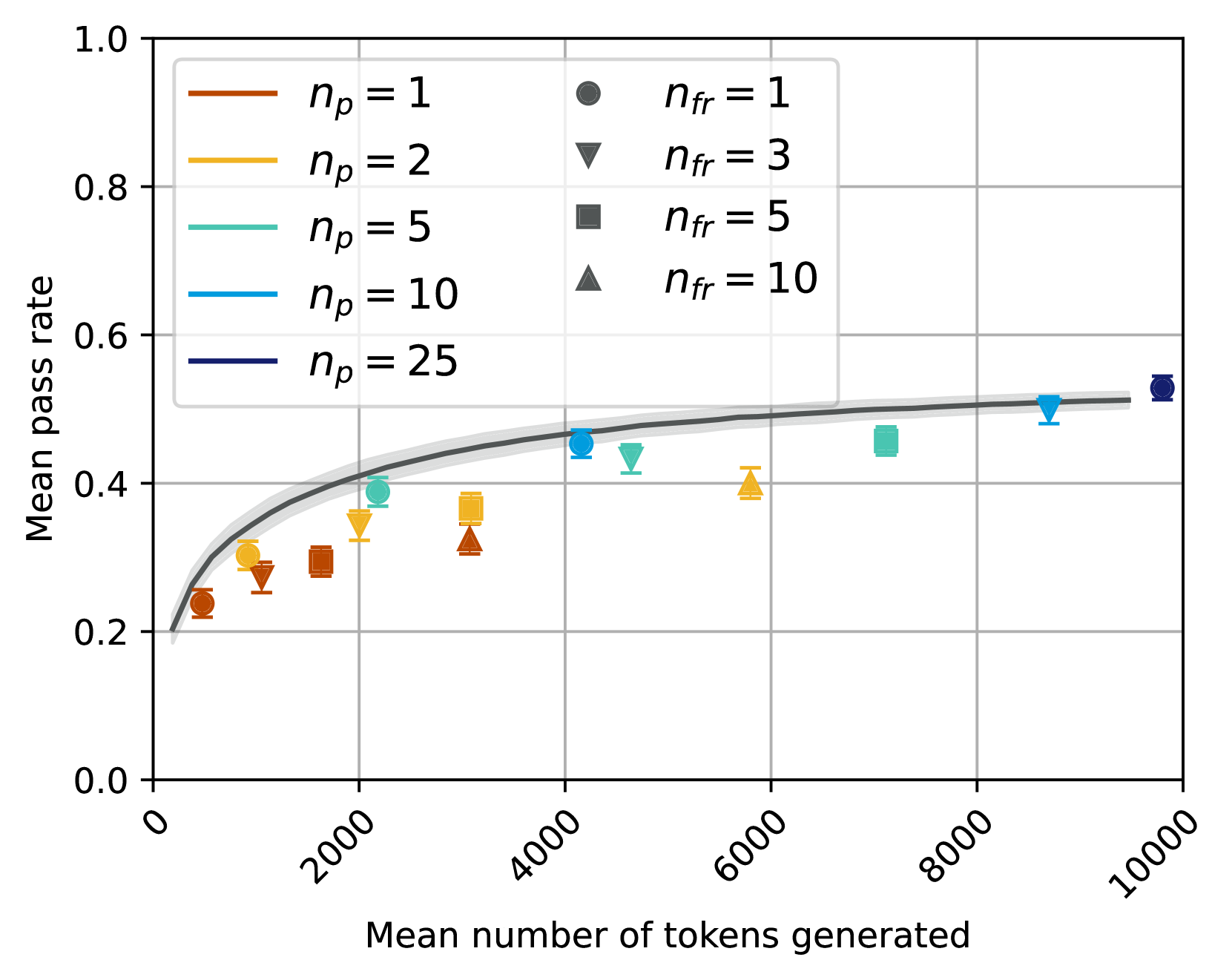
## Scatter Plot with Fitted Curve: Mean Pass Rate vs. Mean Number of Tokens Generated
### Overview
This image is a technical scatter plot chart displaying the relationship between the mean number of tokens generated (x-axis) and the mean pass rate (y-axis). The chart includes multiple data series differentiated by color (representing a parameter \( n_p \)) and marker shape (representing a parameter \( n_{fr} \)). A fitted curve with a confidence interval is overlaid on the data points.
### Components/Axes
* **Chart Type:** Scatter plot with error bars and a fitted trend line.
* **X-Axis:**
* **Title:** "Mean number of tokens generated"
* **Scale:** Linear, ranging from 0 to 10000.
* **Major Tick Marks:** 0, 2000, 4000, 6000, 8000, 10000.
* **Y-Axis:**
* **Title:** "Mean pass rate"
* **Scale:** Linear, ranging from 0.0 to 1.0.
* **Major Tick Marks:** 0.0, 0.2, 0.4, 0.6, 0.8, 1.0.
* **Legend (Top-Left Corner):** The legend is split into two columns.
* **Left Column (Line Color - \( n_p \)):**
* Orange line: \( n_p = 1 \)
* Yellow line: \( n_p = 2 \)
* Teal line: \( n_p = 5 \)
* Light Blue line: \( n_p = 10 \)
* Dark Blue line: \( n_p = 25 \)
* **Right Column (Marker Shape - \( n_{fr} \)):**
* Circle (●): \( n_{fr} = 1 \)
* Inverted Triangle (▼): \( n_{fr} = 3 \)
* Square (■): \( n_{fr} = 5 \)
* Triangle (▲): \( n_{fr} = 10 \)
* **Fitted Curve:** A dark grey line with a light grey shaded area representing the confidence interval. The curve shows a logarithmic-like trend, rising steeply initially and then plateauing.
### Detailed Analysis
**Data Series and Points (Approximate Values):**
The data points are plotted using a combination of color (for \( n_p \)) and shape (for \( n_{fr} \)). Each point includes vertical error bars.
1. **\( n_p = 1 \) (Orange):**
* Circle (\( n_{fr}=1 \)): x ≈ 500, y ≈ 0.23
* Inverted Triangle (\( n_{fr}=3 \)): x ≈ 1000, y ≈ 0.27
* Square (\( n_{fr}=5 \)): x ≈ 1500, y ≈ 0.29
* Triangle (\( n_{fr}=10 \)): x ≈ 3000, y ≈ 0.32
2. **\( n_p = 2 \) (Yellow):**
* Circle (\( n_{fr}=1 \)): x ≈ 1000, y ≈ 0.30
* Inverted Triangle (\( n_{fr}=3 \)): x ≈ 2000, y ≈ 0.35
* Square (\( n_{fr}=5 \)): x ≈ 3000, y ≈ 0.36
* Triangle (\( n_{fr}=10 \)): x ≈ 5800, y ≈ 0.40
3. **\( n_p = 5 \) (Teal):**
* Circle (\( n_{fr}=1 \)): x ≈ 2000, y ≈ 0.39
* Inverted Triangle (\( n_{fr}=3 \)): x ≈ 4500, y ≈ 0.43
* Square (\( n_{fr}=5 \)): x ≈ 7000, y ≈ 0.45
4. **\( n_p = 10 \) (Light Blue):**
* Circle (\( n_{fr}=1 \)): x ≈ 4000, y ≈ 0.46
* Inverted Triangle (\( n_{fr}=3 \)): x ≈ 8500, y ≈ 0.50
5. **\( n_p = 25 \) (Dark Blue):**
* Circle (\( n_{fr}=1 \)): x ≈ 9800, y ≈ 0.53
**Fitted Curve Trend:** The dark grey fitted line starts near (0, 0.2) and rises sharply until approximately x=2000, y=0.4. The slope then decreases, and the curve gradually flattens, approaching a value just above 0.5 as x approaches 10000. The light grey confidence interval is narrowest at lower x-values and widens slightly as x increases.
### Key Observations
1. **Positive Correlation:** There is a clear positive relationship between the mean number of tokens generated and the mean pass rate. As token count increases, the pass rate increases.
2. **Diminishing Returns:** The relationship is non-linear. The most significant gains in pass rate occur with the initial increase in tokens (0 to ~2000). After this point, each additional token yields a smaller improvement in pass rate.
3. **Parameter Influence:**
* **\( n_p \):** For a given approximate x-value, data points with higher \( n_p \) (cooler colors: teal, blue) tend to have a higher y-value (pass rate) than those with lower \( n_p \) (warmer colors: orange, yellow).
* **\( n_{fr} \):** For a given color series (\( n_p \)), points with higher \( n_{fr} \) (e.g., triangle) are generally positioned further to the right (higher token count) than points with lower \( n_{fr} \) (e.g., circle).
4. **Data Spread:** The data points are distributed around the fitted curve, with some scatter. The error bars indicate variability in the mean pass rate measurement for each condition.
### Interpretation
This chart likely illustrates the performance of a generative model (e.g., for code or text) where "pass rate" is a success metric. The data suggests that allocating more computational resources (allowing the model to generate more tokens) improves the probability of success, but with clear diminishing marginal returns.
The parameters \( n_p \) and \( n_{fr} \) represent different experimental conditions or model configurations. The trend indicates that configurations with a higher \( n_p \) value are more efficient, achieving a higher pass rate for a similar or even lower token budget. The parameter \( n_{fr} \) appears to be correlated with the token count itself, possibly representing a retry or refinement step that consumes more tokens.
The fitted curve provides a generalized model of the token-pass rate trade-off, useful for predicting performance or optimizing resource allocation. The plateau suggests there may be an upper bound to the pass rate achievable simply by increasing token generation, hinting at other limiting factors in the model's capability or the task's difficulty.