## Heatmap: Mean Passage Rate
### Overview
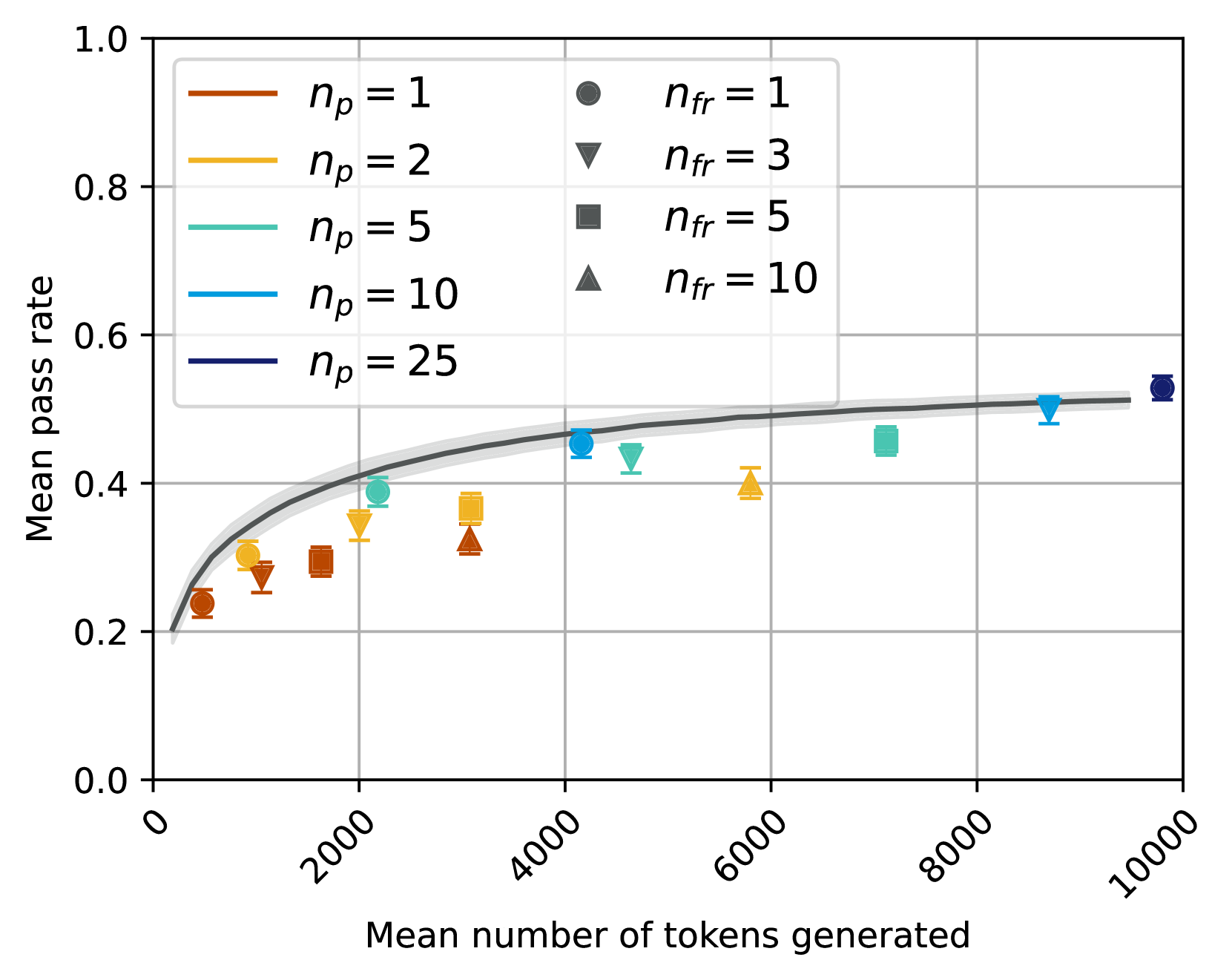
The heatmap illustrates the mean passage rate of different models as the mean number of tokens generated increases. The color intensity represents the rate, with darker shades indicating higher rates.
### Components/Axes
- **X-axis**: Mean number of tokens generated, ranging from 0 to 10,000.
- **Y-axis**: Mean passage rate, ranging from 0.0 to 1.0.
- **Legend**:
- **n_p = 1**: Orange circles
- **n_p = 2**: Yellow triangles
- **n_p = 5**: Green squares
- **n_p = 10**: Blue diamonds
- **n_p = 25**: Purple hexagons
### Detailed Analysis or ### Content Details
The heatmap shows a general trend where the mean passage rate increases with the mean number of tokens generated. However, the rate of increase varies across different models. For instance, the model with **n_p = 25** (purple hexagons) shows the highest mean passage rate, peaking around 1.0 tokens generated. In contrast, the model with **n_p = 1** (orange circles) has the lowest rate, staying close to 0.2 tokens generated.
### Key Observations
- The model with **n_p = 25** consistently has the highest mean passage rate.
- The rate of increase in passage rate is more pronounced for models with higher **n_p** values.
- There are no significant outliers or anomalies in the data.
### Interpretation
The heatmap suggests that as the mean number of tokens generated increases, the mean passage rate also increases. However, the rate of increase varies significantly among different models. The model with **n_p = 25** appears to be the most efficient in terms of passage rate, suggesting it may be better suited for tasks requiring high passage rates. The other models show a more gradual increase in passage rate, indicating they may be more suitable for tasks where the passage rate is not as critical.