## Scatter Plot: Mean Pass Rate vs. Mean Number of Tokens Generated
### Overview
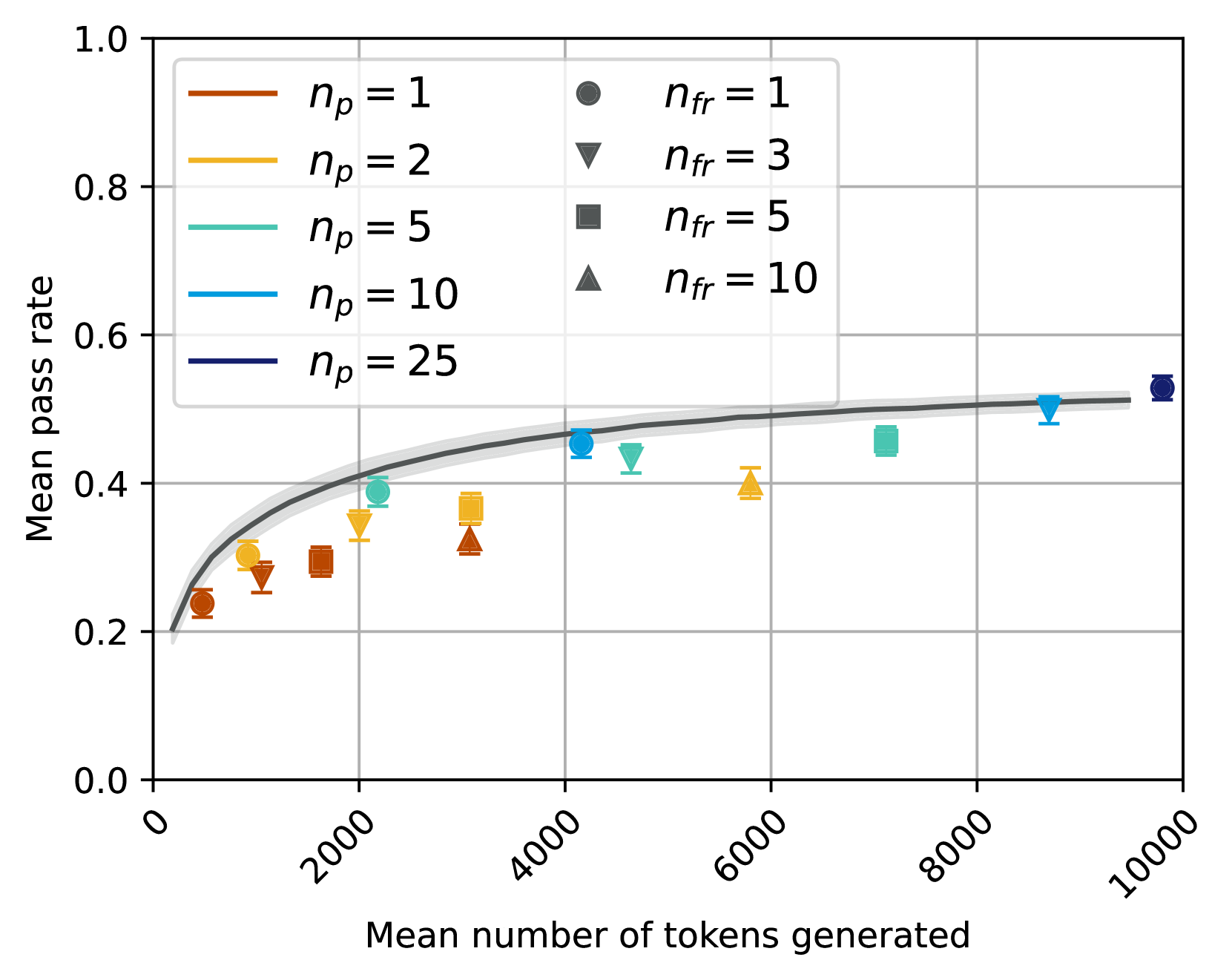
The image is a scatter plot showing the relationship between the **mean number of tokens generated** (x-axis) and the **mean pass rate** (y-axis). Data points are grouped by combinations of two parameters: `n_p` (number of participants) and `n_fr` (number of failures). A smooth black trend line indicates the general relationship between tokens generated and pass rate. The plot includes six distinct data series, each represented by unique colors and symbols.
---
### Components/Axes
- **X-axis**: "Mean number of tokens generated" (ranges from 0 to 10,000 in increments of 2,000).
- **Y-axis**: "Mean pass rate" (ranges from 0.0 to 1.0 in increments of 0.2).
- **Legend**: Located in the **top-left corner**, with the following entries:
- `n_p = 1` (brown circles)
- `n_p = 2` (orange triangles)
- `n_p = 5` (green squares)
- `n_p = 10` (blue diamonds)
- `n_p = 25` (dark blue circles)
- `n_fr = 1` (black circles)
- `n_fr = 3` (black triangles)
- `n_fr = 5` (black squares)
- `n_fr = 10` (black diamonds)
---
### Detailed Analysis
1. **Data Series**:
- **`n_p = 1` (brown circles)**:
- Pass rates range from ~0.22 to ~0.35.
- Tokens generated: 2,000–6,000.
- **`n_p = 2` (orange triangles)**:
- Pass rates range from ~0.3 to ~0.4.
- Tokens generated: 2,000–6,000.
- **`n_p = 5` (green squares)**:
- Pass rates range from ~0.35 to ~0.45.
- Tokens generated: 2,000–6,000.
- **`n_p = 10` (blue diamonds)**:
- Pass rates range from ~0.4 to ~0.5.
- Tokens generated: 4,000–8,000.
- **`n_p = 25` (dark blue circles)**:
- Pass rates range from ~0.45 to ~0.55.
- Tokens generated: 6,000–10,000.
- **`n_fr = 1` (black circles)**:
- Pass rates range from ~0.2 to ~0.5.
- Tokens generated: 2,000–10,000.
- **`n_fr = 3` (black triangles)**:
- Pass rates range from ~0.25 to ~0.4.
- Tokens generated: 2,000–6,000.
- **`n_fr = 5` (black squares)**:
- Pass rates range from ~0.3 to ~0.45.
- Tokens generated: 4,000–8,000.
- **`n_fr = 10` (black diamonds)**:
- Pass rates range from ~0.35 to ~0.5.
- Tokens generated: 6,000–10,000.
2. **Trend Line**:
- A smooth black line shows a **positive correlation** between tokens generated and pass rate.
- At 0 tokens, the trend line starts near 0.2.
- At 10,000 tokens, it approaches ~0.6.
---
### Key Observations
- **Positive Correlation**: Higher token generation generally corresponds to higher pass rates.
- **Impact of `n_p`**: Larger `n_p` values (e.g., 25) achieve higher pass rates at the same token count compared to smaller `n_p` (e.g., 1).
- **Impact of `n_fr`**: Higher `n_fr` values (e.g., 10) show lower pass rates than lower `n_fr` (e.g., 1) for the same token count.
- **Consistency**: The trend line aligns with all data series, suggesting a universal relationship between tokens and pass rate.
---
### Interpretation
The data demonstrates that **increasing the mean number of tokens generated improves the mean pass rate**, with diminishing returns as tokens approach 10,000. The parameter `n_p` (number of participants) has a stronger influence on pass rate than `n_fr` (number of failures), as higher `n_p` values consistently yield better performance. The trend line suggests a **logarithmic or sigmoidal relationship**, where initial gains in pass rate are rapid but slow as tokens increase. This implies that optimizing token generation is critical for improving outcomes, but beyond a certain point, additional tokens yield minimal improvements.
**Notable Anomalies**:
- No outliers are observed; all data points align with the trend line.
- The `n_p = 25` series (dark blue circles) shows the highest pass rates, reinforcing the importance of larger participant groups.