TECHNICAL ASSET FINGERPRINT
b44cc5a1e889a0dbedbb049e
Click to view fullscreen
Press ESC or click to close
FOUND IN PAPERS
EXPERT: gemini-2.0-flash VERSION 1
RUNTIME: nugit/gemini/gemini-2.0-flash
INTEL_VERIFIED
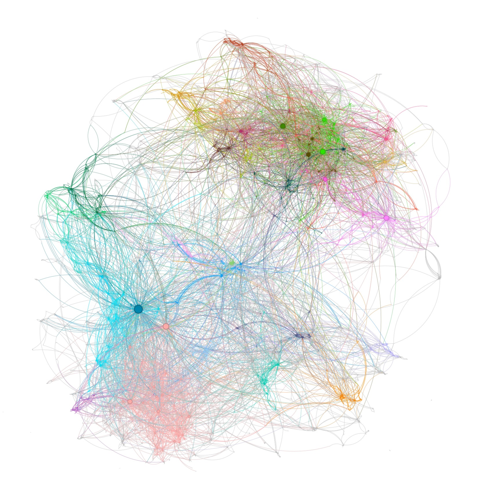
## Network Diagram: Complex Interconnections
### Overview
The image is a network diagram illustrating complex interconnections between various nodes. The nodes are represented by colored circles, and the connections between them are shown as lines of corresponding colors. The diagram is densely populated with connections, indicating a high degree of interaction between the nodes.
### Components/Axes
* **Nodes:** Represented by colored circles. The size of the circles varies, suggesting different levels of importance or activity.
* **Edges:** Represented by colored lines connecting the nodes. The colors of the lines correspond to the colors of the nodes they connect, indicating the type or category of relationship.
* **Colors:** Multiple colors are used to differentiate between different groups or categories of nodes and their connections. The colors observed include red, orange, green, light blue, dark blue, pink, purple, and gray.
### Detailed Analysis
The network diagram consists of several clusters of nodes, each characterized by a dominant color. The connections within each cluster are dense, while the connections between clusters are less frequent.
* **Top Cluster:** Dominated by red, orange, and green connections. This cluster appears to be highly interconnected, with many nodes linked to each other.
* **Left Cluster:** Dominated by green and light blue connections. This cluster is also densely connected, with a central node having numerous connections to other nodes in the cluster.
* **Bottom Cluster:** Dominated by pink and light red connections. This cluster is less dense than the others, with fewer connections between the nodes.
* **Central Area:** A mix of all colors, indicating connections between all clusters.
The nodes vary in size. Some nodes are larger, suggesting they may be more central or influential within the network. The lines also vary in thickness, possibly indicating the strength or frequency of the connection.
### Key Observations
* The network is highly interconnected, with multiple clusters of nodes.
* The colors of the nodes and connections indicate different categories or types of relationships.
* The size of the nodes and the thickness of the lines may represent the importance or strength of the connections.
* There are a few larger nodes that appear to be central hubs within the network.
### Interpretation
The network diagram likely represents a complex system with multiple interacting components. The clusters of nodes may represent different groups or categories within the system, while the connections between them indicate the relationships and interactions between these groups. The larger nodes may represent key players or influential factors within the system.
The diagram suggests that the system is highly interconnected, with a high degree of interaction between the different components. This could indicate a complex and dynamic system, where changes in one part of the system can have ripple effects throughout the entire network.
Without additional context or information, it is difficult to determine the specific meaning of the diagram. However, the visual representation provides a valuable overview of the structure and relationships within the system.
DECODING INTELLIGENCE...
EXPERT: gemini-3.1-pro-preview VERSION 1
RUNTIME: gemini/gemini-3.1-pro-preview
INTEL_VERIFIED
## Network Graph: Complex Multi-Cluster Node-Link Diagram
### Overview
This image displays a highly complex, unlabelled network graph (specifically, a force-directed node-link diagram) rendered against a solid white background. **CRITICAL NOTE:** There is absolutely no text, typography, labels, axes, legends, or explicit numerical data present in this image. Therefore, no factual data tables or exact numerical values can be extracted.
Instead, the image conveys structural and relational information through visual encodings: nodes (circles representing entities), edges (curved lines representing relationships or interactions), node size (representing degree or centrality), and color (representing modularity classes or distinct communities).
### Components/Structure
Because traditional chart axes and legends are absent, the structural components of this visualization are defined by its graphical elements:
* **Nodes (Vertices):** Solid circles of varying diameters. Larger circles indicate a higher number of connections (degree centrality).
* **Edges (Links):** Thin, curved, semi-transparent lines connecting the nodes. The curvature helps distinguish overlapping connections.
* **Color Coding:** Distinct hues (Cyan, Dark Blue, Green, Pink, Orange, Purple) are used to group nodes and their primary edges into clusters, indicating algorithmic community detection.
* **Layout:** The spatial distribution appears to be a force-directed layout, where connected nodes are pulled together (forming dense clusters) and unconnected nodes are pushed apart, utilizing the white space to show relational distance.
### Detailed Analysis (Spatial Grounding & Component Isolation)
To analyze this complex structure, the graph can be segmented into distinct spatial and color-coded regions:
**1. The Center-Left Hub (Cyan/Dark Blue Region)**
* *Visual Trend:* A classic "hub-and-spoke" topology radiating from a single massive point.
* *Details:* Located in the mid-to-lower left quadrant. This region is dominated by a single, prominent **Dark Blue node**, which is visually the largest node in the entire graph. Hundreds of light blue/cyan edges radiate outward from this single point, connecting to a vast array of smaller, peripheral cyan nodes. This cluster has long, sweeping connections reaching across the graph to the top-right and bottom-center clusters.
**2. The Top-Right Agglomeration (Green/Olive/Magenta Region)**
* *Visual Trend:* A highly dense, tightly knit "mesh" topology with multiple medium-sized hubs rather than one dominant center.
* *Details:* Located in the upper right quadrant. This is the most visually dense area of the graph. It contains several distinct, medium-to-large nodes colored bright green, olive green, and dark magenta. The edges here are highly entangled and short, suggesting intense internal connectivity.
**3. The Bottom-Center Base (Pink/Light Red Region)**
* *Visual Trend:* A diffuse but highly interconnected cloud lacking a single dominant hub.
* *Details:* Located at the bottom center of the image. The nodes here are generally small to very small. There is a high density of internal pink/red edges, creating a "cloud" effect. It shares a significant number of bridging edges with the Cyan hub to its left.
**4. Peripheral and Minor Clusters**
* *Orange/Yellow:* Found in two primary locations—a sparse grouping at the top-center (bridging the left and right main clusters) and a smaller, distinct cluster at the bottom-right edge.
* *Purple:* A small, distinct cluster located at the extreme bottom-left edge, connected primarily to the outer edges of the Cyan cluster.
**5. Inter-Cluster Edges (The "Bridges")**
* *Visual Trend:* Long, sweeping arcs crossing the negative (white) space.
* *Details:* While edges within clusters share the cluster's color, the graph features many long, faint, often grey or multi-colored lines connecting distant nodes. A massive bundle of these bridging edges flows between the Center-Left (Cyan) hub and the Top-Right (Green) agglomeration.
### Key Observations
* **Extreme Centrality:** The dark blue node on the left possesses an exceptionally high degree of centrality compared to any other node in the network.
* **Differing Topologies:** The graph demonstrates two distinct types of network behavior simultaneously: a broadcast/influencer model (the left cyan hub) and a community/echo-chamber model (the top-right green mesh).
* **High Modularity:** The distinct separation of colors indicates that the algorithm used to generate this graph found very strong, isolated communities that interact internally much more than they interact externally.
### Interpretation
*Note: Because the graph is unlabelled, this interpretation relies on standard network analysis principles (Peircean abduction) applied to the visual topology.*
* **What the data suggests:** This visualization likely represents a complex system such as a social media network (e.g., Twitter/X retweets or mentions), a biological network (protein-protein interactions), or an IT routing topology.
* **Reading between the lines:**
* If this is a **social network**, the giant Dark Blue node represents a major broadcaster, celebrity, or viral post. It pushes information out to thousands of disconnected users (the cyan cloud). Conversely, the Top-Right Green cluster represents a highly interactive, conversational community where many users are talking directly to one another, rather than just listening to one central figure.
* The long bridging edges between the Cyan and Green clusters represent "weak ties"—individuals who act as conduits of information between two otherwise isolated communities.
* The smaller clusters (Orange, Purple) represent niche sub-communities that are largely isolated from the main flow of the network, interacting only with the extreme periphery of the larger groups.
DECODING INTELLIGENCE...
EXPERT: gemma-3-27b-it-free VERSION 1
RUNTIME: google-free/gemma-3-27b-it
INTEL_VERIFIED
\n
## Network Graph: Complex Interconnection Diagram
### Overview
The image depicts a complex network graph with numerous nodes connected by edges. The nodes vary in size and are colored, suggesting different categories or importance. The overall structure appears somewhat clustered, with several distinct groups of nodes exhibiting denser connections within the group than between groups. There are no explicit axes or labels present in the image itself. The graph is presented on a white background.
### Components/Axes
There are no explicit axes or scales. The components are nodes (circles) and edges (lines connecting the nodes). Node size appears to correlate with some metric, potentially degree centrality or node weight. Node color is used to differentiate groups or categories.
### Detailed Analysis or Content Details
Due to the density and lack of labels, precise numerical data extraction is impossible. However, we can describe the visual characteristics and approximate groupings:
* **Color Clusters:**
* **Light Blue/Cyan Cluster (Bottom-Left):** This is the largest cluster, with many nodes and edges. The nodes are predominantly light blue and cyan.
* **Pink/Peach Cluster (Bottom):** A smaller cluster, primarily pink and peach colored.
* **Green Cluster (Top-Right):** A moderately sized cluster, with nodes in various shades of green. This cluster appears to have a higher density of connections than the others.
* **Purple/Lavender Cluster (Top):** A smaller cluster, with nodes in shades of purple and lavender.
* **Orange/Brown Cluster (Top-Right):** A smaller cluster, with nodes in shades of orange and brown.
* **Mixed Color Areas:** There are areas where nodes of different colors are interconnected, suggesting relationships between the clusters.
* **Node Size:**
* There are a few larger nodes (diameter approximately 5-8 pixels) scattered throughout the graph, particularly within the blue, green, and purple clusters. These likely represent more significant nodes within the network.
* The majority of nodes are smaller (diameter approximately 2-3 pixels).
* **Edge Density:**
* The green cluster exhibits the highest edge density, with many lines connecting the nodes.
* The blue cluster has a moderate edge density.
* The pink, purple, and orange clusters have lower edge densities.
* **Edge Distribution:**
* Edges are distributed seemingly randomly, but with a clear tendency to connect nodes within the same color cluster.
* There are numerous edges connecting nodes across different clusters, indicating inter-cluster relationships.
### Key Observations
* The network is highly interconnected, with a large number of edges.
* The blue cluster is the most extensive, suggesting it may represent the core of the network.
* The green cluster is the most densely connected, indicating strong relationships within that group.
* The varying node sizes suggest a hierarchical structure or differing importance of nodes.
* The lack of labels makes it difficult to interpret the meaning of the nodes and edges.
### Interpretation
This network graph likely represents a complex system of relationships between entities. The nodes could represent individuals, organizations, concepts, or any other type of entity. The edges represent the connections or interactions between these entities.
The clustering suggests that the entities can be grouped into distinct communities or categories. The varying node sizes and edge densities indicate that some entities and relationships are more important or influential than others.
Without labels, it is impossible to determine the specific meaning of the graph. However, the visual patterns suggest that the system is highly interconnected and that there are strong relationships within and between different groups. The graph could be used to visualize social networks, knowledge graphs, biological networks, or any other type of complex system.
The absence of quantitative data (e.g., edge weights, node attributes) limits the depth of analysis. Further investigation would require access to the underlying data and a clear understanding of the entities and relationships represented by the graph. The image is a visualization of relationships, but lacks the factual data to provide a definitive interpretation.
DECODING INTELLIGENCE...
EXPERT: healer-alpha-free VERSION 1
RUNTIME: free/openrouter/healer-alpha
INTEL_VERIFIED
## Network Graph: Complex Multi-Cluster Force-Directed Layout
### Overview
The image is a high-density, force-directed network graph visualization. It displays a complex system of interconnected nodes (points) and edges (lines) arranged in a roughly circular, organic layout against a plain white background. The graph exhibits clear community structure, with distinct clusters of nodes connected more densely within themselves and more sparsely to other clusters. There is **no textual information, labels, titles, legends, or axis markers** present in the image.
### Components/Axes
* **Nodes:** Represented as small circles. Their size varies, with some nodes appearing significantly larger than others (e.g., a prominent dark blue node in the lower-left quadrant, a bright green node in the upper-right quadrant). Node color varies across a broad spectrum.
* **Edges:** Represented as thin, curved lines connecting nodes. The edges are colored, often matching or relating to the color of the nodes they connect. The density of edges is extremely high, creating a tangled, web-like appearance.
* **Clusters/Communities:** The graph is organized into several major color-coded clusters:
* **Lower-Left:** A dense cluster dominated by cyan and light blue nodes/edges, with a large, dark blue central node.
* **Lower-Center:** A diffuse cluster of pink and light red nodes/edges.
* **Upper-Right:** A dense cluster featuring bright green, magenta, and orange nodes/edges.
* **Upper-Left:** A cluster with yellow and orange tones.
* **Periphery:** Scattered nodes and edges in purple, grey, and other colors connect the major clusters or exist on the outskirts.
* **Spatial Layout:** The clusters are not perfectly separated; they are interconnected by numerous long-range edges, indicating relationships between different communities. The overall shape is amorphous but contained within a circular boundary.
### Detailed Analysis
* **Node Distribution:** Node density is highest within the identified color clusters. The largest nodes (by visual size) appear to be hub nodes within their respective communities (e.g., the dark blue hub in the cyan cluster, the bright green hub in the upper-right cluster).
* **Edge Characteristics:** Edges are not straight lines but follow curved paths, typical of force-directed algorithms that minimize edge crossings and energy. The color of an edge often blends between the colors of the two nodes it connects, suggesting a potential gradient or relationship strength.
* **Color Palette:** The visualization uses a wide, non-categorical color palette including: cyan, light blue, dark blue, pink, light red, magenta, bright green, yellow, orange, purple, and grey. Without a legend, the semantic meaning of these colors is unknown. They likely represent node attributes, community membership, or another categorical variable.
* **Scale and Quantification:** There is no scale, axis, or numerical data provided. Therefore, it is impossible to extract specific data points, counts, or quantitative relationships. The analysis is purely topological and visual.
### Key Observations
1. **Clear Community Structure:** The most salient feature is the organization of the network into distinct, color-coded communities. This suggests the underlying data has strong modular properties.
2. **Presence of Hub Nodes:** Several communities appear to be organized around one or more significantly larger nodes, indicating a potential scale-free or hub-and-spoke topology within those clusters.
3. **High Inter-Connectivity:** Despite the clear clustering, there is a substantial number of edges connecting different communities, indicating the network is not fully segregated. Some clusters (like the cyan and pink ones) appear more interconnected than others.
4. **Global vs. Local Structure:** The graph shows both local cohesion (dense clusters) and global connectivity (long-range edges linking clusters), which is characteristic of many real-world networks like social networks, biological networks, or citation networks.
5. **Absence of Metadata:** The complete lack of labels, a legend, or a title is a critical limitation. It prevents any definitive interpretation of what the nodes, edges, or colors represent.
### Interpretation
This visualization demonstrates the **structural properties of a complex network**. The force-directed layout successfully reveals the inherent community structure, which is a primary goal of such visualizations.
* **What the data suggests:** The graph suggests the underlying system consists of several tightly-knit groups or modules (the color clusters) that interact with each other to a lesser degree. The presence of hub nodes implies that certain elements within these groups are disproportionately important or connected.
* **How elements relate:** Nodes within the same color cluster are more likely to be connected to each other than to nodes in other clusters. The long-range edges represent bridges or weak ties between these communities, which are often crucial for information flow or system resilience in network theory.
* **Notable anomalies/limitations:** The primary anomaly is the **complete absence of explanatory text**. For a technical document, this renders the graph an abstract illustration of network topology rather than an informative data visualization. To be actionable, it would require a legend explaining the color coding, labels for key hub nodes, and a title describing the network's context (e.g., "Co-authorship Network of AI Researchers, 2020-2025").
* **Peircean Investigation:** From a semiotic perspective, the image is an **icon** (it resembles a network) and an **index** (it is directly generated from data). However, without a **symbol** layer (text, labels, legend), its specific meaning is indeterminate. It effectively communicates the *existence* of structure and community but not the *identity* of that structure. The viewer can infer patterns but cannot derive factual conclusions about the subject matter.
DECODING INTELLIGENCE...
EXPERT: nemotron-free VERSION 1
RUNTIME: free/nvidia/nemotron-nano-12b-v2-vl:free
INTEL_VERIFIED
## Network Diagram: Interconnected System Architecture
### Overview
The image depicts a complex, undirected network of interconnected nodes and edges. Nodes are represented as colored circles of varying sizes, while edges are thin, crisscrossing lines. The network is densely packed, with no clear hierarchical structure or directional flow. Colors appear to cluster regionally, suggesting potential groupings or communities.
### Components/Axes
- **Nodes**:
- Colors: Blue, green, red, orange, pink, purple, gray.
- Sizes: Vary significantly (e.g., large blue node at bottom-left, small gray nodes scattered throughout).
- Positioning:
- Top-right cluster: Dominated by green and pink nodes.
- Bottom-left cluster: Blue and orange nodes.
- Central region: Mixed colors with high edge density.
- **Edges**:
- Thin, unidirectional lines (no arrows).
- Overlapping and tangled, indicating high connectivity.
- **Legend**: Absent. Color meanings inferred from spatial clustering.
### Detailed Analysis
- **Color Distribution**:
- Blue nodes (bottom-left) and green nodes (top-right) form distinct clusters.
- Red and orange nodes are sparse, appearing as outliers.
- Pink and purple nodes are interspersed across the network.
- **Node Sizes**:
- Largest node: Blue, bottom-left (potential hub).
- Smallest nodes: Gray, scattered peripherally.
- **Edge Density**:
- Central region has the highest edge concentration, suggesting a core module.
- Peripheral nodes (e.g., top-right green cluster) have fewer connections.
### Key Observations
1. **Modular Structure**: Color clustering implies potential communities (e.g., blue/orange vs. green/pink).
2. **Hub Nodes**: Large blue node (bottom-left) and green node (top-right) may act as central connectors.
3. **Edge Overlap**: High density in the center suggests critical interdependencies.
4. **Outliers**: Red and orange nodes are isolated, possibly representing edge cases or specialized components.
### Interpretation
The network likely represents a system with decentralized, modular components. The absence of a legend limits definitive categorization, but color clustering suggests functional or categorical groupings. The large blue and green nodes may serve as critical hubs, while the dense central connections imply a core module with high interaction. Outliers (red/orange) could indicate specialized or underconnected elements. The lack of directional edges suggests bidirectional relationships, common in social or peer-to-peer networks.
**Note**: Without explicit labels or legends, interpretations rely on visual patterns and common network analysis conventions (e.g., node size = importance, color = category).
DECODING INTELLIGENCE...