## [Multi-Panel Chart]: Optimal Error and Overlap Analysis as a Function of α/L
### Overview
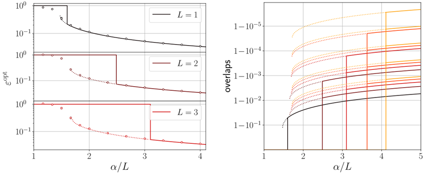
The image displays a two-panel technical figure containing four plots that analyze the relationship between a normalized parameter `α/L` and two metrics: `ε_opt` (optimal error) and `overlaps`. The left panel consists of three vertically stacked subplots showing `ε_opt` vs. `α/L` for different values of `L`. The right panel is a single plot showing `overlaps` vs. `α/L` for multiple data series, likely corresponding to different `L` values or related parameters. The plots use logarithmic scales on the y-axes and include both discrete data points (circles) and continuous lines (solid and dotted).
### Components/Axes
**Left Panel (Three Subplots):**
* **Common X-axis:** Label: `α/L`. Scale: Linear, ranging from 1 to 4. Major ticks at 1, 2, 3, 4.
* **Common Y-axis:** Label: `ε_opt`. Scale: Logarithmic, ranging from `10^-1` to `10^0` (0.1 to 1.0).
* **Subplot 1 (Top):**
* **Legend:** Located in the top-right corner. Label: `L = 1`. Line color: Black.
* **Data Series:** Black circles (data points), a black solid step-function line, and a black dotted curve.
* **Subplot 2 (Middle):**
* **Legend:** Located in the top-right corner. Label: `L = 2`. Line color: Dark red (maroon).
* **Data Series:** Dark red circles, a dark red solid step-function line, and a dark red dotted curve.
* **Subplot 3 (Bottom):**
* **Legend:** Located in the top-right corner. Label: `L = 3`. Line color: Red.
* **Data Series:** Red circles, a red solid step-function line, and a red dotted curve.
**Right Panel (Single Plot):**
* **X-axis:** Label: `α/L`. Scale: Linear, ranging from 1 to 5. Major ticks at 1, 2, 3, 4, 5.
* **Y-axis:** Label: `overlaps`. Scale: Logarithmic, with labels formatted as `1-10^-1`, `1-10^-2`, `1-10^-3`, `1-10^-4`, `1-10^-5`. This represents values approaching 1 from below (e.g., 0.9, 0.99, 0.999, etc.).
* **Data Series:** Multiple lines in a color gradient from black to yellow. Based on consistency with the left panel, the colors likely correspond to increasing values of `L` or a related parameter. The visible colors, from bottom to top at the right edge of the plot, are:
1. Black (lowest curve)
2. Dark Red
3. Red
4. Orange
5. Yellow (highest curve)
* **Line Styles:** Each color series appears to have both a solid line and a dotted line component.
### Detailed Analysis
**Left Panel - `ε_opt` vs. `α/L`:**
* **Trend Verification:** For all three values of `L` (1, 2, 3), the general trend is that `ε_opt` decreases as `α/L` increases. The decrease is not smooth but features a sharp, step-like drop at a critical `α/L` value, followed by a more gradual decline.
* **Data Points & Lines:**
* **L=1 (Black):** The step drop occurs at approximately `α/L ≈ 1.5`. The dotted curve passes through the data points (circles) which start near `ε_opt = 1` at `α/L=1` and decay to approximately `ε_opt ≈ 0.02` at `α/L=4`.
* **L=2 (Dark Red):** The step drop occurs at a higher `α/L ≈ 2.5`. The data points follow a similar decaying pattern, starting near `ε_opt = 1` and ending near `ε_opt ≈ 0.03` at `α/L=4`.
* **L=3 (Red):** The step drop occurs at an even higher `α/L ≈ 3.2`. The data points decay from `ε_opt = 1` to approximately `ε_opt ≈ 0.04` at `α/L=4`.
* **Key Observation:** The critical `α/L` value where the step drop occurs increases with `L`. The post-step decay slope appears similar across all `L` values.
**Right Panel - `overlaps` vs. `α/L`:**
* **Trend Verification:** All data series show that `overlaps` increase (approach 1) as `α/L` increases. The increase is characterized by a very sharp, almost vertical rise at a critical `α/L`, followed by a plateau or slower increase.
* **Data Series & Critical Points:**
* **Black Line:** Shows the earliest and smallest step, beginning its sharp rise around `α/L ≈ 1.5`. It plateaus at the lowest overlap value (near `1-10^-1` or 0.9).
* **Dark Red Line:** Step begins around `α/L ≈ 2.5`. Plateaus at a higher overlap than black.
* **Red Line:** Step begins around `α/L ≈ 3.2`. Plateaus higher still.
* **Orange Line:** Step begins around `α/L ≈ 4.0`. Reaches a very high overlap (near `1-10^-4` or 0.9999).
* **Yellow Line:** Step begins around `α/L ≈ 4.5`. Reaches the highest overlap shown (approaching `1-10^-5` or 0.99999).
* **Cross-Reference:** The critical `α/L` values for the step increases in the right panel (`~1.5, 2.5, 3.2, 4.0, 4.5`) correspond closely to the step-drop values in the left panel for `L=1,2,3` and suggest the orange and yellow lines correspond to `L=4` and `L=5`, respectively.
### Key Observations
1. **Phase Transition Behavior:** Both metrics exhibit sharp, discontinuous changes (steps) at specific critical values of the control parameter `α/L`.
2. **Monotonic Relationship with L:** The critical `α/L` value for the transition increases monotonically with `L`. Higher `L` requires a larger `α/L` to trigger the transition.
3. **Inverse Relationship Between Metrics:** The transition that causes a sharp *drop* in `ε_opt` (error) corresponds to a sharp *rise* in `overlaps` (similarity/agreement).
4. **Performance Scaling:** After the transition, higher `L` values result in slightly higher final `ε_opt` (worse error) but significantly higher final `overlaps` (better agreement).
### Interpretation
This figure likely comes from a study in statistical physics, machine learning, or information theory, analyzing the performance of a system (e.g., a neural network, a spin glass, an error-correcting code) as a function of its load or complexity (`α`) normalized by its size or depth (`L`).
* **What the data suggests:** The system undergoes a sharp **phase transition** at a critical load `α_c(L)`. Below this critical load (`α/L < α_c(L)`), the system is in a "poor" phase characterized by high error (`ε_opt ≈ 1`) and low overlap. Above the critical load, it enters a "good" phase where error drops significantly and overlaps (likely measuring similarity between the system's state and a target state) approach 1.
* **How elements relate:** The left and right panels are two views of the same phenomenon. The step in `ε_opt` is the signature of the transition to a retrieval or learning phase. The corresponding step in `overlaps` confirms that this low-error state is also one of high correlation with a desired pattern or solution.
* **Notable Anomalies/Patterns:** The precise, step-like nature of the transitions suggests a theoretical or idealized model. The fact that the critical `α/L` increases with `L` implies that larger or deeper systems (`L`) can tolerate a higher normalized load `α` before failing, but they require that higher load to "activate" into the good phase. The dotted lines likely represent a theoretical prediction or a different approximation method, while the circles are simulation results, showing excellent agreement. The color gradient in the right panel elegantly encodes the progression of the `L` parameter, allowing for the visualization of five series without a cluttered legend.