## Charts: Optimization Error and Overlaps vs. α/L
### Overview
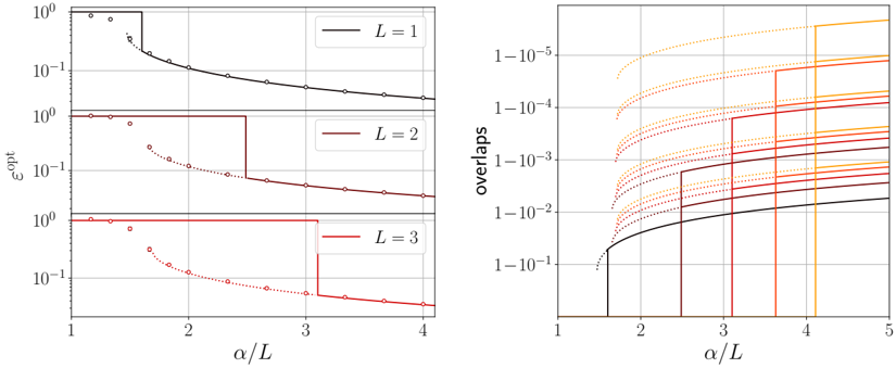
The image presents two charts side-by-side. The left chart depicts the optimization error (ε<sub>opt</sub>) as a function of α/L for different values of L (1, 2, and 3). The right chart shows the number of overlaps as a function of α/L, also for different values of L, represented by a series of curves. Both charts use a logarithmic scale for the y-axis.
### Components/Axes
**Left Chart:**
* **X-axis:** α/L (labeled at the bottom) with a scale ranging from approximately 1 to 4.
* **Y-axis:** ε<sub>opt</sub> (labeled on the left) with a logarithmic scale ranging from 10<sup>0</sup> to 10<sup>2</sup>.
* **Legend:** Located in the top-right corner, with the following entries:
* L = 1 (Black solid line)
* L = 2 (Red solid line)
* L = 3 (Brown solid line)
* **Data Series:** Three lines representing different values of L. The L=2 and L=3 lines also contain dotted lines.
**Right Chart:**
* **X-axis:** α/L (labeled at the bottom) with a scale ranging from approximately 1 to 5.
* **Y-axis:** overlaps (labeled on the left) with a logarithmic scale ranging from 10<sup>-5</sup> to 10<sup>-1</sup>.
* **Data Series:** Multiple curves representing different values of L. The curves are colored in shades of orange, red, and brown. There is no explicit legend, but the color coding appears to correspond to the L values in the left chart.
### Detailed Analysis or Content Details
**Left Chart:**
* **L = 1 (Black):** The line starts at approximately ε<sub>opt</sub> = 1.0 at α/L = 1. It decreases steadily to approximately ε<sub>opt</sub> = 0.03 at α/L = 4.
* **L = 2 (Red):** The line starts at approximately ε<sub>opt</sub> = 0.1 at α/L = 1. It decreases to approximately ε<sub>opt</sub> = 0.02 at α/L = 2, then remains constant until α/L = 3, where it drops sharply to approximately ε<sub>opt</sub> = 0.01, and continues to decrease to approximately ε<sub>opt</sub> = 0.005 at α/L = 4. A dotted line is also present, starting at approximately ε<sub>opt</sub> = 0.1 at α/L = 1, and decreasing to approximately ε<sub>opt</sub> = 0.02 at α/L = 2.
* **L = 3 (Brown):** The line starts at approximately ε<sub>opt</sub> = 0.01 at α/L = 1. It decreases to approximately ε<sub>opt</sub> = 0.005 at α/L = 2, then remains constant until α/L = 3, where it drops sharply to approximately ε<sub>opt</sub> = 0.001, and continues to decrease to approximately ε<sub>opt</sub> = 0.0005 at α/L = 4. A dotted line is also present, starting at approximately ε<sub>opt</sub> = 0.01 at α/L = 1, and decreasing to approximately ε<sub>opt</sub> = 0.005 at α/L = 2.
**Right Chart:**
* The chart displays a series of curves, each representing a different value of L. The curves generally start at higher overlap values (around 10<sup>-2</sup> to 10<sup>-3</sup>) at α/L = 1 and decrease as α/L increases.
* There are vertical step-like drops in the curves at approximately α/L = 2, 3, and 4.
* The curves appear to cluster into groups, with darker shades of orange/red representing lower values of L and lighter shades representing higher values of L.
* The black line starts at approximately 1e-2 at α/L = 1 and decreases to approximately 1e-3 at α/L = 5.
### Key Observations
* In the left chart, increasing L generally leads to lower optimization error, but also introduces step-like changes in the error curve.
* The right chart shows that as α/L increases, the number of overlaps decreases. The step-like drops in the curves suggest that there are critical values of α/L where the overlap changes significantly.
* The dotted lines in the left chart suggest a different optimization process or initial condition.
* The color scheme in the right chart is consistent with the L values in the left chart, suggesting a relationship between the two charts.
### Interpretation
The data suggests that the optimization process is sensitive to the parameter α/L and the value of L. Increasing L can improve the optimization error, but it also introduces discontinuities in the error curve and affects the number of overlaps. The step-like drops in the overlap curves indicate that there are critical values of α/L where the system undergoes a transition. The relationship between the two charts suggests that the optimization error and the number of overlaps are interconnected. The dotted lines in the left chart might represent a different optimization strategy or a different initial state, leading to a different convergence behavior. The logarithmic scales on both y-axes emphasize the significant changes in both optimization error and overlap values over the range of α/L. The charts likely represent a study of an optimization algorithm's performance with varying parameters, potentially in a physical or computational system where overlaps are a relevant metric.