## Line Graphs: ε_opt and Overlaps vs α/L
### Overview
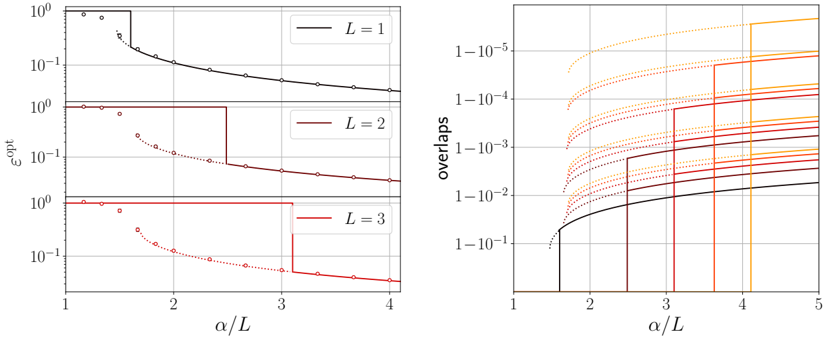
The image contains two side-by-side graphs. The left graph shows three decaying curves labeled L=1, L=2, and L=3, plotting ε_opt against α/L. The right graph displays multiple colored curves labeled "overlaps" against α/L, with vertical threshold lines at α/L=2, 3, and 4.
### Components/Axes
**Left Graph:**
- **Y-axis (ε_opt):** Logarithmic scale from 10⁻¹ to 10⁰
- **X-axis (α/L):** Linear scale from 1 to 4
- **Legend:** Positioned right, labels L=1 (black), L=2 (red), L=3 (dark red)
- **Lines:** Solid for L=1, dashed for L=2, dotted for L=3
**Right Graph:**
- **Y-axis (overlaps):** Logarithmic scale from 10⁻⁵ to 1
- **X-axis (α/L):** Linear scale from 1 to 5
- **Legend:** Positioned right, labels match colors (black, red, orange, yellow)
- **Lines:** Mixed solid/dotted styles, varying slopes
- **Vertical Lines:** At α/L=2 (red), 3 (orange), 4 (yellow)
### Detailed Analysis
**Left Graph Trends:**
1. **L=1 (black):** Starts at ε_opt ≈ 10⁰ (α/L=1), decays exponentially to 10⁻¹ (α/L=4)
2. **L=2 (red):** Starts at ε_opt ≈ 10⁰.⁵ (α/L=1), decays to 10⁻¹ (α/L=4)
3. **L=3 (dark red):** Starts at ε_opt ≈ 10⁰.⁷ (α/L=1), decays to 10⁻¹ (α/L=4)
- All curves show similar asymptotic behavior, with L=3 having the highest initial ε_opt
**Right Graph Trends:**
1. **Black Line:** Sharp drop from 10⁰ to 10⁻² at α/L=1.5, then gradual increase to 10⁻¹
2. **Red Line:** Starts at 10⁻³, rises to 10⁻¹ at α/L=3, then plateaus
3. **Orange Line:** Begins at 10⁻⁴, peaks at 10⁻² at α/L=2.5, then declines
4. **Yellow Line:** Starts at 10⁻⁵, rises to 10⁻¹ at α/L=4, then plateaus
- Vertical thresholds align with color-coded transitions in the curves
### Key Observations
1. **Left Graph:** Higher L values correlate with higher initial ε_opt but similar asymptotic decay
2. **Right Graph:** Overlaps show threshold-dependent behavior, with color-coded transitions at α/L=2, 3, 4
3. **Vertical Lines:** Serve as visual markers for critical α/L ratios in the right graph
4. **Dotted/Solid Styles:** Indicate different regimes or measurement conditions in the right graph
### Interpretation
The left graph demonstrates that ε_opt decreases with increasing α/L, with higher L values maintaining greater initial efficiency. The right graph suggests overlaps exhibit threshold-dependent behavior, with distinct regimes separated by α/L=2, 3, and 4. The color-coded transitions in the right graph likely correspond to different system configurations or measurement protocols, while the left graph's L parameter may represent system dimensionality or complexity. The exponential decay in ε_opt implies a fundamental scaling relationship between system parameters and performance metrics.