## Screenshot: KoinKnight Landing Page
### Overview
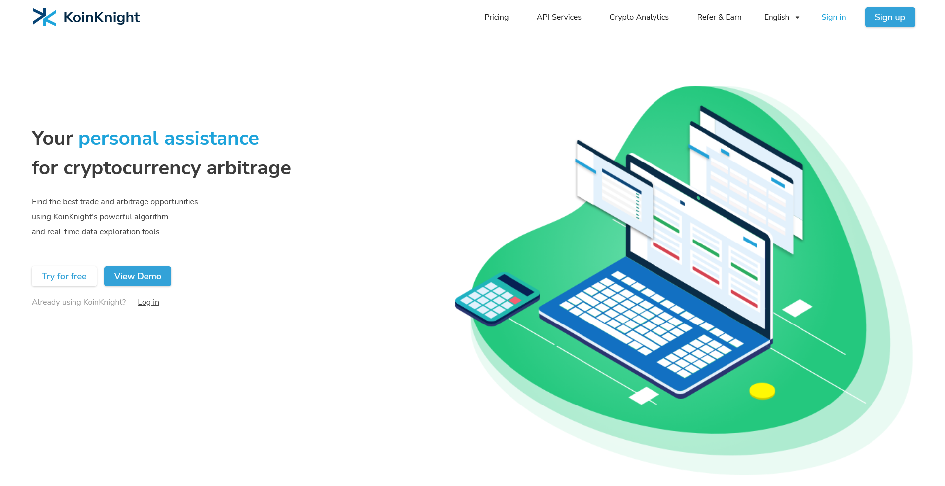
This image is a screenshot of the hero section of the "KoinKnight" website landing page. The page is designed to introduce the service as a tool for cryptocurrency arbitrage, featuring a clean, modern layout with a prominent illustration. The primary language is English.
### Components/Axes
The page is structured into three main visual regions:
1. **Header/Navigation Bar (Top):** Contains the site logo and primary navigation links.
2. **Main Content Area (Left):** Contains the value proposition headline, descriptive text, and call-to-action buttons.
3. **Illustrative Graphic (Right):** A large, isometric illustration depicting the service's function.
**Header Elements (from left to right):**
* **Logo:** "KoinKnight" with a stylized blue "K" icon.
* **Navigation Links:** "Pricing", "API Services", "Crypto Analytics", "Refer & Earn".
* **Utility Links:** "English" (with a dropdown indicator), "Sign in", and a blue "Sign up" button.
**Main Content Elements (Left-aligned):**
* **Primary Headline:** "Your personal assistance for cryptocurrency arbitrage" (with "personal assistance" highlighted in blue).
* **Supporting Text:** "Find the best trade and arbitrage opportunities using KoinKnight's powerful algorithm and real-time data exploration tools."
* **Call-to-Action Buttons:** "Try for free" (white button with blue text) and "View Demo" (blue button with white text).
* **Login Prompt:** "Already using KoinKnight? Log in" (with "Log in" as a hyperlink).
**Illustrative Graphic (Right-aligned):**
* An isometric illustration on a green circular background.
* **Central Element:** A blue laptop displaying multiple overlapping data screens or charts with red and green bars, suggesting market data.
* **Peripheral Elements:** A calculator to the left of the laptop and a single yellow coin to the right, symbolizing calculation and profit.
* **Background:** A large, soft green circle with a lighter green outer ring, creating a focal point.
### Detailed Analysis / Content Details
**Complete Text Transcription:**
* **Header:** `KoinKnight` `Pricing` `API Services` `Crypto Analytics` `Refer & Earn` `English` `Sign in` `Sign up`
* **Main Content:**
* `Your personal assistance`
* `for cryptocurrency arbitrage`
* `Find the best trade and arbitrage opportunities`
* `using KoinKnight's powerful algorithm`
* `and real-time data exploration tools.`
* `Try for free` `View Demo`
* `Already using KoinKnight? Log in`
* **Illustration:** No embedded text is present within the graphic itself.
**Visual & Layout Details:**
* **Color Palette:** Dominant colors are white (background), blue (logo, buttons, laptop), green (illustration background, chart bars), and dark gray/black (text).
* **Typography:** A clean, sans-serif font is used throughout. The headline uses a larger, bolder weight.
* **Spatial Composition:** The layout is asymmetric. The text content is left-aligned with generous white space, while the large illustration occupies the right half, creating visual balance. The header spans the full width at the top.
### Key Observations
1. **Clear Value Proposition:** The headline and supporting text immediately communicate the service's core function: finding arbitrage opportunities in cryptocurrency markets using algorithms and real-time data.
2. **Dual Call-to-Action:** The page offers two primary paths for new users: a free trial ("Try for free") and a product demonstration ("View Demo"), catering to different levels of user commitment.
3. **Illustrative Metaphor:** The graphic effectively visualizes the service's purpose. The multiple screens on the laptop represent data aggregation and analysis, the calculator signifies computation and strategy, and the coin represents the financial outcome (profit).
4. **User Journey Consideration:** The page includes a direct login link for existing users ("Already using KoinKnight? Log in"), ensuring they are not forced through the new user onboarding flow.
5. **Professional Aesthetic:** The design is modern, uncluttered, and uses a professional color scheme (blue/green/white) commonly associated with finance, technology, and trust.
### Interpretation
This landing page is a classic example of a conversion-focused hero section for a B2B or prosumer fintech SaaS (Software as a Service) product. Its primary goal is to quickly communicate the product's unique selling proposition (USP)—automated cryptocurrency arbitrage—and persuade visitors to take the first step in the conversion funnel.
* **Problem/Solution Framing:** It implicitly identifies a problem (the difficulty of manually finding profitable arbitrage trades across crypto markets) and presents KoinKnight as the solution (an algorithmic "personal assistance").
* **Trust Building:** The professional design, clear language, and mention of "powerful algorithm" and "real-time data" are intended to build credibility and trust with a technically savvy audience.
* **Reducing Friction:** By offering a "Try for free" option, the page lowers the barrier to entry, allowing users to experience value before committing financially. The "View Demo" option serves users who prefer to understand the product more deeply before signing up.
* **Audience Targeting:** The terminology ("arbitrage," "API Services," "Crypto Analytics") and the analytical nature of the illustration clearly target individuals or businesses already engaged in or knowledgeable about cryptocurrency trading and quantitative finance.
In essence, the page is designed to act as an efficient filter and converter: it attracts the right audience with specific language, explains the value succinctly, and provides clear, low-friction pathways for engagement.