## [Line Chart with Confidence Intervals]: Performance Metrics vs. α (Alpha)
### Overview
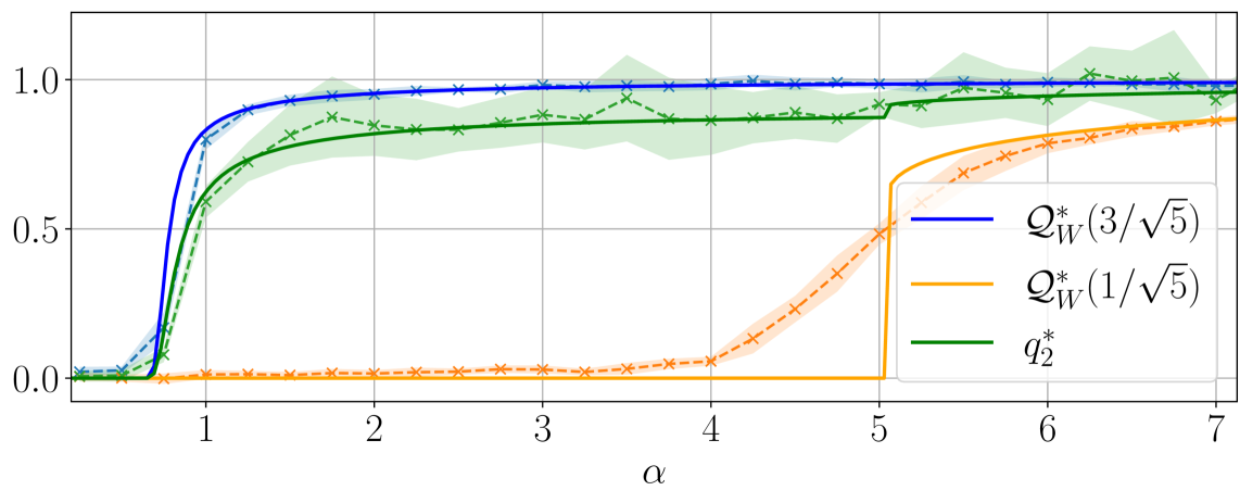
The image is a line chart plotting three data series (with shaded confidence intervals) against the x-axis variable \( \boldsymbol{\alpha} \) (alpha) and a y-axis ranging from 0.0 to 1.0. Each series is labeled in a legend at the bottom-right, and the chart includes grid lines for reference.
### Components/Axes
- **X-axis**: Labeled \( \boldsymbol{\alpha} \) (alpha), with tick marks at 1, 2, 3, 4, 5, 6, 7 (range: 0 to 7).
- **Y-axis**: Numerical scale from 0.0 to 1.0, with major ticks at 0.0, 0.5, 1.0.
- **Legend**: Positioned at the bottom-right, containing three entries:
- Blue line: \( \boldsymbol{Q_W^*(3/\sqrt{5})} \)
- Orange line: \( \boldsymbol{Q_W^*(1/\sqrt{5})} \)
- Green line: \( \boldsymbol{q_2^*} \)
- **Lines & Shaded Areas**: Each line has a color-matched shaded region (likely representing uncertainty/confidence intervals).
### Detailed Analysis
#### 1. Blue Line (\( Q_W^*(3/\sqrt{5}) \))
- **Trend**: Rapid increase from \( \alpha=0 \) to \( \alpha=1 \), then plateaus near 1.0 for \( \alpha \geq 1 \).
- **Data Points (approximate)**:
- \( \alpha=0 \): ~0.0
- \( \alpha=1 \): ~0.8
- \( \alpha=2 \) to \( 7 \): ~1.0 (stable)
- **Shaded Area**: Narrow, indicating low variability.
#### 2. Orange Line (\( Q_W^*(1/\sqrt{5}) \))
- **Trend**: Remains near 0 until \( \alpha=5 \), then rises sharply, approaching ~0.8 at \( \alpha=7 \).
- **Data Points (approximate)**:
- \( \alpha=0 \) to \( 4 \): ~0.0
- \( \alpha=5 \): ~0.5
- \( \alpha=6 \): ~0.7
- \( \alpha=7 \): ~0.8
- **Shaded Area**: Narrow until \( \alpha=5 \), then widens slightly as the line rises.
#### 3. Green Line (\( q_2^* \))
- **Trend**: Gradual increase from \( \alpha=0 \), with fluctuations (shaded area shows variability), plateauing near 1.0 for \( \alpha \geq 2 \).
- **Data Points (approximate)**:
- \( \alpha=0 \): ~0.0
- \( \alpha=1 \): ~0.6
- \( \alpha=2 \): ~0.8
- \( \alpha=3 \) to \( 7 \): ~1.0 (with minor fluctuations)
- **Shaded Area**: Wider than the blue line, indicating more variability.
### Key Observations
- The blue line reaches a high value (near 1.0) much earlier (\( \alpha=1 \)) than the orange line (\( \alpha=5 \)).
- The green line has a more gradual increase and higher variability (wider shaded area) compared to the blue line.
- The orange line remains low until \( \alpha=5 \), then shows a sharp increase, suggesting a **threshold effect** at \( \alpha=5 \).
### Interpretation
The chart likely illustrates the behavior of three metrics (or functions) as a function of \( \alpha \) (e.g., a parameter like signal-to-noise ratio, regularization strength, or a system parameter).
- The blue line (\( Q_W^*(3/\sqrt{5}) \)) is highly responsive to \( \alpha \), reaching a maximum value quickly—suggesting it is sensitive to small changes in \( \alpha \).
- The orange line (\( Q_W^*(1/\sqrt{5}) \)) has a delayed response, only increasing significantly after \( \alpha=5 \)—indicating a critical threshold where \( \alpha \) must exceed 5 to trigger a response.
- The green line (\( q_2^* \)) shows a more gradual, variable increase—suggesting a different underlying mechanism (e.g., a less sensitive or more stochastic process).
The shaded regions imply uncertainty: the blue line has the least uncertainty, while the green line has more, and the orange line’s uncertainty increases as it rises. This could be relevant in fields like optimization, signal processing, or statistical modeling, where \( \alpha \) and the y-axis metric (e.g., accuracy, probability) are key variables.
(Note: All values are approximate, based on visual inspection of the chart.)