## Chart: Performance Curves vs. Alpha
### Overview
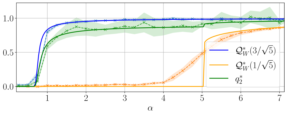
The image presents a line chart illustrating the performance of three different metrics (Q*w(3/√5), Q*w(1/√5), and q*2) as a function of the parameter α (alpha). The chart displays how these metrics change as α varies from approximately 0.5 to 7. The chart includes shaded regions around each line, likely representing confidence intervals or standard deviations.
### Components/Axes
* **X-axis:** Labeled "α" (alpha), ranging from approximately 0.5 to 7. The scale is linear.
* **Y-axis:** Ranges from 0.0 to 1.0, representing the performance metric value. The scale is linear.
* **Legend:** Located in the top-right corner of the chart. It identifies the three lines:
* Blue line: Q*w(3/√5)
* Orange line: Q*w(1/√5)
* Green line: q*2
* **Shaded Regions:** Lightly colored regions surrounding each line, indicating variability or uncertainty.
### Detailed Analysis
* **Q*w(3/√5) (Blue Line):** This line starts at approximately 0.1 at α = 0.5, rapidly increases, and reaches a plateau around 0.95-1.0 at α ≈ 1.5. It remains relatively stable at this level for the rest of the α range.
* **Q*w(1/√5) (Orange Line):** This line begins at approximately 0.05 at α = 0.5. It increases more slowly than the blue line, reaching a plateau around 0.75-0.85 at α ≈ 4. It then exhibits a significant drop around α = 5, falling to approximately 0.1, before increasing again to around 0.75 at α = 7.
* **q*2 (Green Line):** This line starts at approximately 0.1 at α = 0.5. It increases steadily, but slower than the blue line, reaching a plateau around 0.85-0.95 at α ≈ 5. It remains relatively stable for the rest of the α range.
**Approximate Data Points (extracted visually):**
| α | Q*w(3/√5) | Q*w(1/√5) | q*2 |
| :---- | :-------- | :-------- | :------ |
| 0.5 | 0.1 | 0.05 | 0.1 |
| 1 | 0.7 | 0.2 | 0.4 |
| 2 | 0.95 | 0.4 | 0.65 |
| 3 | 1.0 | 0.65 | 0.75 |
| 4 | 1.0 | 0.75 | 0.85 |
| 5 | 1.0 | 0.1 | 0.9 |
| 6 | 1.0 | 0.5 | 0.9 |
| 7 | 1.0 | 0.75 | 0.9 |
### Key Observations
* The blue line (Q*w(3/√5)) consistently outperforms the other two metrics across most of the α range, reaching a stable high value quickly.
* The orange line (Q*w(1/√5)) exhibits a significant dip in performance around α = 5, followed by a recovery. This is a notable anomaly.
* The green line (q*2) shows a more gradual increase in performance, reaching a plateau later than the blue line.
* The shaded regions indicate that the performance of each metric is not constant, but varies within a certain range.
### Interpretation
This chart likely represents the performance of different algorithms or strategies as a function of a key parameter α. The rapid convergence of Q*w(3/√5) suggests it is a robust and efficient approach, quickly achieving high performance. The dip in Q*w(1/√5) around α = 5 indicates a potential instability or sensitivity to this parameter value. The chart suggests that the optimal value of α depends on the chosen metric, with Q*w(3/√5) being the most consistently high-performing option. The shaded regions highlight the inherent variability in the performance, suggesting that the results may be influenced by factors not explicitly modeled in the chart. The choice of α = 5 is a critical point, as it causes a significant performance drop for Q*w(1/√5). Further investigation into the cause of this dip would be valuable.