## Scatter Plot: GCI Value vs. Citations
### Overview
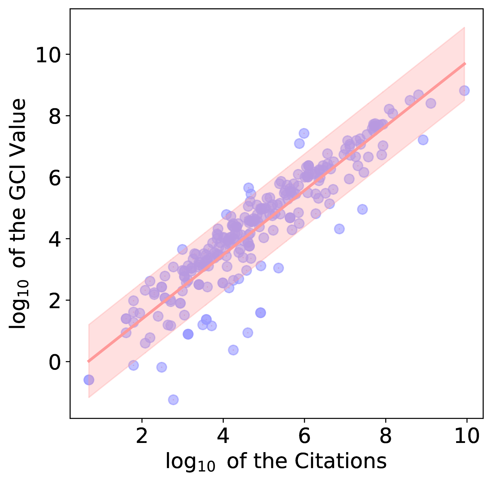
The image is a scatter plot showing the relationship between the base-10 logarithm of the GCI (presumably some kind of impact) value and the base-10 logarithm of the number of citations. The plot includes a linear regression line with a confidence interval shaded around it. The data points are represented as transparent blue circles.
### Components/Axes
* **X-axis:** log₁₀ of the Citations, with tick marks at 2, 4, 6, 8, and 10.
* **Y-axis:** log₁₀ of the GCI Value, with tick marks at 0, 2, 4, 6, 8, and 10.
* **Data Points:** Transparent blue circles representing individual data points.
* **Regression Line:** A solid light red line representing the linear regression fit to the data.
* **Confidence Interval:** A shaded light red region around the regression line, representing the confidence interval.
### Detailed Analysis
* **Data Point Distribution:** The blue data points are scattered around the regression line. The density of points appears higher in the middle range of both axes (around log₁₀ Citations = 4-6 and log₁₀ GCI Value = 3-5).
* **Regression Line:** The light red regression line slopes upwards from left to right, indicating a positive correlation between log₁₀ of the Citations and log₁₀ of the GCI Value.
* At log₁₀ Citations = 2, the regression line is approximately at log₁₀ GCI Value = 1.
* At log₁₀ Citations = 10, the regression line is approximately at log₁₀ GCI Value = 9.
* **Confidence Interval:** The shaded light red region widens slightly at the extremes of the x-axis, indicating greater uncertainty in the regression fit at those points.
* At log₁₀ Citations = 2, the confidence interval ranges from approximately 0 to 2.
* At log₁₀ Citations = 10, the confidence interval ranges from approximately 8 to 10.
### Key Observations
* There is a positive correlation between the base-10 logarithm of the number of citations and the base-10 logarithm of the GCI value.
* The data points are somewhat scattered, but generally follow the trend indicated by the regression line.
* There are some outliers, particularly at lower citation counts.
### Interpretation
The scatter plot suggests that there is a positive relationship between the number of citations a publication receives and its GCI value. This implies that publications with more citations tend to have higher GCI values. The confidence interval indicates the uncertainty in this relationship, which is greater at the extremes of the citation range. The outliers suggest that some publications may have high GCI values despite having relatively few citations, or vice versa. The plot demonstrates a general trend, but also highlights the variability in the relationship between citations and GCI value.