## Scatter Plot: Correlation between log10 Citations and log10 GCI Value
### Overview
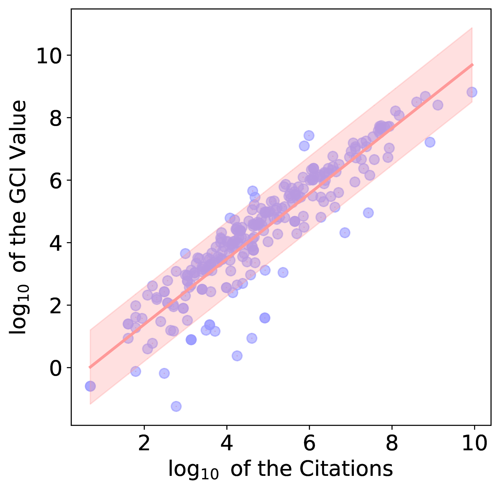
The image is a scatter plot visualizing the relationship between two variables: the "log10 of the Citations" (x-axis) and the "log10 of the GCI Value" (y-axis). The plot features a linear regression line (solid red) surrounded by a shaded confidence interval (light red), indicating a strong positive correlation between the two metrics. The data points are represented by semi-transparent blue circles.
### Components/Axes
* **X-Axis:** Labeled "log10 of the Citations". The scale ranges from approximately 1 to 10, with major tick marks at 2, 4, 6, 8, and 10.
* **Y-Axis:** Labeled "log10 of the GCI Value". The scale ranges from approximately -1 to 11, with major tick marks at 0, 2, 4, 6, 8, and 10.
* **Data Series:**
* **Scatter Points:** Semi-transparent blue circles distributed across the plot area.
* **Regression Line:** A solid red line running diagonally from the bottom-left to the top-right.
* **Confidence Interval:** A light red shaded region encompassing the regression line, representing the uncertainty or variance of the fit.
### Detailed Analysis
* **Trend Verification:** The red regression line exhibits a clear, consistent upward slope from the bottom-left (near x=0.5, y=0) to the top-right (near x=10, y=9.5). This confirms a positive linear relationship between the log-transformed variables.
* **Data Distribution:**
* **Density:** The highest concentration of blue data points occurs between x=3 and x=7, and y=2 and y=7.
* **Regression Line Path:** The line originates near the origin (0,0) and terminates near (10, 9.5).
* **Confidence Interval:** The shaded region is narrowest in the center (around x=4 to 6) and widens slightly at the lower and upper extremes, indicating higher uncertainty in the model's prediction at the edges of the data range.
* **Outliers and Anomalies:**
* **Below the Line:** There is a cluster of outliers in the lower-left quadrant (x=2 to 5, y=0 to 2) that fall significantly below the regression line. These represent data points with lower-than-predicted GCI values relative to their citation counts.
* **Above the Line:** There are fewer outliers above the regression line. A notable example is located near x=6, y=7.5, which sits above the main cluster and the regression line.
### Key Observations
* **Strong Correlation:** The tight clustering of points around the regression line indicates a robust correlation between citation counts and GCI values.
* **Log-Log Relationship:** Because both axes are log-transformed, the linear relationship suggests that the underlying raw data likely follows a power-law distribution.
* **Variance:** While the correlation is strong, there is visible variance, particularly in the lower citation range, suggesting that for lower-impact items, the GCI value is less predictable based solely on citation count.
### Interpretation
* **What the data demonstrates:** The plot demonstrates that citation count is a highly reliable predictor of the GCI value. As citations increase, the GCI value increases proportionally on a logarithmic scale.
* **Why it matters:** In bibliometrics or research evaluation, this relationship is critical for normalizing impact metrics. It suggests that the GCI is likely derived from or heavily influenced by citation counts, or that both metrics are measuring the same underlying phenomenon of "academic impact."
* **Peircean Investigative Insight:** The presence of outliers—specifically those below the regression line—is significant. These points represent "under-performing" entities where high citation counts do not translate into proportionally high GCI values. Conversely, the points above the line represent "over-performing" entities where the GCI value is higher than what the citation count alone would predict. This suggests that while citations are a primary driver of the GCI, there are secondary factors influencing the GCI score that cause these deviations.