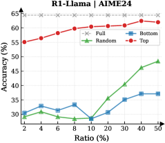
## Line Chart: R1-Llama / AIME24 Performance vs. Ratio
### Overview
The image is a line chart titled "R1-Llama / AIME24". It plots the performance metric "Accuracy (%)" against a variable "Ratio (%)" for four different methods or data subsets: Full, Bottom, Random, and Top. The chart demonstrates how the accuracy of each method changes as the ratio increases from 2% to 50%.
### Components/Axes
* **Chart Title:** "R1-Llama / AIME24" (centered at the top).
* **Y-Axis:**
* **Label:** "Accuracy (%)"
* **Scale:** Linear scale from 25 to 65, with major tick marks every 5 units (25, 30, 35, 40, 45, 50, 55, 60, 65).
* **X-Axis:**
* **Label:** "Ratio (%)"
* **Scale:** Non-linear scale with marked points at 2, 4, 6, 8, 10, 20, 30, 40, and 50.
* **Legend:** Located in the top-right quadrant of the chart area. It defines four data series:
1. **Full:** Red line with solid circle markers.
2. **Bottom:** Blue line with solid square markers.
3. **Random:** Green line with solid triangle markers.
4. **Top:** Gray line with 'x' markers.
### Detailed Analysis
**Data Series Trends and Approximate Values:**
1. **Full (Red Circles):**
* **Trend:** Shows a steady, monotonic upward trend. Accuracy increases consistently as the Ratio increases.
* **Data Points (Approximate):**
* Ratio 2%: ~55%
* Ratio 4%: ~56%
* Ratio 6%: ~57%
* Ratio 8%: ~58%
* Ratio 10%: ~59%
* Ratio 20%: ~60%
* Ratio 30%: ~61%
* Ratio 40%: ~61.5%
* Ratio 50%: ~62%
2. **Bottom (Blue Squares):**
* **Trend:** Relatively flat with minor fluctuations. It shows a slight dip around Ratio 10% before recovering and plateauing.
* **Data Points (Approximate):**
* Ratio 2%: ~30%
* Ratio 4%: ~32%
* Ratio 6%: ~31%
* Ratio 8%: ~33%
* Ratio 10%: ~28% (notable dip)
* Ratio 20%: ~30%
* Ratio 30%: ~35%
* Ratio 40%: ~37%
* Ratio 50%: ~37%
3. **Random (Green Triangles):**
* **Trend:** Exhibits a distinct "hockey stick" or exponential-like growth pattern. It remains low and flat for Ratios up to 10%, then increases sharply and linearly from 20% to 50%.
* **Data Points (Approximate):**
* Ratio 2%: ~31%
* Ratio 4%: ~32%
* Ratio 6%: ~30%
* Ratio 8%: ~29%
* Ratio 10%: ~28%
* Ratio 20%: ~35%
* Ratio 30%: ~40%
* Ratio 40%: ~45%
* Ratio 50%: ~48%
4. **Top (Gray 'x's):**
* **Trend:** Perfectly flat, horizontal line. Accuracy is constant and does not change with the Ratio.
* **Data Points (Approximate):**
* All Ratios (2% to 50%): ~63%
### Key Observations
* **Performance Hierarchy:** The "Top" method consistently achieves the highest accuracy (~63%), followed by "Full" (~55-62%). "Random" and "Bottom" perform significantly worse, especially at low ratios.
* **Critical Threshold:** The "Random" series shows a dramatic change in behavior at a Ratio of approximately 10%. Below this point, its accuracy is stagnant and low; above it, accuracy improves rapidly.
* **Stability vs. Growth:** "Top" is perfectly stable. "Full" shows steady, reliable growth. "Bottom" is unstable with a notable performance drop at 10%. "Random" is highly sensitive to the Ratio, showing poor initial performance but strong late growth.
* **Convergence:** At the highest measured Ratio (50%), the gap between "Random" (~48%) and "Bottom" (~37%) has widened significantly, with "Random" clearly outperforming "Bottom".
### Interpretation
This chart likely evaluates different data selection or sampling strategies ("Full", "Bottom", "Random", "Top") for a model or task named "R1-Llama" on the "AIME24" benchmark. The "Ratio (%)" probably represents the percentage of data used (e.g., for training, fine-tuning, or retrieval).
The data suggests:
1. **Superiority of "Top" Selection:** Using the "Top" data (presumably the highest-quality or most relevant samples) yields the best and most consistent performance, independent of the quantity used within this range. This implies high data quality is paramount.
2. **Value of "Full" Data:** Using all available data ("Full") provides a strong, predictable performance baseline that improves with more data, but it never reaches the peak efficiency of the curated "Top" set.
3. **Inefficiency of "Bottom" Data:** The "Bottom" subset (likely the lowest-quality data) provides poor and erratic performance. The dip at 10% could indicate a point where adding more low-quality data introduces noise that harms performance before sheer volume compensates slightly.
4. **"Random" Sampling's Phase Change:** The "Random" strategy is ineffective at low ratios but becomes surprisingly effective as the ratio increases beyond 10%. This suggests that once a sufficient random sample size is reached, it begins to capture enough useful signal to drive significant performance gains, though it remains less efficient than using curated ("Top") or complete ("Full") data.
**Overall Implication:** For this specific task, investing in data curation to create a "Top" subset is the most effective strategy. If curation is not possible, using all data ("Full") is a reliable fallback. Random sampling requires a substantial data volume (>10% ratio) to become viable, while relying on the "Bottom" data is not recommended.