## 3D Scatter Plot: Token Position Distribution Across PCA Directions
### Overview
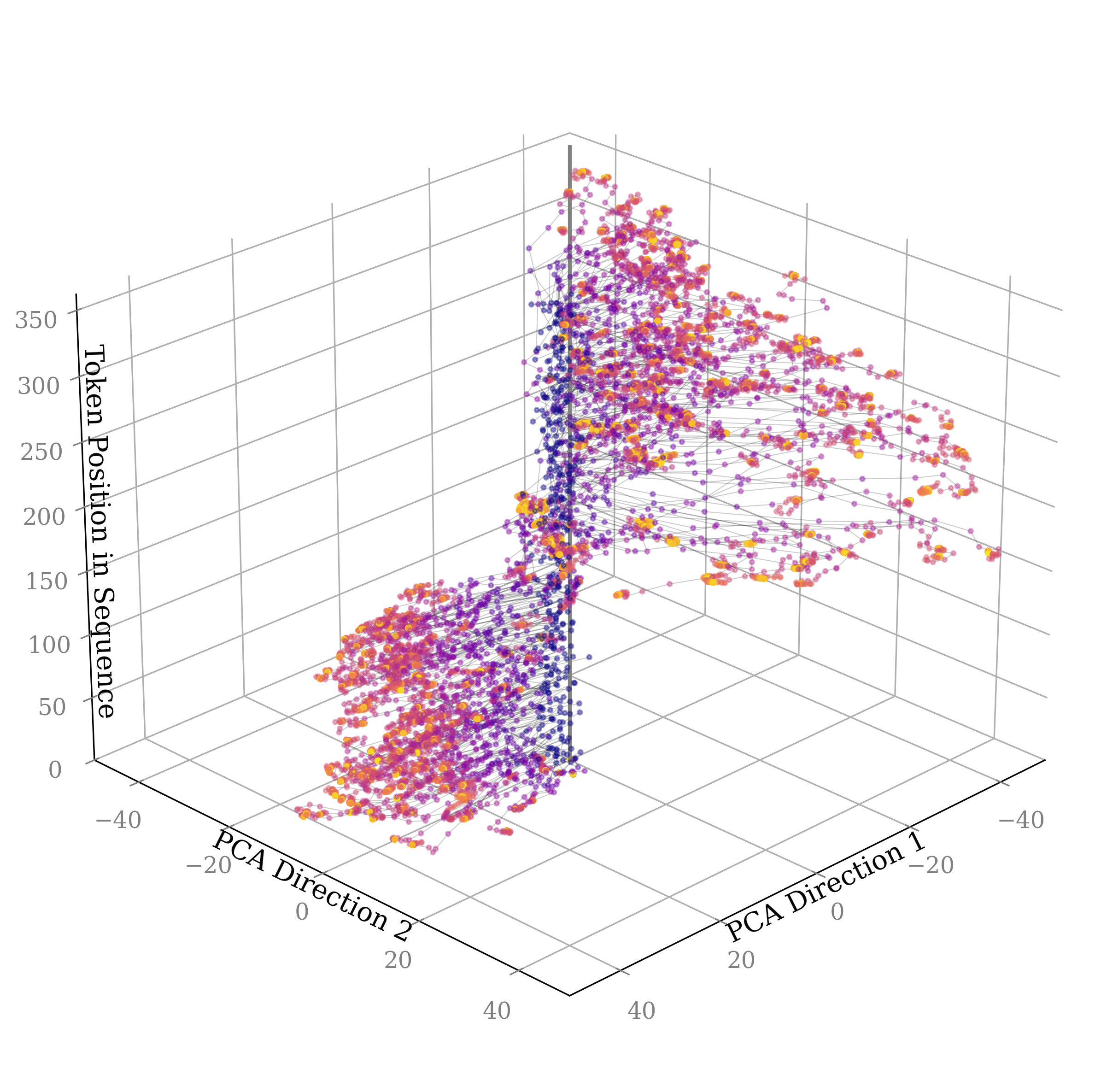
The image depicts a 3D scatter plot visualizing the distribution of data points across two principal component analysis (PCA) directions and their corresponding token positions in a sequence. Points are colored in purple, orange, and yellow, with connecting lines suggesting relationships between data points. The plot reveals two distinct clusters and a transitional region between them.
### Components/Axes
- **X-axis**: PCA Direction 1 (ranges from -40 to 40)
- **Y-axis**: PCA Direction 2 (ranges from -40 to 40)
- **Z-axis**: Token Position in Sequence (ranges from 0 to 350)
- **Color Coding**:
- Purple: Dominant in transitional regions
- Orange: Concentrated in lower-left cluster
- Yellow: Concentrated in upper-right cluster
- **No explicit legend** is visible in the image, but color coding is inferred from point distributions.
### Detailed Analysis
1. **Cluster 1 (Lower-Left)**:
- Located in negative PCA Direction 1 (-40 to 0) and negative PCA Direction 2 (-40 to 0).
- Dominated by **orange** points (≈60% of cluster) with **purple** points (≈40%).
- Token positions cluster between **50–150** on the z-axis.
- Lines connect points in a dense, localized network.
2. **Cluster 2 (Upper-Right)**:
- Located in positive PCA Direction 1 (0 to 40) and positive PCA Direction 2 (0 to 40).
- Dominated by **yellow** points (≈70% of cluster) with **purple** points (≈30%).
- Token positions cluster between **200–350** on the z-axis.
- Lines form a sparser, more dispersed network compared to Cluster 1.
3. **Transitional Region**:
- Overlaps near the origin (PCA1 ≈ 0, PCA2 ≈ 0).
- Points here are predominantly **purple**, with sparse **orange** and **yellow**.
- Token positions span the full z-axis range (0–350), indicating mixed distributions.
4. **Connecting Lines**:
- Lines link points across all clusters, suggesting sequential or hierarchical relationships.
- Lines in the transitional region are shorter and denser, while those between clusters are longer and sparser.
### Key Observations
- **Cluster Separation**: Two distinct groups exist along PCA axes, with minimal overlap except in the transitional region.
- **Color Correlation**:
- Orange correlates with lower PCA values and lower token positions.
- Yellow correlates with higher PCA values and higher token positions.
- **Token Position Trends**:
- Lower cluster tokens are concentrated in the lower half of the z-axis.
- Upper cluster tokens are concentrated in the upper half.
- **Line Density**: Higher density in lower cluster suggests stronger local relationships.
### Interpretation
The plot likely represents a dimensionality reduction of high-dimensional data (e.g., text tokens) into two PCA directions, with token positions indicating their original sequence order. The two clusters may represent distinct categories or states (e.g., semantic groups, syntactic roles), with color coding reflecting subcategories or transitional states. The connecting lines imply a process or flow between points, possibly modeling dependencies or transitions in the original data. The absence of a legend leaves the exact meaning of colors ambiguous, but their spatial distribution suggests a gradient or hierarchical relationship. The transitional region’s mixed colors and token positions indicate intermediate states or overlapping categories.