## Scatter Plot: A-mem vs. Base Distribution
### Overview
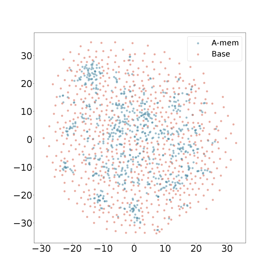
The image is a 2D scatter plot comparing the spatial distribution of two data series, labeled "A-mem" and "Base". The plot displays a cloud of points for each series on a common coordinate system, allowing for visual comparison of their spread, density, and central tendency. No explicit axis titles are provided, suggesting the axes represent two generic dimensions or features.
### Components/Axes
* **Chart Type:** Scatter Plot.
* **Legend:** Located in the top-right corner of the plot area. It contains two entries:
* A blue dot labeled **"A-mem"**.
* A pink/salmon dot labeled **"Base"**.
* **X-Axis:** A horizontal numerical axis. Major tick marks and labels are present at intervals of 10, ranging from **-30** to **30**. The axis line is solid black.
* **Y-Axis:** A vertical numerical axis. Major tick marks and labels are present at intervals of 10, ranging from **-30** to **30**. The axis line is solid black.
* **Plot Area:** A white background enclosed by the axes. No grid lines are visible.
### Detailed Analysis
* **Data Series - "A-mem" (Blue Points):**
* **Trend/Distribution:** The blue points form a relatively dense, centralized cluster. The distribution appears roughly elliptical or circular, centered near the origin (0,0).
* **Spatial Spread:** The points are concentrated within an approximate range of **-20 to +20** on both the X and Y axes. The density is highest near the center and gradually decreases outward. There are very few points beyond the ±20 range on either axis.
* **Visual Density:** The cluster is dense enough that individual points overlap significantly, especially near the center.
* **Data Series - "Base" (Pink Points):**
* **Trend/Distribution:** The pink points form a much more diffuse, widespread cloud that encompasses the entire visible plot area.
* **Spatial Spread:** The points are distributed across the full range of the axes, from approximately **-30 to +30** on both X and Y. While there is a slight concentration towards the center, the points maintain a significant presence even at the extreme edges of the plot.
* **Visual Density:** The points are more sparsely distributed compared to the blue series, with less overlap. They create a background "noise" or "cloud" against which the blue cluster is situated.
* **Spatial Relationship:** The "A-mem" (blue) cluster is entirely contained within the broader "Base" (pink) cloud. The blue points do not extend to the peripheries occupied by the pink points.
### Key Observations
1. **Variance Contrast:** The most striking observation is the dramatic difference in variance (spread) between the two series. "Base" exhibits high variance across both dimensions, while "A-mem" exhibits low variance.
2. **Central Tendency:** Both distributions appear centered around the origin (0,0), but the "A-mem" series has a much tighter central tendency.
3. **Outliers:** The "Base" series contains numerous points that could be considered outliers relative to the "A-mem" cluster, located in the outer regions of the plot (e.g., near (-30, 10), (25, -20)).
4. **Overlap Zone:** There is a significant region of overlap where both blue and pink points coexist, primarily within the central ±20 range. However, the blue points dominate the visual density in the very center.
### Interpretation
This scatter plot visually demonstrates a fundamental difference in the behavior or characteristics of the "A-mem" and "Base" entities.
* **What the data suggests:** The "A-mem" method, model, or dataset produces results that are highly consistent and confined to a specific, predictable region of the feature space. In contrast, the "Base" method produces results that are highly variable, exploring or occupying a much wider range of possible states.
* **How elements relate:** The plot implies that "A-mem" might be a constrained, regularized, or optimized version of "Base". The "Base" distribution could represent a baseline, raw, or uncontrolled state, while "A-mem" represents a state where variance has been significantly reduced, focusing the output around a central mean.
* **Notable implications:** If this plot represents, for example, the latent space of two neural networks, it would suggest "A-mem" has learned a more compact and focused representation. If it represents experimental results, "A-mem" shows higher precision and reproducibility. The lack of axis labels means the specific meaning of the dimensions is unknown, but the pattern of **reduced variance** is the key takeaway. The "Base" series acts as a reference, showing the full scope of possibility, against which the focused performance of "A-mem" is highlighted.