\n
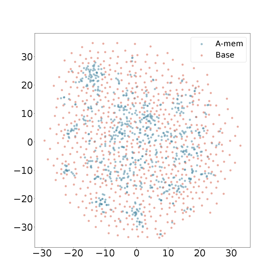
## Scatter Plot: A-mem vs. Base
### Overview
This image presents a scatter plot comparing two datasets, labeled "A-mem" and "Base". The plot displays the distribution of data points across a two-dimensional space, with values ranging approximately from -30 to 30 on both the x and y axes. The data appears to be randomly distributed, with some clustering visible.
### Components/Axes
* **X-axis:** Ranges from approximately -30 to 30, unlabeled.
* **Y-axis:** Ranges from approximately -30 to 30, unlabeled.
* **Legend:** Located in the top-right corner.
* "A-mem" - Represented by blue dots.
* "Base" - Represented by orange/red dots.
### Detailed Analysis
The plot contains a large number of data points for both "A-mem" and "Base". Due to the density of points, precise numerical values cannot be extracted without further data. However, we can describe the general distribution.
**A-mem (Blue Dots):**
The "A-mem" data points are distributed across the entire range of both axes. There appears to be a slight concentration of points in the region between x = -10 and x = 10, and y = -10 and y = 10. There is also a noticeable cluster of points with x values between -20 and 0, and y values between 10 and 25. The distribution appears roughly symmetrical around the y-axis.
**Base (Orange/Red Dots):**
The "Base" data points are also widely distributed. They appear to be more evenly spread across the entire range of both axes compared to "A-mem". There is a concentration of points in the lower half of the plot (y < 0), particularly between x = -20 and x = 20. There is also a cluster of points with x values between 0 and 20, and y values between 10 and 30.
### Key Observations
* The "Base" dataset appears to have a wider spread along the y-axis than the "A-mem" dataset.
* Both datasets exhibit a degree of clustering, but the clusters are not sharply defined.
* There is significant overlap between the two datasets, making it difficult to visually distinguish them in certain regions of the plot.
* The distributions appear roughly symmetrical around the y-axis.
### Interpretation
The scatter plot suggests that the "A-mem" and "Base" datasets represent two different distributions of values. The wider spread of the "Base" dataset along the y-axis indicates greater variability in that dataset. The clustering observed in both datasets suggests that there may be underlying patterns or groupings within the data. The overlap between the datasets indicates that there is some similarity between the two distributions, but also that they are distinct.
Without knowing what the x and y axes represent, it is difficult to draw more specific conclusions. However, the plot could be used to compare the characteristics of two different populations, or to assess the relationship between two variables. The lack of clear separation between the datasets suggests that there may not be a strong correlation between the variables being plotted. Further statistical analysis would be needed to confirm these observations and to determine the significance of any differences between the datasets.