\n
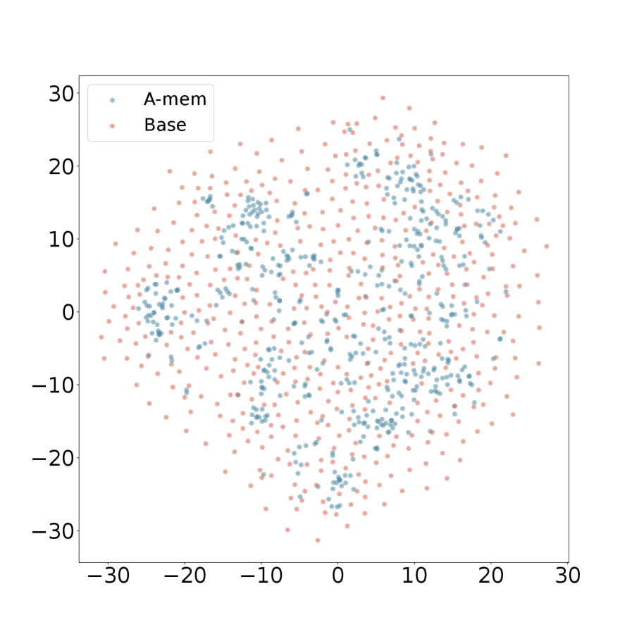
## Scatter Plot: A-mem vs. Base
### Overview
The image presents a scatter plot comparing two datasets, labeled "A-mem" and "Base". The plot displays the distribution of data points across a two-dimensional space, with both axes ranging from approximately -30 to 30. The data appears to be randomly distributed, with some clustering observed.
### Components/Axes
* **X-axis:** Ranges from approximately -30 to 30. No explicit label is provided.
* **Y-axis:** Ranges from approximately -30 to 30. No explicit label is provided.
* **Legend:** Located in the top-left corner.
* "A-mem": Represented by blue dots.
* "Base": Represented by orange dots.
### Detailed Analysis
The plot contains a large number of data points for both "A-mem" and "Base". Due to the density of points, precise numerical values cannot be extracted without further data. However, we can describe the distribution:
* **A-mem (Blue Dots):** The points are generally concentrated between x = -15 and x = 15, and between y = -15 and y = 20. There is a slight tendency for points to cluster around y = 10. The distribution appears relatively uniform within this range.
* **Base (Orange Dots):** The points are more widely distributed, with a noticeable concentration in the lower half of the plot (y < 0). There is a cluster of points around x = -10 to x = 10 and y = -10 to y = 0. There is also a significant number of points with negative y-values, extending down to approximately y = -30.
The data points are scattered, suggesting a lack of strong correlation between the x and y values for either dataset.
### Key Observations
* The "Base" dataset appears to have a wider distribution than the "A-mem" dataset.
* The "A-mem" dataset is more concentrated in the upper portion of the plot, while the "Base" dataset is more evenly distributed across the entire range.
* There is significant overlap between the two datasets, making it difficult to visually separate them.
* No clear trends or patterns are immediately apparent.
### Interpretation
The scatter plot suggests that the two datasets, "A-mem" and "Base", represent independent variables or have a very weak correlation. The wider distribution of the "Base" dataset could indicate greater variability or a larger sample size. The concentration of "A-mem" points in the upper portion of the plot might suggest a systematic difference between the two datasets, but further statistical analysis would be needed to confirm this. Without knowing what the axes represent, it's difficult to draw definitive conclusions. The plot could be visualizing the relationship between two features in a dataset, or it could be comparing the performance of two different algorithms or models. The lack of a clear trend suggests that neither dataset consistently outperforms the other, or that the relationship is non-linear and not captured by a simple scatter plot.