## Scatter Plot: A-mem vs. Base Distribution
### Overview
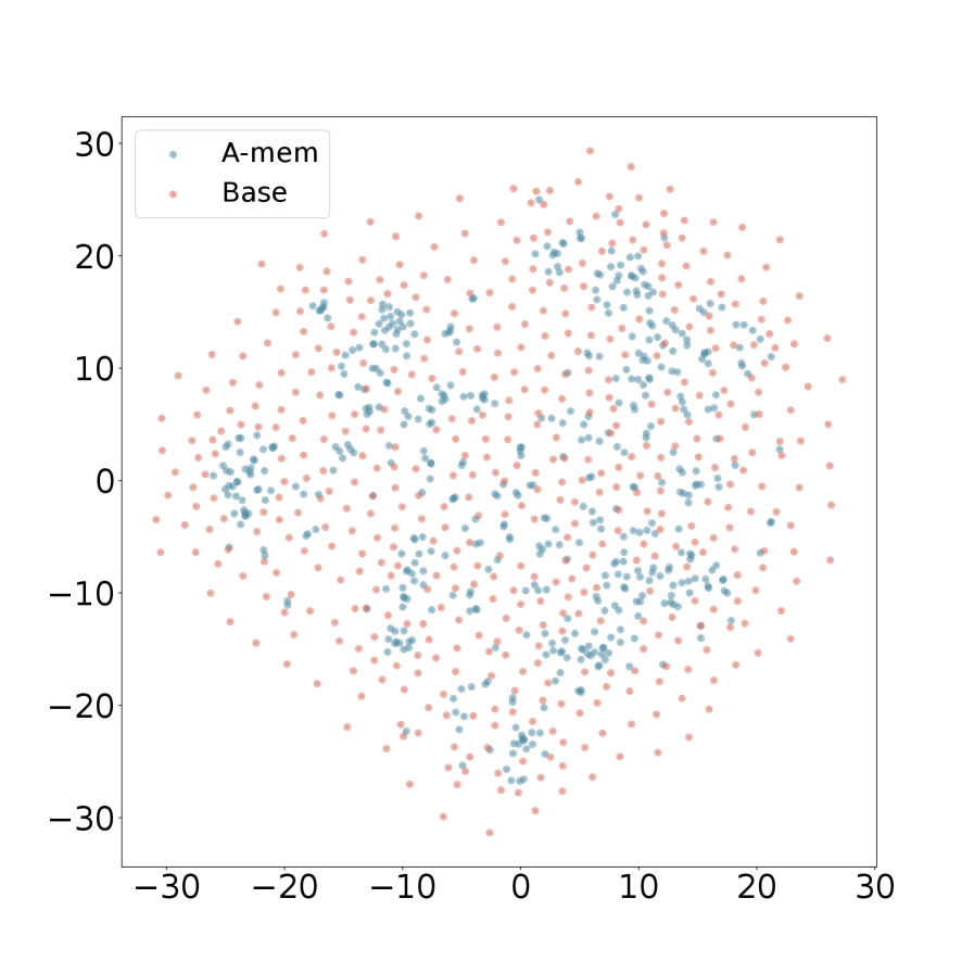
The image is a 2D scatter plot comparing the spatial distribution of two data series, labeled "A-mem" and "Base". The plot displays a cloud of points on a Cartesian coordinate system, with both axes ranging from approximately -30 to +30. The data appears to represent some form of embedding or latent space visualization, where the relative positions and clustering of points are the primary information.
### Components/Axes
* **Plot Type:** Scatter Plot.
* **X-Axis:** Linear scale. Major tick marks and labels are present at intervals of 10: -30, -20, -10, 0, 10, 20, 30. There is no explicit axis title.
* **Y-Axis:** Linear scale. Major tick marks and labels are present at intervals of 10: -30, -20, -10, 0, 10, 20, 30. There is no explicit axis title.
* **Legend:** Located in the top-left corner of the plot area. It contains two entries:
* A blue-gray dot labeled **"A-mem"**.
* A salmon/light red dot labeled **"Base"**.
* **Data Points:** Hundreds of individual points are plotted, corresponding to the two series defined in the legend.
### Detailed Analysis
**1. Data Series "A-mem" (Blue-Gray Points):**
* **Visual Trend:** These points form a relatively dense, centrally concentrated cluster. The distribution appears roughly circular or elliptical, centered near the origin (0,0).
* **Spatial Distribution:** The highest density of "A-mem" points is within the region bounded approximately by X: [-15, 15] and Y: [-15, 15]. The points become sparser as you move away from this central region. Very few "A-mem" points are located beyond ±20 on either axis.
* **Approximate Bounds:** The visible extremes for this series are roughly X: [-20, 20] and Y: [-20, 20].
**2. Data Series "Base" (Salmon/Light Red Points):**
* **Visual Trend:** These points are much more widely dispersed across the entire plot area. They do not form a single tight cluster but instead create a broad, diffuse cloud.
* **Spatial Distribution:** "Base" points are found throughout the range of the axes, from approximately -30 to +30 on both X and Y. They completely surround the denser "A-mem" cluster. The density of "Base" points appears more uniform compared to the peaked density of "A-mem".
* **Approximate Bounds:** The visible extremes for this series span nearly the full axis ranges: X: [-30, 30] and Y: [-30, 30].
**3. Relationship Between Series:**
* The "A-mem" distribution is entirely contained within the spatial extent of the "Base" distribution.
* There is significant overlap between the two series in the central region of the plot (roughly within ±15 on both axes).
* The outer periphery of the plot (beyond ±20) is populated almost exclusively by "Base" points.
### Key Observations
* **Variance Difference:** The most striking observation is the difference in variance or spread. "A-mem" exhibits low variance (tight clustering), while "Base" exhibits high variance (wide dispersion).
* **Central Tendency:** Both distributions appear to be centered around the origin (0,0), but "A-mem" has a much stronger central tendency.
* **No Clear Outliers:** Given the diffuse nature of the "Base" series, no single point can be definitively labeled an outlier relative to its own series. However, all "A-mem" points could be considered outliers relative to the full spatial range defined by the "Base" series.
* **Missing Context:** The plot lacks axis titles, a main title, or any descriptive caption. This omits crucial information about what the axes represent (e.g., dimensions, features, coordinates) and the overall subject of the comparison.
### Interpretation
This scatter plot visually demonstrates a fundamental difference in the structure of two datasets or model outputs, "A-mem" and "Base".
* **What the data suggests:** The "A-mem" data is highly constrained or focused within a specific region of the feature space represented by the axes. This could indicate a model that produces consistent, similar outputs ("A-mem") or a dataset with low intrinsic dimensionality. In contrast, the "Base" data is highly variable and explores a much broader region of the space, suggesting a model with higher entropy, a more diverse dataset, or a less constrained process.
* **How elements relate:** The containment of the "A-mem" cluster within the "Base" cloud implies that the "A-mem" distribution may be a specialized, refined, or converged subset of the more general "Base" distribution. It could represent the result of a training process, a filtering operation, or a more focused sampling strategy applied to the "Base" population.
* **Notable implications:** Without axis labels, the practical significance is abstract. However, in contexts like machine learning (e.g., visualizing word embeddings, model activations, or generative model outputs), this pattern is classic. It often shows a baseline or random model ("Base") producing scattered, unstructured representations, while a trained or specialized model ("A-mem") organizes its representations into a tighter, more meaningful cluster. The plot argues for the effectiveness of whatever process "A-mem" represents in reducing variance and creating consistency.