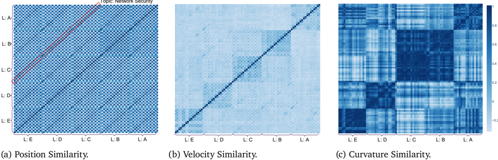
## Heatmap Composite: Network Security Similarity Matrices
### Overview
The image displays three square heatmap plots arranged horizontally, each representing a different type of similarity metric applied to a dataset labeled under the topic "Network Security." The plots are labeled (a) Position Similarity, (b) Velocity Similarity, and (c) Curvature Similarity. All three share identical axis labels and a common color scale.
### Components/Axes
* **Main Title:** "Topic: Network Security" (centered at the top).
* **Subplot Titles:**
* (a) Position Similarity.
* (b) Velocity Similarity.
* (c) Curvature Similarity.
* **Axes:** All three plots have identical x and y axes.
* **Y-axis Labels (from top to bottom):** L:A, L:B, L:C, L:D, L:E.
* **X-axis Labels (from left to right):** L:E, L:D, L:C, L:B, L:A.
* **Note:** The x-axis order is the reverse of the y-axis order.
* **Color Scale/Legend:** A vertical color bar is positioned to the right of plot (c).
* **Scale Range:** Approximately -0.2 to 0.8.
* **Color Mapping:** Light blue/white represents low values (~-0.2 to 0), medium blue represents mid-range values (~0.2 to 0.4), and dark blue represents high values (~0.6 to 0.8).
* **Annotations:** Plot (a) contains two red annotations:
1. A red diagonal line drawn from the top-left corner (L:A, L:A) to the bottom-right corner (L:E, L:E).
2. A red circle highlighting the intersection point on the y-axis at label "L:C".
### Detailed Analysis
**Plot (a) Position Similarity:**
* **Visual Trend:** The matrix is predominantly a uniform, medium-dark blue, indicating consistently high similarity values across most pairs.
* **Key Features:**
* The main diagonal (from top-left to bottom-right) is a very dark blue line, representing the maximum similarity (value ~0.8) of each item with itself.
* The red diagonal line annotation overlays this dark blue diagonal.
* The red circle highlights the "L:C" row on the y-axis.
* The off-diagonal areas show a fine-grained, checkerboard-like pattern of slightly varying blue shades, but the overall contrast is low.
**Plot (b) Velocity Similarity:**
* **Visual Trend:** This matrix shows more variation than (a). It has a clear dark blue diagonal, but the off-diagonal areas are generally lighter.
* **Key Features:**
* The main diagonal is dark blue (value ~0.8).
* There are distinct, lighter blue (lower similarity) rectangular blocks in the off-diagonal regions. For example, the block corresponding to rows L:A-L:B and columns L:D-L:E is notably lighter.
* The overall pattern suggests that while self-similarity is high, the "velocity" similarity between different items (L:A through L:E) is more variable and generally lower than their position similarity.
**Plot (c) Curvature Similarity:**
* **Visual Trend:** This matrix exhibits the most pronounced block structure and variation.
* **Key Features:**
* The main diagonal is dark blue (value ~0.8).
* Strong, dark blue square blocks are visible along the diagonal, particularly centered around the L:C and L:D labels. This indicates clusters of items (e.g., L:C with L:D) that have very high curvature similarity with each other.
* The off-diagonal areas between these blocks are much lighter, indicating low similarity between items in different clusters.
* The pattern is highly structured, suggesting distinct groupings within the data based on the curvature metric.
### Key Observations
1. **Metric Divergence:** The three similarity metrics (Position, Velocity, Curvature) produce markedly different patterns for the same set of items (L:A to L:E). Position similarity is high and uniform, velocity similarity is moderate with some block structure, and curvature similarity is highly clustered.
2. **Cluster Identification:** Plot (c) most clearly identifies potential clusters. Items L:C and L:D appear to form a tight cluster with high mutual curvature similarity. Items L:A and L:B may form another, less tight cluster.
3. **Diagonal Consistency:** The dark blue diagonal in all plots confirms the expected property that each item is perfectly similar to itself across all metrics.
4. **Axis Order:** The reversed x-axis (L:E to L:A) versus the y-axis (L:A to L:E) means the main diagonal runs from the top-left to bottom-right, which is standard for a similarity matrix where rows and columns represent the same ordered set.
### Interpretation
This composite figure is a technical visualization likely from a research paper or analysis report on network security data. It compares how five entities (labeled L:A through L:E, which could represent network layers, log sources, attack patterns, or security events) relate to each other under three different analytical lenses:
* **Position Similarity (a):** Suggests the entities are fundamentally similar in their static "position" or state within the network security landscape. The high, uniform similarity implies they share many core characteristics.
* **Velocity Similarity (b):** Indicates that the rate or direction of change ("velocity") of these entities is less uniform. Some pairs change in similar ways (darker blue blocks), while others diverge, hinting at different dynamic behaviors.
* **Curvature Similarity (c):** Reveals the underlying structure or "shape" of the relationships. The strong block patterns suggest the entities naturally group into distinct clusters based on their curvature. This is the most discriminative metric shown, effectively separating the five items into what appears to be two or three groups.
**Conclusion:** The data demonstrates that while the network security entities may appear similar on the surface (Position), their dynamic behaviors (Velocity) and intrinsic relational structures (Curvature) are more nuanced and clustered. The curvature analysis is particularly valuable for identifying meaningful subgroups within the data, which could be critical for tasks like threat clustering, anomaly detection, or policy segmentation in a network security context. The red annotations in plot (a) may be highlighting a specific item (L:C) for further discussion in the source document.