## Chart Type: Radar Chart
### Overview
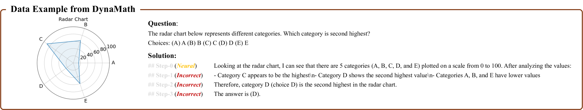
The image presents a radar chart displaying five categories (A, B, C, D, and E) with values ranging from 0 to 100. The chart is accompanied by a question asking which category has the second-highest value, along with a solution.
### Components/Axes
* **Title:** Radar Chart
* **Categories:** A, B, C, D, E (arranged clockwise around the chart)
* **Scale:** 0 to 100 (represented by concentric circles, with markers at 20, 40, 60, 80, and 100)
* **Data Representation:** A blue shaded area connecting the values for each category.
### Detailed Analysis
* **Category A:** Approximately 30
* **Category B:** Approximately 40
* **Category C:** Approximately 85
* **Category D:** Approximately 70
* **Category E:** Approximately 20
### Key Observations
* Category C has the highest value.
* Category D has the second-highest value.
* Categories A, B, and E have significantly lower values compared to C and D.
### Interpretation
The radar chart visually represents the relative values of five different categories. The solution correctly identifies category D as having the second-highest value. The chart allows for a quick comparison of the categories and their respective magnitudes. The question and solution demonstrate how to interpret the data presented in the radar chart.