\n
## Radar Chart: Data Example from DynaMath
### Overview
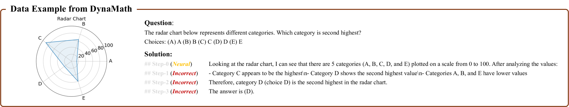
The image presents a radar chart alongside a question, multiple-choice answers, and a step-by-step solution. The radar chart visually represents data for five categories (A, B, C, D, and E) on a scale from 0 to 100. The question asks which category is second highest. The solution attempts to identify the second highest category through a series of steps, but incorrectly identifies the answer.
### Components/Axes
* **Chart Type:** Radar Chart (also known as Spider Chart or Star Chart)
* **Categories:** A, B, C, D, E
* **Scale:** 0 to 100, marked at intervals of 20 (20, 40, 60, 80, 100)
* **Axes:** Five radial axes, one for each category, emanating from the center.
* **Question:** "The radar chart below represents different categories. Which category is second highest?"
* **Choices:** (A) A, (B) B, (C) C, (D) D, (E) E
* **Solution Steps:**
* Step 0 (Neutral): "Looking at the radar chart, I can see that there are 5 categories (A, B, C, D, and E) plotted on a scale from 0 to 100. After analyzing the values:"
* Step 1 (Incorrect): "Category C appears to be the highest- Category D shows the second highest value- Categories A, B, and E have lower values"
* Step 2 (Incorrect): "Therefore, category D (choice D) is the second highest in the radar chart."
* Step 3 (Incorrect): "The answer is (D)."
### Detailed Analysis or Content Details
The radar chart shows the following approximate values:
* **Category A:** ~30
* **Category B:** ~10
* **Category C:** ~90
* **Category D:** ~70
* **Category E:** ~20
The lines representing each category extend from the center of the chart to the corresponding value on its axis. The chart is positioned in the top-left corner of the image. The question and solution are positioned to the right of the chart.
### Key Observations
* Category C has the highest value.
* Category B and E have the lowest values.
* The solution incorrectly identifies Category D as the second highest. Category D is indeed higher than A, B, and E, but is lower than C.
* The solution steps are labeled with their correctness (Neutral, Incorrect).
### Interpretation
The radar chart is used to visually compare the values of five different categories. The question tests the ability to interpret the chart and identify the second highest category. The provided solution demonstrates a misunderstanding of the chart, incorrectly identifying Category D as the second highest. The chart clearly shows Category C as the highest, and Category D as the second highest. The solution's error highlights the importance of careful visual analysis when interpreting charts and graphs. The labeling of the solution steps as "Incorrect" suggests this is a learning example, designed to illustrate common mistakes in data interpretation.