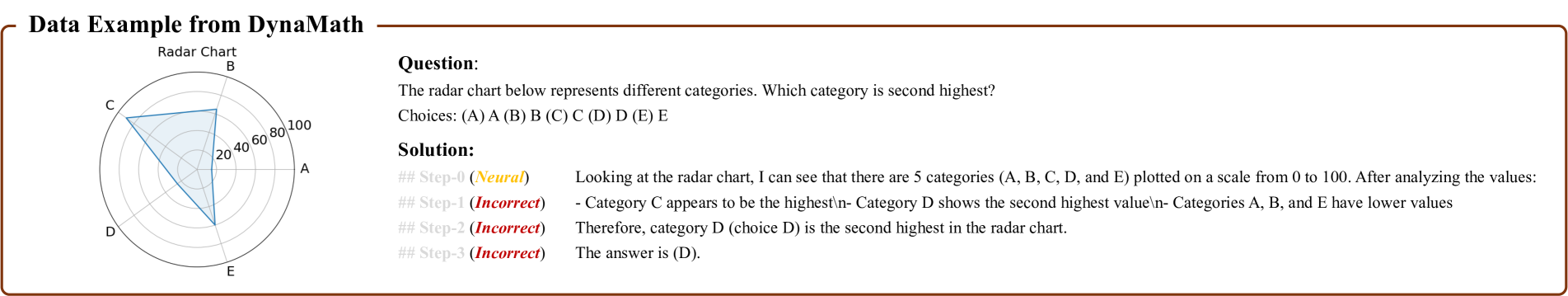
## Radar Chart: DynaMath Data Example
### Overview
The image displays a technical document or problem card from a dataset or system named "DynaMath." It consists of two primary sections: a radar chart on the left and a textual question-and-solution block on the right. The entire content is enclosed within a thin brown border.
### Components/Axes
**1. Radar Chart (Left Side):**
* **Title:** "Radar Chart" (centered above the chart).
* **Axes/Categories:** Five categories are plotted radially, labeled with single letters:
* **A** (positioned at approximately 3 o'clock)
* **B** (positioned at approximately 12 o'clock)
* **C** (positioned at approximately 10 o'clock)
* **D** (positioned at approximately 8 o'clock)
* **E** (positioned at approximately 6 o'clock)
* **Scale:** Concentric circles represent the scale, with markers at **20, 40, 60, 80, and 100**. The center represents 0.
* **Data Series:** A single data series is plotted as a blue, semi-transparent polygon connecting points on each category axis.
**2. Text Block (Right Side):**
* **Main Title:** "Data Example from DynaMath" (top, bold, left-aligned).
* **Question Section:**
* **Label:** "Question:" (bold).
* **Text:** "The radar chart below represents different categories. Which category is second highest?"
* **Choices:** "Choices: (A) A (B) B (C) C (D) D (E) E"
* **Solution Section:**
* **Label:** "Solution:" (bold).
* **Step-0:** Labeled "(Neural)" in yellow text. Text: "Looking at the radar chart, I can see that there are 5 categories (A, B, C, D, and E) plotted on a scale from 0 to 100. After analyzing the values:"
* **Step-1:** Labeled "(Incorrect)" in red text. Text: "- Category C appears to be the highest\n- Category D shows the second highest value\n- Categories A, B, and E have lower values"
* **Step-2:** Labeled "(Incorrect)" in red text. Text: "Therefore, category D (choice D) is the second highest in the radar chart."
* **Step-3:** Labeled "(Incorrect)" in red text. Text: "The answer is (D)."
### Detailed Analysis
**Chart Data Extraction (Estimated Values):**
Based on visual inspection of the blue polygon's vertices against the concentric scale:
* **Category C:** The vertex extends to the outermost ring, indicating a value of **~100**.
* **Category D:** The vertex is between the 80 and 100 rings, closer to 100. Estimated value: **~90**.
* **Category B:** The vertex is between the 60 and 80 rings. Estimated value: **~70**.
* **Category A:** The vertex is between the 40 and 60 rings. Estimated value: **~50**.
* **Category E:** The vertex is between the 20 and 40 rings. Estimated value: **~30**.
**Text Transcription:**
All text is in English. The transcription is provided above in the Components section. Notable formatting includes the use of bold for labels ("Question:", "Solution:"), colored text for step annotations (yellow for "Neural", red for "Incorrect"), and a line break (`\n`) in the Step-1 text.
### Key Observations
1. **Data Ranking:** Visually, the order from highest to lowest value is: **C (~100) > D (~90) > B (~70) > A (~50) > E (~30)**.
2. **Solution Discrepancy:** The provided "Solution" text correctly identifies C as highest and D as second highest in Step-1. However, every step of this solution (Step-0 through Step-3) is annotated as either "(Neural)" or, more prominently, **"(Incorrect)"**.
3. **Final Answer:** The solution concludes with "The answer is (D)." Given the visual data, this conclusion (that D is second highest) appears factually correct based on the chart, yet the system labels the entire reasoning chain as incorrect.
### Interpretation
This image is not a presentation of raw data but a **meta-example of an AI or automated reasoning system's output**. The core informational content is twofold:
1. **The Radar Chart Data:** It presents a simple, clear dataset where category C has the maximum value (100) and category D has the second-highest value (~90). The chart is designed for straightforward visual comparison.
2. **The Reasoning Process Artifact:** The more significant information lies in the structure and annotations of the "Solution." The labels "(Neural)" and "(Incorrect)" suggest this is a logged output from a model (possibly a neural network) being evaluated. The fact that a logically sound conclusion (D is second highest) is marked "Incorrect" implies one of two scenarios:
* **The evaluation is about the *process*, not the answer:** The system may be flagging the reasoning steps as flawed (e.g., lacking precision, using informal language like "appears to be") even though the final answer is correct.
* **There is an external ground truth mismatch:** The dataset ("DynaMath") may have a different correct answer for this specific chart, making the model's conclusion wrong despite its visual plausibility. This would indicate a potential error in the chart's rendering or the dataset's answer key.
The image serves as a diagnostic or training example, highlighting the challenge of aligning visual data interpretation with formal reasoning validation. It demonstrates that in technical AI evaluation, correctness is not solely about the final output but also about the trace and quality of the steps taken to reach it.