## Radar Chart: Data Example from DynaMath
### Overview
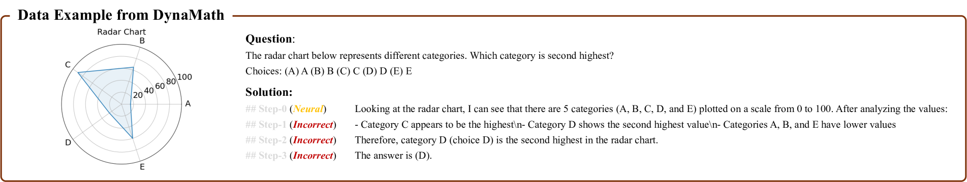
The image displays a radar chart titled "Data Example from DynaMath," which visualizes performance across five categories (A, B, C, D, E) on a scale from 0 to 100. The chart includes a shaded triangular area representing data values, with a legend on the right associating colors with solution steps. The solution text is embedded on the right side of the chart.
---
### Components/Axes
- **Categories (Axes):**
- A, B, C, D, E (labeled clockwise around the radar chart).
- Scale: 0 to 100, with increments of 20 (20, 40, 60, 80, 100).
- **Legend:**
- Step 0: Yellow (`# Step-0 (Neural)`).
- Steps 1–3: Red (`# Step-1 (Incorrect)`, `# Step-2 (Incorrect)`, `# Step-3 (Incorrect)`).
- **Solution Text:**
- Embedded on the right side, explaining the analysis process.
---
### Detailed Analysis
- **Category Values (Approximate):**
- **C:** Highest value (likely 80–100, based on the shaded area's peak).
- **D:** Second-highest value (likely 60–80).
- **A, B, E:** Lower values (likely below 60, with minimal differentiation).
- **Solution Steps:**
- **Step 0 (Neural):** Identifies categories and scale.
- **Steps 1–3 (Incorrect):** Misidentifies the second-highest category as C, then D, then concludes D is correct.
---
### Key Observations
1. **Category C** dominates the radar chart, indicating the highest performance.
2. **Category D** is the second-highest, with values significantly lower than C but higher than A, B, and E.
3. **A, B, and E** cluster near the lower end of the scale, showing minimal performance.
4. The solution text contains logical inconsistencies (e.g., mislabeling categories during analysis).
---
### Interpretation
- The radar chart demonstrates a clear hierarchy: **C > D > A/B/E**.
- The solution process highlights common errors in interpreting radar charts, such as misjudging relative values.
- The color-coded steps (yellow for initial analysis, red for errors) emphasize the importance of systematic evaluation.
- While exact numerical values are not provided, the shaded area’s geometry suggests approximate ranges for each category.
---
### Spatial Grounding
- **Radar Chart:** Left side of the image.
- **Legend:** Right side, aligned vertically.
- **Solution Text:** Right side, below the legend.
- **Color Consistency:** Step 0 (yellow) and Steps 1–3 (red) match the legend labels.
---
### Content Details
- **Text Transcription:**
- **Question:** "The radar chart below represents different categories. Which category is second highest?"
- **Choices:** (A) A, (B) B, (C) C, (D) D, (E) E.
- **Solution:**
- Step 0: Identifies categories and scale.
- Step 1: Incorrectly labels C as highest.
- Step 2: Correctly identifies D as second-highest.
- Step 3: Concludes D is the answer.
---
### Final Answer
The second-highest category is **(D) D**, as confirmed by the solution text despite initial missteps in the analysis.