## Heatmap Comparison: Position vs. Velocity Similarity
### Overview
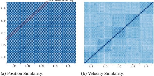
The image displays two side-by-side heatmap visualizations, labeled (a) and (b), comparing two different similarity metrics for a dataset related to "Network Security." Both heatmaps are square matrices with identical axis labels, suggesting they compare the same set of entities (likely layers or levels, denoted "L:") using different criteria.
### Components/Axes
* **Overall Title/Topic:** "Topic: Network Security" is displayed at the top center, spanning both charts.
* **Chart (a) Title:** "(a) Position Similarity." located below the left heatmap.
* **Chart (b) Title:** "(b) Velocity Similarity." located below the right heatmap.
* **Axes (Both Charts):**
* **Y-axis (Vertical):** Labels from top to bottom: `L:A`, `L:B`, `L:C`, `L:D`, `L:E`.
* **X-axis (Horizontal):** Labels from left to right: `L:E`, `L:D`, `L:C`, `L:B`, `L:A`.
* **Note:** The x-axis order is the reverse of the y-axis order. This creates a matrix where the diagonal runs from the bottom-left corner to the top-right corner.
* **Legend/Color Scale:** No explicit legend or color bar is present in the image. The similarity values are represented by a blue color gradient, where darker shades of blue indicate higher similarity and lighter shades indicate lower similarity. The exact numerical mapping is not provided.
* **Key Visual Element (Chart a):** A solid red line is drawn along the main diagonal from the bottom-left (`L:E` vs. `L:E`) to the top-right (`L:A` vs. `L:A`). This line highlights the perfect self-similarity of each entity.
### Detailed Analysis
**Chart (a): Position Similarity**
* **Visual Trend:** The heatmap exhibits a distinct, high-contrast checkered or grid-like pattern. Dark blue squares (high similarity) are not confined to the diagonal but appear in a regular, repeating pattern across the entire matrix.
* **Data Points & Pattern:**
* The diagonal (marked by the red line) is dark blue, indicating perfect similarity of each layer with itself.
* There is a strong, repeating pattern of dark blue blocks. For example, the intersection of `L:A` (y-axis) with `L:C` (x-axis) is dark blue, as is `L:A` with `L:E`. Similarly, `L:B` shows high similarity with `L:D`.
* This pattern suggests that "Position Similarity" between layers is not solely determined by their adjacency or order. Instead, it reveals a structured, possibly periodic or hierarchical relationship where certain non-adjacent layers (e.g., A with C, B with D) are highly similar in terms of "position."
**Chart (b): Velocity Similarity**
* **Visual Trend:** This heatmap is predominantly a uniform light blue, with a single, sharp, dark blue line running along the main diagonal (from bottom-left to top-right).
* **Data Points & Pattern:**
* The diagonal is dark blue, indicating perfect similarity of each layer's "velocity" with itself.
* All off-diagonal cells are a very similar, light blue shade. This indicates that the "Velocity Similarity" between any two *different* layers (e.g., `L:A` vs. `L:B`, `L:C` vs. `L:E`) is uniformly low.
* The pattern is simple and stark: high similarity only exists for self-comparison.
### Key Observations
1. **Contrasting Patterns:** The most striking observation is the fundamental difference in pattern between the two metrics. Position Similarity shows a complex, structured grid of relationships, while Velocity Similarity shows a simple, diagonal-only relationship.
2. **Axis Order:** The reversed x-axis order (`L:E` to `L:A`) is a deliberate design choice that places the `L:A` vs. `L:A` comparison in the top-right corner, which is atypical for similarity matrices (often placed top-left). The red line in chart (a) helps the viewer track the diagonal.
3. **Implied Data Structure:** The labels `L:A` through `L:E` suggest five distinct layers or levels within the "Network Security" topic. The analysis compares how similar these layers are based on two different attributes: their "position" and their "velocity."
### Interpretation
These heatmaps provide a comparative analysis of two dimensions of similarity within a network security model.
* **What the Data Suggests:** The "Position" of a layer (which could refer to its location in a network topology, its rank in a hierarchy, or its stage in a process) has a complex, non-local relationship with other layers. Layers can be highly similar in position even if they are not neighbors (e.g., A and C). This might indicate functional equivalence, shared protocols, or common vulnerabilities between non-adjacent layers.
* **In contrast, the "Velocity" of a layer (which could refer to the speed of data flow, rate of change, or propagation speed of threats) appears to be a unique, intrinsic property.** Each layer's velocity profile is distinct from all others, as shown by the near-zero similarity between any two different layers. This suggests that monitoring or controlling "velocity" is layer-specific; what happens in one layer's velocity domain does not strongly correlate with another's.
* **Why It Matters:** For network security, this analysis is crucial. It implies that:
* **Defensive strategies based on "position"** (e.g., segmentation, access controls) must account for hidden similarities between non-adjacent network segments. A threat in Layer A might have a similar "positional" profile to Layer C, potentially allowing for lateral movement or similar attack vectors.
* **Defensive strategies based on "velocity"** (e.g., anomaly detection for traffic speed, rate limiting) can be tuned independently for each layer. An anomaly in Layer B's velocity is unlikely to be mirrored in Layer C's, making detection more precise but also requiring layer-specific baselines.
* **Anomaly/Outlier:** The red line in chart (a) is not a data outlier but an annotation. The true outlier is the stark difference between the two charts themselves, highlighting that the choice of similarity metric fundamentally changes the perceived relationships between the system's components.