## Chart Type: Pie Chart
### Overview
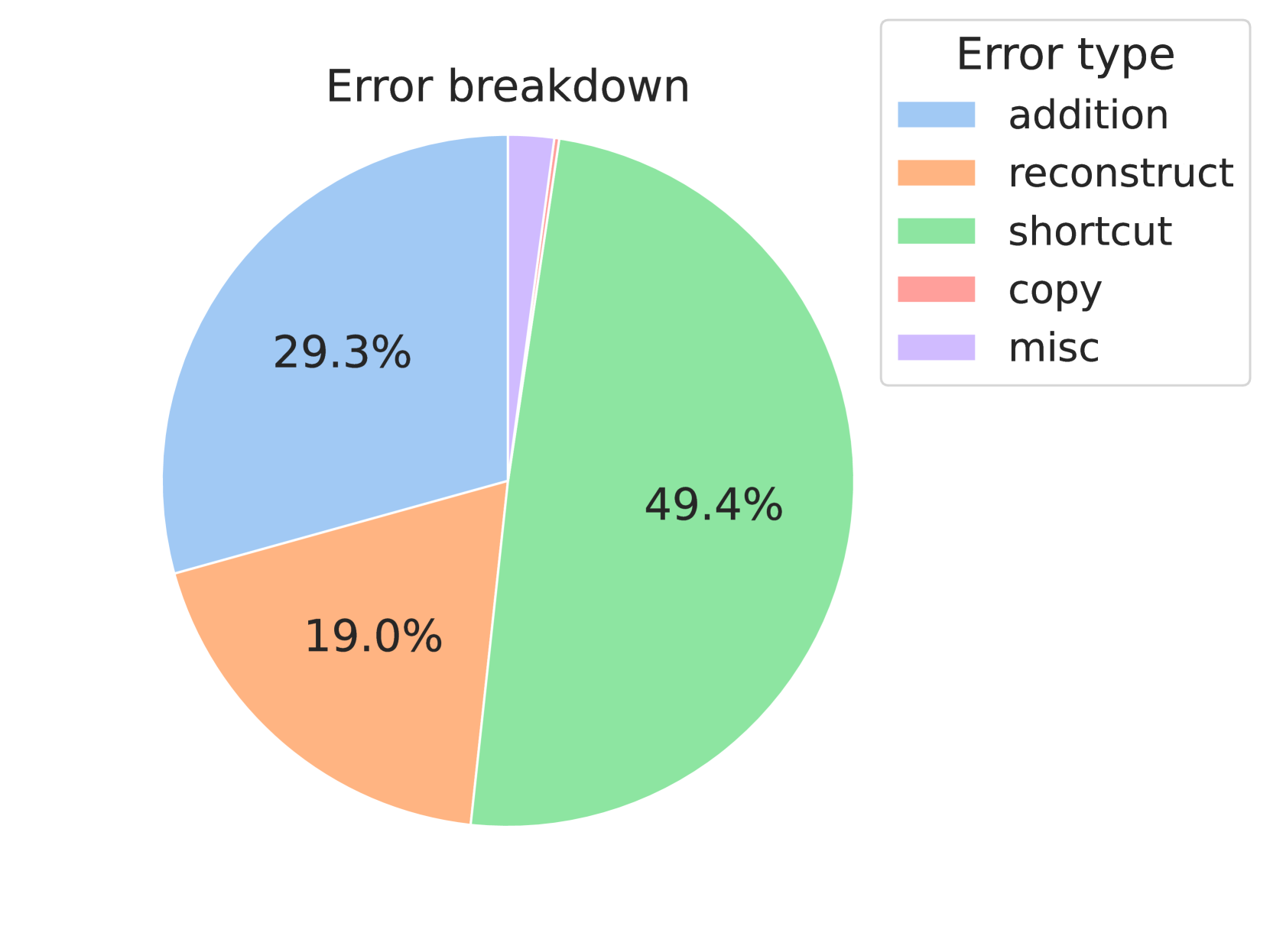
The image is a pie chart titled "Error breakdown". It shows the distribution of different error types, with each slice representing a specific error category and its corresponding percentage. The legend on the top-right corner identifies each error type by color.
### Components/Axes
* **Title:** Error breakdown
* **Legend (Top-Right):** Error type
* **Addition:** Light Blue
* **Reconstruct:** Light Orange
* **Shortcut:** Light Green
* **Copy:** Light Red
* **Misc:** Light Purple
### Detailed Analysis
The pie chart is divided into five slices, each representing a different error type. The percentages are displayed directly on the slices.
* **Addition (Light Blue):** 29.3%
* **Reconstruct (Light Orange):** 19.0%
* **Shortcut (Light Green):** 49.4%
* **Copy (Light Red):** The copy slice is very small, and the percentage is not directly labeled on the chart. Based on the remaining percentage, it is approximately 1.3%.
* **Misc (Light Purple):** The misc slice is very small, and the percentage is not directly labeled on the chart. Based on the remaining percentage, it is approximately 1.0%.
### Key Observations
* The "Shortcut" error type accounts for the largest portion of errors, representing 49.4% of the total.
* "Addition" errors make up the second-largest portion, at 29.3%.
* "Reconstruct" errors account for 19.0%.
* "Copy" and "Misc" errors are relatively small, accounting for approximately 1.3% and 1.0% respectively.
### Interpretation
The pie chart provides a clear visual representation of the distribution of different error types. The dominance of "Shortcut" errors suggests that this area should be prioritized for improvement efforts. The relatively small percentages of "Copy" and "Misc" errors indicate that these may be less critical areas to focus on, although they should still be monitored. The data suggests that addressing "Shortcut" and "Addition" errors would have the most significant impact on reducing overall errors.