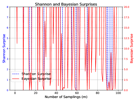
## Line Chart: Shannon and Bayesian Surprises
### Overview
The image presents a line chart comparing Shannon Surprise and Bayesian Surprise over a range of sampling points. The chart displays two fluctuating lines, one representing Shannon Surprise (dashed blue line) and the other representing Bayesian Surprise (solid red line). The x-axis represents the number of samplings, and the y-axes represent the respective surprise values.
### Components/Axes
* **Title:** "Shannon and Bayesian Surprises" (centered at the top)
* **X-axis:** "Number of Samplings (m)" - Scale ranges from approximately 0 to 100, with tick marks at intervals of 10.
* **Left Y-axis:** "Shannon Surprise" - Scale ranges from 0 to 8, with tick marks at intervals of 1.
* **Right Y-axis:** "Bayesian Surprise" - Scale ranges from 0 to 20, with tick marks at intervals of 2.5.
* **Legend:** Located in the bottom-left corner.
* "Shannon Surprise" - Represented by a dashed blue line.
* "Bayesian Surprise" - Represented by a solid red line.
* **Gridlines:** Horizontal and vertical gridlines are present to aid in reading values.
### Detailed Analysis
**Shannon Surprise (Dashed Blue Line):**
The Shannon Surprise line exhibits a highly oscillatory pattern. It fluctuates rapidly between approximately 0 and 8.
* At x = 0, y ≈ 0.
* At x = 10, y ≈ 7.
* At x = 20, y ≈ 0.
* At x = 30, y ≈ 6.
* At x = 40, y ≈ 0.
* At x = 50, y ≈ 5.
* At x = 60, y ≈ 0.
* At x = 70, y ≈ 4.
* At x = 80, y ≈ 0.
* At x = 90, y ≈ 2.
* At x = 100, y ≈ 0.
**Bayesian Surprise (Solid Red Line):**
The Bayesian Surprise line also shows a highly oscillatory pattern, but with a larger amplitude and generally higher values. It fluctuates between approximately 0 and 18.
* At x = 0, y ≈ 1.
* At x = 10, y ≈ 17.
* At x = 20, y ≈ 1.
* At x = 30, y ≈ 15.
* At x = 40, y ≈ 1.
* At x = 50, y ≈ 13.
* At x = 60, y ≈ 2.
* At x = 70, y ≈ 10.
* At x = 80, y ≈ 1.
* At x = 90, y ≈ 8.
* At x = 100, y ≈ 2.
### Key Observations
* Both surprise measures exhibit a strong oscillatory behavior, suggesting a periodic or fluctuating underlying process.
* Bayesian Surprise generally has a much larger range of values than Shannon Surprise.
* The peaks and troughs of the two lines do not perfectly align, indicating that the two measures capture different aspects of the "surprise" associated with the sampled data.
* The lines appear to be somewhat correlated, as periods of high surprise in one measure often correspond to periods of relatively high surprise in the other.
### Interpretation
The chart demonstrates the difference between Shannon Surprise and Bayesian Surprise as they vary across a series of samplings. The high degree of fluctuation in both lines suggests that the underlying data source is highly variable or contains significant noise. The larger magnitude of Bayesian Surprise indicates that the Bayesian measure is more sensitive to changes in the data or incorporates stronger prior beliefs. The lack of perfect correlation between the two measures suggests that they are capturing different types of uncertainty. The "m" unit on the x-axis likely represents a distance or time interval, implying that the sampling is occurring over a spatial or temporal domain. The chart could be used to analyze the information content or predictability of a signal or process, and to compare the effectiveness of different surprise measures in capturing its characteristics. The oscillatory nature of the data suggests a cyclical or wave-like pattern, which could be further investigated to understand the underlying dynamics of the system.