## Dual-Axis Line Chart: Shannon and Bayesian Surprises
### Overview
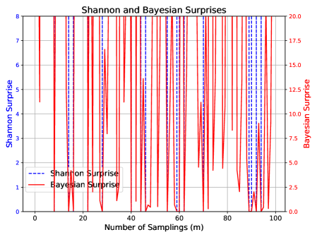
This is a dual-axis line chart titled "Shannon and Bayesian Surprises." It plots two different "surprise" metrics against the number of samplings (m). The chart demonstrates the volatile and spiky nature of both metrics over 100 sampling iterations, with Bayesian Surprise exhibiting significantly higher magnitude and frequency of spikes compared to Shannon Surprise.
### Components/Axes
* **Chart Title:** "Shannon and Bayesian Surprises" (centered at the top).
* **X-Axis:**
* **Label:** "Number of Samplings (m)"
* **Scale:** Linear, from 0 to 100.
* **Major Tick Marks:** 0, 20, 40, 60, 80, 100.
* **Primary Y-Axis (Left):**
* **Label:** "Shannon Surprise"
* **Scale:** Linear, from 0 to 8.
* **Major Tick Marks:** 0, 1, 2, 3, 4, 5, 6, 7, 8.
* **Secondary Y-Axis (Right):**
* **Label:** "Bayesian surprise"
* **Scale:** Linear, from 0.0 to 20.0.
* **Major Tick Marks:** 0.0, 2.5, 5.0, 7.5, 10.0, 12.5, 15.0, 17.5, 20.0.
* **Legend:**
* **Position:** Top-left corner of the plot area.
* **Entry 1:** Blue dashed line (`--`) labeled "Shannon Surprise".
* **Entry 2:** Red solid line (`-`) labeled "Bayesian Surprise".
* **Plot Area:** Contains a dense grid of vertical red and blue lines/spikes against a white background with a light gray grid.
### Detailed Analysis
* **Data Series - Shannon Surprise (Blue Dashed Line):**
* **Trend Verification:** The line is characterized by sharp, narrow, vertical spikes rising from a baseline near zero. The spikes are irregularly spaced and vary in height.
* **Data Points (Approximate):** The spikes reach values primarily between 2 and 8 on the left y-axis. Notable peaks occur near sampling numbers 10, 18, 30, 45, 68, and 90, with the highest spikes approaching or reaching the maximum value of 8. The baseline between spikes is consistently at or very near 0.
* **Data Series - Bayesian Surprise (Red Solid Line):**
* **Trend Verification:** This series also exhibits sharp, vertical spikes, but they are more frequent, often overlapping, and reach much higher magnitudes on the right y-axis.
* **Data Points (Approximate):** Spikes frequently exceed 15.0, with many reaching between 17.5 and 20.0. The highest spikes appear to hit the upper limit of 20.0 at multiple points (e.g., near sampling numbers 5, 15, 25, 55, 75, 95). The baseline is also near zero, but the density of high spikes makes the red line dominate the visual field.
* **Spatial Grounding & Cross-Reference:** The legend in the top-left correctly maps the blue dashed line to the left-axis "Shannon Surprise" and the red solid line to the right-axis "Bayesian surprise." The visual density of the red line confirms its higher magnitude and frequency as per the right-axis scale.
### Key Observations
1. **Magnitude Disparity:** Bayesian Surprise values (0-20 scale) are consistently and significantly higher in magnitude than Shannon Surprise values (0-8 scale) at their peaks.
2. **Frequency and Density:** The spikes for Bayesian Surprise are more densely packed across the 100 samplings compared to the slightly more spaced-out spikes of Shannon Surprise.
3. **Synchronized Spikes:** At several sampling points (e.g., near m=10, 30, 68, 90), spikes in both metrics occur simultaneously, suggesting events that trigger high surprise in both frameworks.
4. **Baseline Behavior:** Both metrics return to a near-zero baseline between spike events.
### Interpretation
This chart visually compares two information-theoretic measures of "surprise" or unexpectedness in a sequential sampling or learning process.
* **What the data suggests:** The data demonstrates that the Bayesian Surprise metric is far more sensitive or reactive than the Shannon Surprise metric in this context. It produces larger and more frequent high-surprise signals. This could imply that the Bayesian framework, which incorporates prior beliefs, is detecting deviations from its expectations more aggressively than the Shannon measure, which is based purely on the information content of the new observation itself.
* **Relationship between elements:** The simultaneous spikes indicate specific sampling events (m values) that are highly informative or anomalous according to both mathematical definitions. The divergence in magnitude suggests that for the same event, the Bayesian update (incorporating prior knowledge) results in a greater "surprise" than the raw information gain calculated by Shannon.
* **Notable patterns/anomalies:** The most notable pattern is the consistent over-performance (in terms of magnitude) of Bayesian Surprise. An anomaly to note is that despite the difference in scale, the *timing* of major surprise events is often correlated, validating that both metrics are responding to the same underlying phenomena in the data stream, albeit with different sensitivities. The chart effectively argues that the choice of surprise metric dramatically affects the perceived "volatility" or "informativeness" of a process.