\n
## Line Chart: Accuracy vs. Sample Size
### Overview
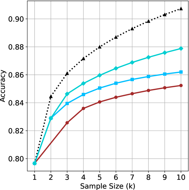
The image presents a line chart illustrating the relationship between sample size and accuracy. Four distinct data series are plotted, each representing a different model or condition. The chart demonstrates how accuracy changes as the sample size increases, ranging from 1k to 10k.
### Components/Axes
* **X-axis:** Labeled "Sample Size (k)", ranging from 1 to 10, with increments of 1.
* **Y-axis:** Labeled "Accuracy", ranging from 0.80 to 0.90, with increments of 0.02.
* **Data Series:** Four lines are present, each with a unique color and style:
* Black dotted line
* Cyan solid line
* Blue solid line
* Red solid line
### Detailed Analysis
Let's analyze each data series individually, noting trends and approximate values.
* **Black Dotted Line:** This line exhibits a strong upward trend, indicating a rapid increase in accuracy with increasing sample size.
* At Sample Size = 1k, Accuracy ≈ 0.84
* At Sample Size = 2k, Accuracy ≈ 0.86
* At Sample Size = 3k, Accuracy ≈ 0.87
* At Sample Size = 4k, Accuracy ≈ 0.88
* At Sample Size = 5k, Accuracy ≈ 0.885
* At Sample Size = 6k, Accuracy ≈ 0.89
* At Sample Size = 7k, Accuracy ≈ 0.895
* At Sample Size = 8k, Accuracy ≈ 0.90
* At Sample Size = 9k, Accuracy ≈ 0.90
* At Sample Size = 10k, Accuracy ≈ 0.90
* **Cyan Solid Line:** This line also shows an upward trend, but the rate of increase is less steep than the black dotted line.
* At Sample Size = 1k, Accuracy ≈ 0.80
* At Sample Size = 2k, Accuracy ≈ 0.83
* At Sample Size = 3k, Accuracy ≈ 0.845
* At Sample Size = 4k, Accuracy ≈ 0.855
* At Sample Size = 5k, Accuracy ≈ 0.86
* At Sample Size = 6k, Accuracy ≈ 0.865
* At Sample Size = 7k, Accuracy ≈ 0.868
* At Sample Size = 8k, Accuracy ≈ 0.87
* At Sample Size = 9k, Accuracy ≈ 0.873
* At Sample Size = 10k, Accuracy ≈ 0.875
* **Blue Solid Line:** This line demonstrates a moderate upward trend, with a slower rate of increase compared to the cyan line.
* At Sample Size = 1k, Accuracy ≈ 0.80
* At Sample Size = 2k, Accuracy ≈ 0.82
* At Sample Size = 3k, Accuracy ≈ 0.835
* At Sample Size = 4k, Accuracy ≈ 0.845
* At Sample Size = 5k, Accuracy ≈ 0.85
* At Sample Size = 6k, Accuracy ≈ 0.855
* At Sample Size = 7k, Accuracy ≈ 0.858
* At Sample Size = 8k, Accuracy ≈ 0.86
* At Sample Size = 9k, Accuracy ≈ 0.862
* At Sample Size = 10k, Accuracy ≈ 0.865
* **Red Solid Line:** This line shows the slowest rate of increase in accuracy with sample size.
* At Sample Size = 1k, Accuracy ≈ 0.80
* At Sample Size = 2k, Accuracy ≈ 0.81
* At Sample Size = 3k, Accuracy ≈ 0.82
* At Sample Size = 4k, Accuracy ≈ 0.83
* At Sample Size = 5k, Accuracy ≈ 0.835
* At Sample Size = 6k, Accuracy ≈ 0.84
* At Sample Size = 7k, Accuracy ≈ 0.843
* At Sample Size = 8k, Accuracy ≈ 0.845
* At Sample Size = 9k, Accuracy ≈ 0.847
* At Sample Size = 10k, Accuracy ≈ 0.85
### Key Observations
* The black dotted line consistently exhibits the highest accuracy across all sample sizes.
* The red solid line consistently exhibits the lowest accuracy across all sample sizes.
* All lines demonstrate diminishing returns in accuracy as sample size increases. The rate of accuracy improvement slows down with larger sample sizes.
* The difference in accuracy between the black dotted line and the red solid line is most pronounced at smaller sample sizes.
### Interpretation
The chart suggests that increasing the sample size generally improves accuracy, but the extent of improvement varies depending on the model or condition being evaluated. The black dotted line likely represents a model that benefits significantly from larger datasets, while the red solid line represents a model that is less sensitive to sample size. The diminishing returns observed across all lines indicate that there is a point beyond which increasing the sample size yields only marginal improvements in accuracy. This information is valuable for resource allocation, as it helps determine the optimal sample size for achieving a desired level of accuracy without unnecessary data collection costs. The chart could be demonstrating the performance of different machine learning algorithms, or different data preprocessing techniques. The consistent performance difference between the lines suggests inherent differences in the models' capabilities or the quality of the data they are trained on.