## Line Chart: Accuracy vs. Sample Size (k)
### Overview
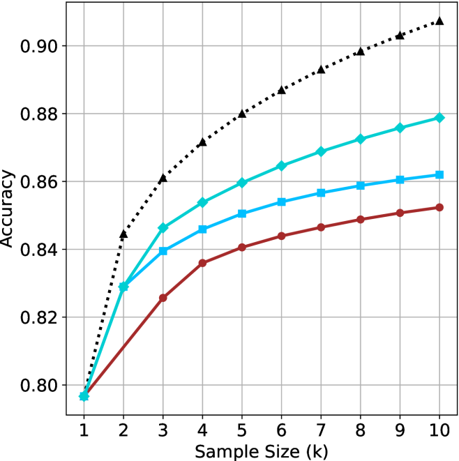
The image is a line chart comparing the performance (Accuracy) of four different methods or models as a function of increasing Sample Size (k). All four series begin at the same accuracy point for k=1 and show improvement as k increases, but they diverge significantly in their rate of improvement and final accuracy.
### Components/Axes
* **X-Axis (Horizontal):** Labeled "Sample Size (k)". It has discrete integer markers from 1 to 10.
* **Y-Axis (Vertical):** Labeled "Accuracy". It has numerical markers from 0.80 to 0.90, in increments of 0.02.
* **Legend:** No explicit legend is present within the chart area. The four data series are distinguished solely by line color, line style, and marker shape.
* **Grid:** A light gray grid is present, with vertical lines at each integer k value and horizontal lines at each 0.02 accuracy increment.
### Detailed Analysis
The chart contains four distinct data series. Their visual trends and approximate data points are as follows:
1. **Black Dotted Line with Upward-Pointing Triangle Markers:**
* **Trend:** This line shows the steepest and most consistent upward slope, indicating the highest rate of improvement with sample size. It is the top-performing series for all k > 1.
* **Data Points (Approximate):**
* k=1: 0.80
* k=2: ~0.845
* k=3: ~0.860
* k=4: ~0.872
* k=5: ~0.880
* k=6: ~0.886
* k=7: ~0.892
* k=8: ~0.898
* k=9: ~0.903
* k=10: ~0.908
2. **Cyan Solid Line with Diamond Markers:**
* **Trend:** This line shows a strong, steady upward slope, second only to the black line. It maintains a clear gap above the blue and red lines.
* **Data Points (Approximate):**
* k=1: 0.80
* k=2: ~0.829
* k=3: ~0.846
* k=4: ~0.854
* k=5: ~0.860
* k=6: ~0.865
* k=7: ~0.869
* k=8: ~0.873
* k=9: ~0.876
* k=10: ~0.879
3. **Blue Solid Line with Square Markers:**
* **Trend:** This line shows a moderate upward slope. Its rate of improvement is slower than the cyan line but faster than the red line.
* **Data Points (Approximate):**
* k=1: 0.80
* k=2: ~0.829 (appears to overlap with cyan at this point)
* k=3: ~0.839
* k=4: ~0.846
* k=5: ~0.850
* k=6: ~0.854
* k=7: ~0.857
* k=8: ~0.859
* k=9: ~0.861
* k=10: ~0.862
4. **Red Solid Line with Circle Markers:**
* **Trend:** This line shows the shallowest upward slope, indicating the slowest rate of improvement with sample size. It is the lowest-performing series for all k > 1.
* **Data Points (Approximate):**
* k=1: 0.80
* k=2: ~0.812
* k=3: ~0.825
* k=4: ~0.836
* k=5: ~0.840
* k=6: ~0.844
* k=7: ~0.846
* k=8: ~0.849
* k=9: ~0.851
* k=10: ~0.852
### Key Observations
* **Common Origin:** All four methods start at an identical accuracy of approximately 0.80 when the sample size (k) is 1.
* **Divergence:** The performance gap between the methods widens consistently as the sample size increases. The hierarchy (Black > Cyan > Blue > Red) is established by k=3 and maintained thereafter.
* **Diminishing Returns:** All curves show signs of diminishing returns; the slope (rate of accuracy gain) decreases as k increases, particularly for the blue and red lines.
* **Performance Gap:** At k=10, the difference between the best (Black, ~0.908) and worst (Red, ~0.852) performing methods is approximately 0.056 accuracy points.
### Interpretation
This chart demonstrates a classic learning curve analysis, comparing how different algorithms or models benefit from increased data (sample size). The key takeaway is that while all methods improve with more data, their **data efficiency** and **learning capacity** differ markedly.
* The method represented by the **black dotted line** is not only the most accurate but also the most data-efficient, showing the largest gains per additional sample. It suggests a model with high capacity that effectively leverages more information.
* The **red line** represents a method with lower capacity or a less effective learning algorithm for this task, as it plateaus more quickly and achieves the lowest final accuracy.
* The **cyan and blue lines** represent intermediate performers. The cyan method consistently outperforms the blue one, indicating a superior approach, though both are clearly outpaced by the black method.
**Notable Anomaly/Consideration:** The critical missing information is the **identity of the four methods**. Without a legend, the chart shows a clear performance ranking but cannot attribute it to specific algorithms (e.g., "Model A vs. Model B"). The analysis is therefore purely comparative based on visual trends. The overlapping point for the cyan and blue lines at k=2 is also a precise detail worth noting.