## Bar Chart: Frequency Over Time
### Overview
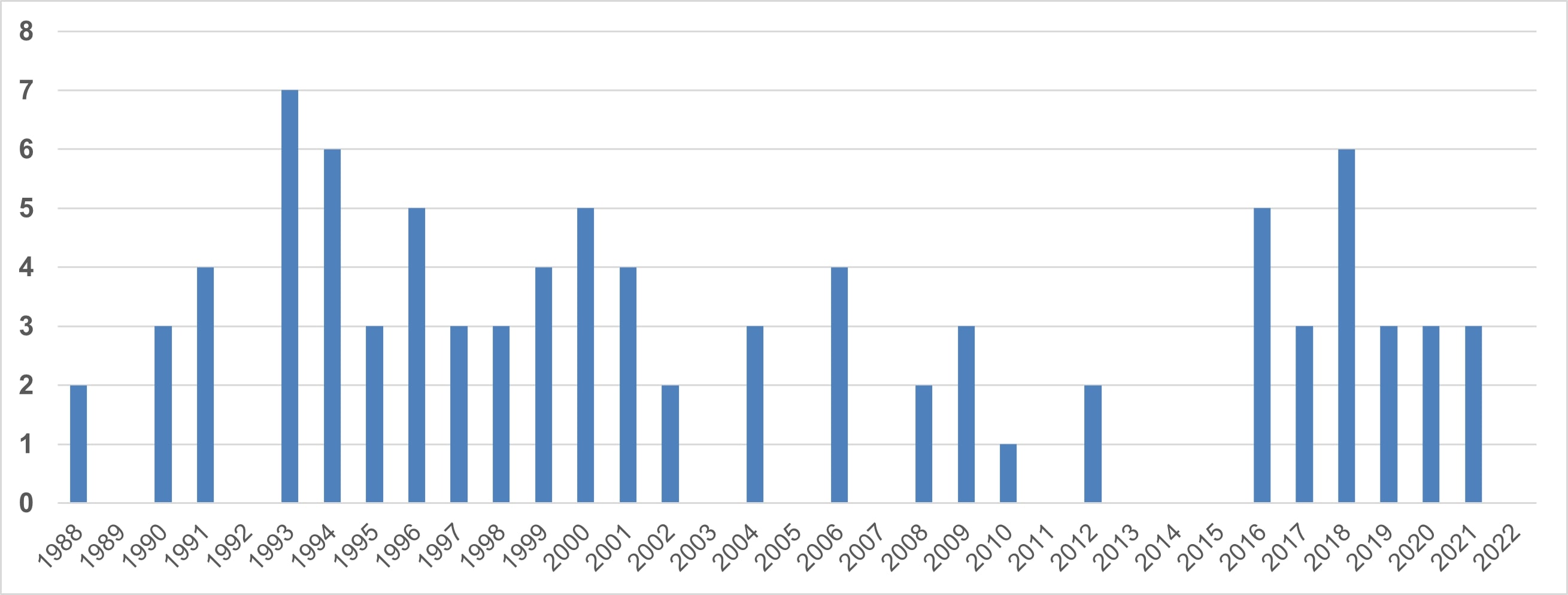
The image is a bar chart showing the frequency of an event over time, spanning from 1988 to 2022. The y-axis represents the frequency, ranging from 0 to 8. The x-axis represents the years. The bars are all blue.
### Components/Axes
* **X-axis:** Years, ranging from 1988 to 2022 in increments of 1 year.
* **Y-axis:** Frequency, ranging from 0 to 8 in increments of 1.
* **Data:** Blue bars representing the frequency for each year.
### Detailed Analysis
Here's a breakdown of the frequency for each year:
* **1988:** 2
* **1989:** 0
* **1990:** 3
* **1991:** 4
* **1992:** 4
* **1993:** 7
* **1994:** 6
* **1995:** 3
* **1996:** 3
* **1997:** 3
* **1998:** 3
* **1999:** 4
* **2000:** 5
* **2001:** 4
* **2002:** 2
* **2003:** 0
* **2004:** 3
* **2005:** 0
* **2006:** 4
* **2007:** 0
* **2008:** 2
* **2009:** 3
* **2010:** 1
* **2011:** 0
* **2012:** 2
* **2013:** 0
* **2014:** 0
* **2015:** 0
* **2016:** 5
* **2017:** 3
* **2018:** 6
* **2019:** 3
* **2020:** 3
* **2021:** 3
* **2022:** 3
### Key Observations
* The frequency peaks in 1993 with a value of 7.
* There is a period of low frequency between 2003 and 2015, with several years having a frequency of 0.
* The frequency increases again in 2016 and 2018, but then stabilizes around 3 from 2019 to 2022.
### Interpretation
The chart illustrates the temporal distribution of an event. The high frequency in the early 1990s, followed by a decline and subsequent resurgence, suggests potential cyclical patterns or external factors influencing the event's occurrence. The period of low frequency could indicate a period of reduced activity or a change in data collection methods. The recent stabilization suggests a new equilibrium or a consistent level of activity. Further context is needed to understand the nature of the event and the factors driving these trends.