## Bar Chart: Data Over Time
### Overview
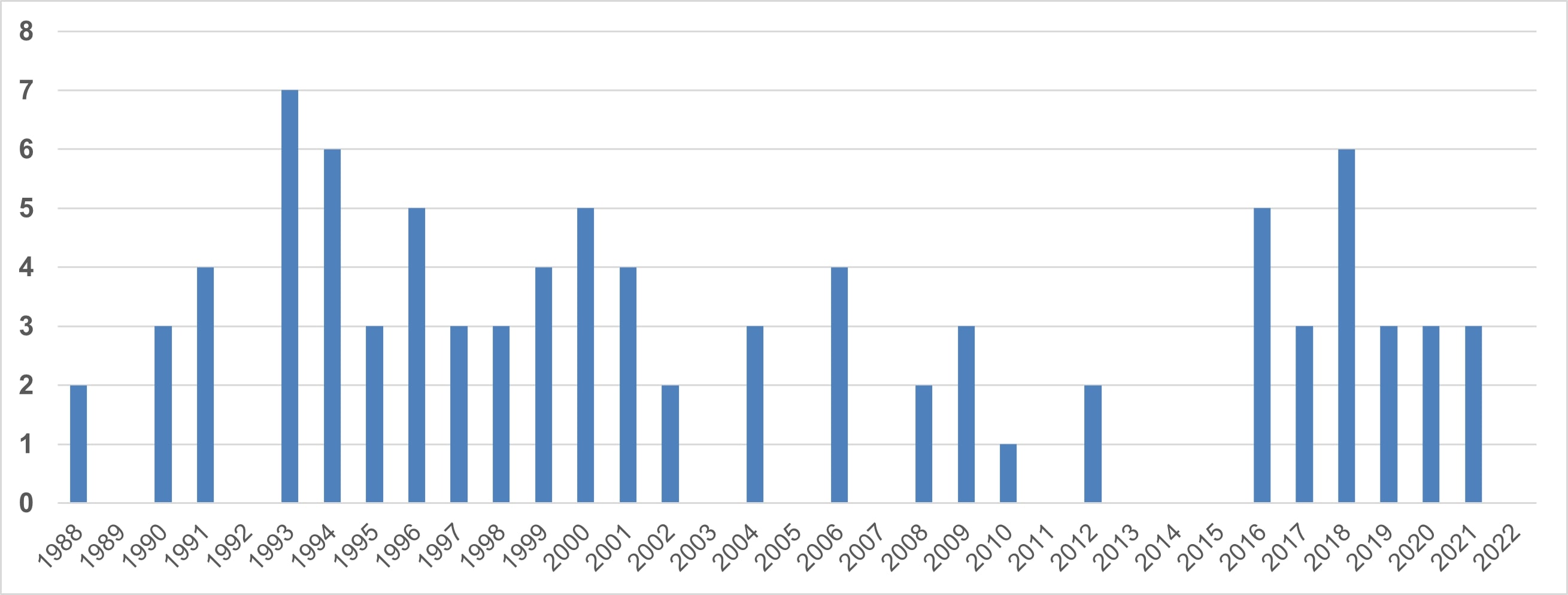
The image presents a bar chart displaying data values over a period from 1988 to 2022. The y-axis represents the data value, ranging from 0 to 8, while the x-axis represents the year. The chart consists of a series of vertical bars, each corresponding to a specific year, with the height of the bar indicating the data value for that year.
### Components/Axes
* **X-axis:** Years from 1988 to 2022, incrementing by one year.
* **Y-axis:** Data values, ranging from 0 to 8, incrementing by 1.
* **Bars:** Represent data values for each year. All bars are the same color (light blue).
* **No Legend:** There is no legend present in the image.
### Detailed Analysis
The chart shows fluctuating data values over the years. Here's a breakdown of approximate values for each year:
* **1988:** Approximately 2.5
* **1989:** Approximately 0.5
* **1990:** Approximately 3
* **1991:** Approximately 1
* **1992:** Approximately 7
* **1993:** Approximately 6.5
* **1994:** Approximately 6
* **1995:** Approximately 5
* **1996:** Approximately 5
* **1997:** Approximately 4
* **1998:** Approximately 3.5
* **1999:** Approximately 3
* **2000:** Approximately 5
* **2001:** Approximately 2
* **2002:** Approximately 2
* **2003:** Approximately 2.5
* **2004:** Approximately 4
* **2005:** Approximately 4
* **2006:** Approximately 4
* **2007:** Approximately 4
* **2008:** Approximately 2
* **2009:** Approximately 1
* **2010:** Approximately 0.5
* **2011:** Approximately 1
* **2012:** Approximately 0
* **2013:** Approximately 0
* **2014:** Approximately 0
* **2015:** Approximately 5
* **2016:** Approximately 5
* **2017:** Approximately 6
* **2018:** Approximately 3
* **2019:** Approximately 3
* **2020:** Approximately 3
* **2021:** Approximately 3
* **2022:** Approximately 3
The data generally fluctuates, with peaks around 1992-1994, 2017, and a smaller peak around 2000. There are periods of low values around 2009-2014.
### Key Observations
* **Highest Values:** The highest data values occur in 1992 and 1993, reaching approximately 7.
* **Lowest Values:** The lowest data values occur around 2012-2014, reaching approximately 0.
* **Fluctuations:** The data exhibits significant fluctuations throughout the period, with no clear long-term trend.
* **Recent Stability:** From 2018-2022, the data appears relatively stable, hovering around a value of 3.
### Interpretation
The chart suggests a variable phenomenon being measured over time. The lack of a clear trend indicates that the phenomenon is likely influenced by multiple factors or is inherently unstable. The peaks and troughs could represent periods of increased or decreased activity, events, or other influencing variables. The recent stability from 2018-2022 might indicate a stabilization of these influencing factors, or a new equilibrium has been reached. Without knowing what the y-axis represents, it's difficult to provide a more specific interpretation. The data could represent anything from economic indicators to environmental measurements to social trends. The significant fluctuations suggest that the underlying process is complex and not easily predictable.